You are on the Home/Excel/Charts page
Google
Web This Site

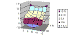
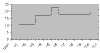
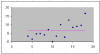
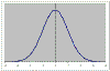
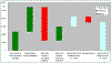
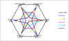
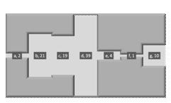
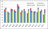
With a little creativity and some understanding of how Excel does what it does, one can create a wide variety of ways to visualize data.  Below are several different types of charts one can create in Excel together with explanations and details of some of the less common built-in charts.


3D surface

Step function

horizontal line

Normal distribution curve
 

Waterfall (vertical)

Custom Radar

Pipeline Chart

Stacked Columns
 
 Progress towards a goal
A "pie-in-pie" chart


Supply and Demand

Price
elasticity of demand
(Interactive)


Values that differ
by a magnitude

One series two axes
     

Conditional colors
       

Non-traditional user interfaces

(combining Excel and VBA)