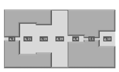
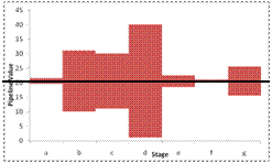
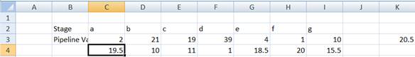
The chart typically shows performance across multiple stages. The width of the pipe reflects the quantity measured at each stage. Examples of what is being measured include processing speed or inventory. If the measurements are uniformly distributed across the stages, the pipeline will look almost uniform. If however, there are irregularities (bottlenecks) in the system, the pipe will have varying widths.

Figure 1

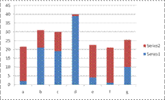
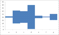
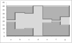
Figure 2
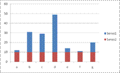
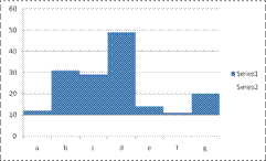
Neither of the above looks like a Excel chart, does it? Yet, both are! Would it help if the pipeline chart looked like:
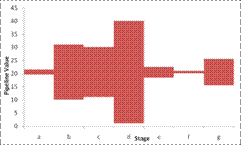
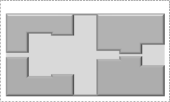
Figure 3
That looks like a Excel chart, doesn't it?
So, how do we start? Well, first, we need the data to plot.
Next, recognize that the only chart capable of drawing a 'shape' like the above is a column chart.
So, if we use a column chart, how do we create what looks like floating rectangles? How about a stacked column chart with the first series made transparent?
To remove the gaps between the columns, set the gap width to zero.
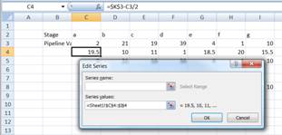
While that gives us 'floating' columns, we don't want the first series to have constant values. How do we calculate what the 1st series values should be? To figure that out, note that the columns in the pipeline chart are aligned at their midpoint.
So, each point in the dummy series plus one-half of the value of the corresponding actual series point must equal a constant value. Since the largest column must fit in the chart, and it has a value of 39, the half of which is 19.5, that will serve as our 'baseline.' Now, if we want the largest column to 'float' we should add a small value to the 19.5. Add 1 and make the midpoint 20.5. To generalize, calculate one-half of the largest column and add 1 with the formula, in say K3: =MAX(C3:I3)/2+1. Then, calculate the value of each point of the dummy series. Enter, in C4 =$K$3-C3/2 and copy across to D4:I4. The result should look like
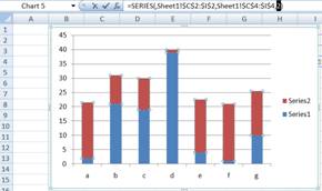
Now, select and create a stacked column chart.
The two series are the wrong way around. The series at the top should be at the bottom. The easiest way to do this is to select the top series. Then, in the formula bar, select the series number and change it from 2 to 1.
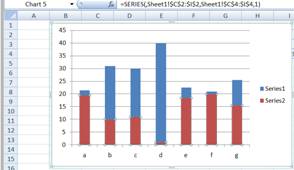
Next, set the Gap Width to zero and delete the legend and the gridlines.
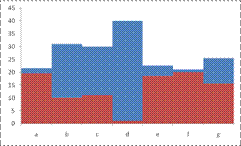
Figure 4
Finally, make the bottom series transparent by setting the Fill and the Line to No Color.
Now, that we have figured out how to create the chart in Figure 3, how about the chart in Figure 2?
Look at Figure 4. If we duplicate the bottom dummy series at the top and then format all three series as desired we will get the result we want. So, add the dummy series as the third series. In Excel 2007, select the chart, then contextual ribbon Chart Tools | Design tab | Data group | Select Data button. In the Select Data Source dialog box, click the Add button. In the Edit Series dialog box, set the Series values to C4:I4.
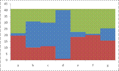
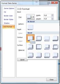
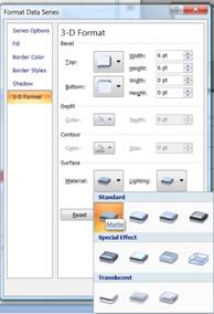
For the top and bottom series, set a 3D format of Top Bevel: Circle and Material: Matte. Also, choose a Fill color of a dark shade of gray.
For the actual (middle) series, select a lighter shade of gray. The result:
Now, remove the x and y axes (select each, right click to select Format Axis... In the Format Axis dialog box, in the Axis Options tab set the Major tick mark type and the Axis labels to None. From the Line Color tab, select the No Line option button.
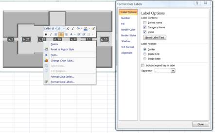
As the penultimate step, add the data labels. Select both Category Name and Value separated by comma. Format the data label to have a dark gray fill and a white font.
Finally, set the Chart Area Fill and Border to No Fill, as well as the Plot Area Fill and we are done.