Infinite opportunities?  Endless problems?  Limited resources?  Talk to us!
Operations
Consulting
Software
Consulting
Publishing and
Training
Applied
Solutions
Excel add-ins
and tutorials
Charts Excel and VBA
Case Studies
VBA
tutorials
PowerPoint
Add-Ins
Miscellenia
You are on the Home/Excel/Charts/Conditional shape colors page

Dashboard example – conditional colors of shapes

Too often a dashboard is a series of charts and tables presented in a grid format.  Yet, there are instances when the “natural context” for that information is not a chart or a grid but some other visual.  A classic example is a geographic map.  Information about countries or states or counties or cities is often easily seen in the context of a map.  For example, consider the two images of the change in the U.S. population first from 1990 to 2000 and then from 2000 to 2005.  Can there possibly be a better way to visualize the trend in national demographics than the two images below?  It shows that almost all the states are increasing in population but those in the south and the west are doing so at a much faster clip than those in the Mid-West and the North-East and the three states just above the Gulf of Mexico.  Note that while I use a map to illustrate how to implement conditional colors of shapes, the technique itself applies to any set of shapes.

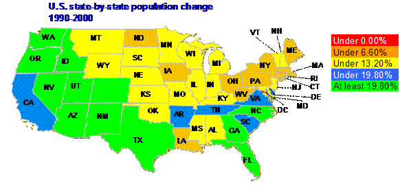
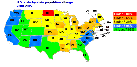
The above maps were created in MS Excel.  Yes, that’s right, Excel.  And, the transformation from one to the other was the result of a single drop down box! 


About this site

What's new

Google
Web
This Site


In addition, since the solution uses shapes and not Excel objects, the 56 color limit imposed by Excel’s palette does not apply to this solution.

The rest of this article describes the various steps needed to implement the above, which, essentially, is the ability to implement conditionally colored shapes.  The final sections discuss the limitations of this approach and summarize the tip.

The concept

There are several pieces that must come together before one can pull off the above:

1)      Create the desired graphic using as many shapes as needed.  In the example of the U.S. mainland map there are 49 individual freeform shapes (from the Drawing toolbar), each of which is shaped like and represents a specific state.  These shapes can optionally be named something other than the default name Excel picks, which is Freeform {n}, where n is a number assigned by Excel.

2)      Identify the cells in the worksheet that will contain values that will decide the color of the associated shape.  Name each of these cells.

3)      Create a table that defines the link between each of these names used for the cells and the shapes.

4)      Create a table that defines how the values in the cells will map to the colors of the shapes.

5)      Identify additional conditions that should trigger an update of the colors of the shapes

6)      Add the minimalist code that uses the information provided in steps 1 through 4 to manage the colors of the shapes.  By using the above approach, the code is very generic and contains nothing specific to any particular solution.  All of the definitions are in the tables and cells identified above.  Hence, one need know no programming to use or modify this technique.

Step 1: Create the desired image using individual shapes

This would typically be done through the objects on the Drawing toolbar.  The final image should consist of individual shapes where each shape can be colored separately. 

For the map example, it made sense to start with an outline map of the US and add one freeform shape for each state customized to look like the state boundary (Drawing toolbar | AutoShapes | Lines > Freeform).  Format the shapes as desired.  In the example, the line color was set to grey.  For the very intertwined boundaries of West Virginia, Virginia, Maryland, and the District of Columbia the line width was reduced to 0.25 pt and simply eliminated for DC itself.


Each state name is a textbox from the Drawing toolbar.  For those states where the name would not fit inside the state boundary, a connector (from the Drawing toolbar: AutoShapes | Connectors > Straight Arrow Connector) linked the shape to the name.  Enter the desired name in each textbox.  The example contains the commonly used 2 letter abbreviations of U.S. states.

The name and shape for each state (and optionally the connector) were grouped together (select the 2 or 3 shapes as appropriate, right click and from the context menu select Grouping > Group).  The net result: 49 grouped objects (one for each of the 48 mainland states and one for the District of Columbia) and, of course, the outline. In the image fragment below, the shapes and labels associated with both Michigan and Vermont and the connector associated with the latter have been moved off-kilter to show the individual groups.  A view of the outline map can be seen underneath the colored shapes.

Step 2: Create, identify and name the cells associated with each shape

The data can be organized anywhere in the worksheet.  For convenience, and because the format suited this particular example, the data for the states were put in three columns: A, B, and C.  A contained the state name, B the population change from 1990 to 2000 and C the change from 2000 to 2005. 


Column D contained the data selected for display (the values from either column B or column C).  Cell D23 had a data validation list to selects one of the two columns.


An out-of-the-way cell (M24) identified the selected column with the formula =MATCH($D$23,$B$23:$C$23,0)

Cells D24 on down contained the data corresponding to the selected column.  D24 contained the formula =INDEX(B24:C24,1,$M$24) and D24 was copied as far down as there were data in column A.

Finally, name each of the cells in column D starting with D25 (Insert | Name > Define…).  Any name will do.  In the context of the map example, it made sense to use the 2 letter abbreviation commonly used with U.S. states.


Step 3: Create a table identifying which cell is associated with which shape

Next, create a relationship between the named cells from step 2 and the freeform shapes of step 1. 

In some out-of-the-way columns (in the example that happens to be columns P and Q), enter all the cell names and the associated shape name.


To find the shape name, select the grouped object, pause and then select the shape itself. For example, Washington corresponds to Freeform 2.

Name this range (i.e., the cells in P:Q  that contain data) MapNameToShape with Insert | Name > Define…  To have the name automatically adjust to changes in the table, in the Define Name dialog box, in the Refers To field, enter the formula
=OFFSET(Sheet1!$N$5,0,0,COUNTA(Sheet1!$N:$N)-1,2).


Step 4: Create a table identifying what color to use for what value in the cells

The next step is to identify what colors correspond to what value in the various cells.  Create a table that contains this information.  Note the somewhat unusual structure.  The first column, which contains the threshold values, has one fewer entries than the second column, which contains the RGB color codes.  Column 1 starts in the 2nd row of the table while column 2 starts in the first row.  This is because of how the data in the table are used.  The third column contains an explanation of how the values are used.

This table can be located anywhere but it must be named MapValueToColor.  It, like the previous table, can be made to dynamically adjust to changing data.  In the Map example, the name refers to the formula =OFFSET(Sheet1!$K$6,0,0,COUNTA(Sheet1!$K:$K)+1-2,2)

Also, the threshold values in the first column of the table can be static or they can change from one data set to the next.  In the Map example they do change depending on which data set is plotted.  Since the 2 data sets (columns B and C) are sufficiently different, the threshold values are linked to the national average.  The thresholds are 0%, half the national average, the national average, and 1-1/2 times the national average.

The software also implements a new user defined function called VBA_RGB.  This allows the spreadsheet user to define colors with exact RGB values.  For example, the color for values under 0% is RGB(255,0,0) or red.  Consequently, cell L6 contains the formula =VBA_RGB(255,0,0).  The color for values between 5.3% and 7.95% is light blue.  Hence, cell L9 contains the formula =VBA_RGB(0,127,255).

Step 5: Identify additional conditions that should trigger an update of the colors of the shapes

One of the last pieces we need to address is a “global” trigger.  There are circumstances when a change to a single cell requires a reexamination of all the shapes and their associated cells.  In the Map example, this would be a change to cell D23.  Selecting a different data set does not trigger any native Excel event that would cause the code (which we will add in the next step) to recolor the different shapes.  So, we identify this global trigger through one cell named UpdateAllCells.  In the Map example, this is T5.  The content of the cell is the address of the cell that serves as the global trigger.  In the Map example, that is done through the formula =CELL("address",D23)

To include multiple cell addresses, separate them with commas or any other delimiter that appeals.

Step 6: Copy and paste the code needed to bring together the results of the above steps

The final piece is to add the code.  In the code module for Sheet1 (assuming Sheet1 is the one with the model described above):

Option Explicit

Private Sub Worksheet_Change(ByVal Target As Range)

    Dim aCell As Range

    For Each aCell In Target

        If InStr(1, Range("UpdateAllCells").Value, _

                aCell.Address(True, True), vbTextCompare) > 0 Then

            updateAll

        Else

            CheckColor aCell

            End If

        Next aCell

    End Sub


In a standard module, add the following:

Option Explicit

Sub CheckColor(aCell As Range)

    Dim aShp As Shape, TargCell As Range

    On Error GoTo Catch1

    Set TargCell = Range("MapNameToShape").Columns(1).Find( _

        aCell.Name.Name, LookAt:=xlWhole)

    Set aShp = ActiveSheet.Shapes(TargCell.Offset(0, 1))

    GoTo Finally1

Catch1:

    Exit Sub

Finally1:

    On Error GoTo 0

    Dim ColorCode As Long

    If aCell.Value < Range("MapValueToColor").Cells(2, 1).Value Then

        ColorCode = Range("MapValueToColor").Cells(1, 2).Value

    Else

        ColorCode = Application.WorksheetFunction.VLookup( _

            aCell.Value, Range("MapValueToColor"), 2, True)

        End If

    aShp.Fill.ForeColor.RGB = ColorCode

    End Sub


Sub updateAll()

    Dim aCell As Range

    For Each aCell In Range("mapnametoshape").Columns(1).Cells

        CheckColor Range(aCell.Value)

        Next aCell

    End Sub


Function VBA_RGB(R As Byte, G As Byte, B As Byte) As Long

    VBA_RGB = RGB(R, G, B)

    End Function

Limitations

Three important limitations come to mind.

First, I am a strong proponent of separating code and data.  Ideally, the code presented in Step 6 above would be in an add-in.  However, including instructions on creating an add-in is outside the scope of this tip.

Second, in many instances, the cells that are linked to the various shapes will have formulas in them.  In such cases, since no one would enter data into these cells directly, the worksheet Change event used in the code above would never be triggered.  One might want to consider the Calculate event.  It, of course, does not indicate which cells were changed.  Integrating that event into the model presented in this tip, while not difficult, would unnecessarily complicate the implementation without adding any value to the concept of conditionally colored shapes. 

Third, it is relatively easy to imagine a scenario where the cell that is linked to a particular shape cannot be named.  Instead, one might want to identify it by the value either in itself or in an adjacent cell.  In the context of the Map example, instead of having the data for the two periods in two columns, one can easily create a PivotTable that includes the state as a row field and the population change as the data field.  In this case, it would not be possible to name the cells in the PivotTable since we cannot be sure that a particular cell will always refer to the same set after the table is refreshed.  Instead, ne might want to create a scenario that indicates something like this: Look for the token “Washington” in this column.  Then, use value of the cell next to it.

Summary

This tip demonstrates a very effective way of visually displaying information using a graphic image that is the most appropriate to the subject at hand.  At its core, the idea is to establish two linkages.  The first establishes a link between a specific worksheet cell and a specific shape.  The second establishes a link between the possible values in the cell and the corresponding color used to color the shape.  The rest, as the cliché goes, is only details.  Of course, this tip goes through the details in detail and includes a functioning example.

References

I don’t believe I have seen any example of conditionally colored shapes.  That, of course, does not mean they do not exist.  Just that I haven’t seen any.

For custom technology solutions, operations consulting, or training contact web-underscore-contact@tushar-hyphen-mehta-dot-cee-oh-em.
By accessing any page or link on this web site other than this page, you agree to the terms and conditions.

Ads from amazon.com

[Optional] Survey (current rating of site: 3.7 out of 4)  If you will take a moment to provide your comments, it will help improve the site both for you, and for other visitors.

On a scale of 4 (just what I need)
to zero (totally useless)

How do you rate the information

on this page?

  on this site?

[Optional]

Your name
Your email address
Other comments
 
Monitor page
for changes
  
it's private   

by ChangeDetection
A comment selected at random:


Copyright © 2000-2008 Tushar Mehta.
Send comments and suggestions about the web site to webmaster@tushar-hyphen-mehta-dot-cee-oh-em
Last edited April 14, 2008