From Anonymous on Feb. 27, 2013:
The tutorial is easy to follow. It is a smart way to graph in excel!
From Jerrod F on December 27, 2012:
Best tutorial available. Simple, easy to understand -- perfect!
From Chillipadi on July 28, 2012:
Thank you very much. It is indeed helpful and easily comprehensible.
From Victor on July 8, 2012:
This is helpful and it is exactly what I want
From Anonymous on Jan 26, 2012:
Perfect. Just what I was looking for.
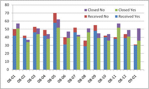
A fairly common chart that is not a default Excel chart type is the stacked cluster chart or a side-by-side stacked column chart. In this chart the data are both stacked and clustered. Excel, out of the box, can do one or the other but not both. This tutorial shows how to cluster a stack in a chart. Such a chart has 2 or more sets of data in 1 stack and 2 or more sets of data in one or more adjacent stacks. An example is shown below. The snapshots in the tutorial apply to Excel 2010 and Excel 2007. The technique will also work with Excel 2003.
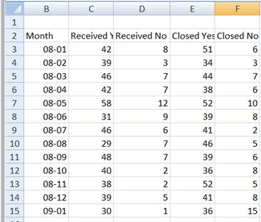
The usual arrangement for the data is something like
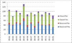
Plot the above in a stacked column and the result will be stacks containing 4 elements.
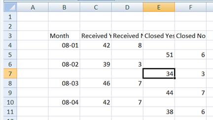
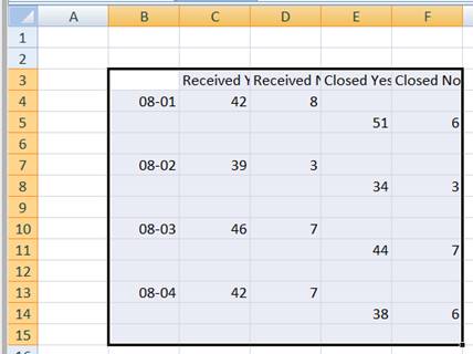
Given the default stacked column chart that Excel creates, we should recognize that one row in the data corresponds to one stack. So, if we want two 'side-by-side' stacks, the only way we will get that is by reorganizing the data layout. Put the data for the 1st column of the 1st stack in 1 row, that for the 1st column of the 2nd stack in the next, that for the 2nd column of the 1st stack in the third row, for the 2nd column of the 2nd stack in the fourth row, and so on. Since we are experimenting, we don't have to reorganize all the data, especially until we see how to reorganize the data quickly. For the time being do it by hand even if it takes a little time. Use just the first 4 rows to get:
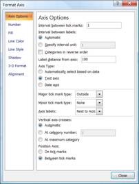
Plot this in a stacked column chart making sure that Excel uses the Month column as the x-values and that the X-axis type is category (or text):
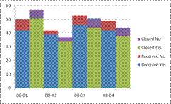
That looks better but is not quite right. We could eliminate the gaps by setting the Gap Width to 0 but the result (see below) will still not be right.
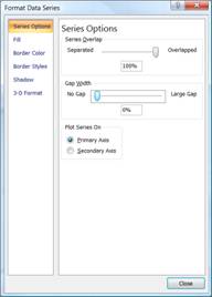
We are close to the desired result but we need to introduce a gap between every pair of stacked columns. Since the Gap Width affects every column, no amount of fiddling with that will give us what we want. Instead, how about adding a 3rd column of values all of which are zero? Suppose we change the data to look like:
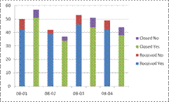
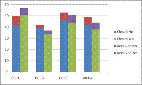
The corresponding chart is what we are looking for.
Even though we have what we want how long did it take you to reorganize just 4 rows of data? Imagine doing it with all the rows! Here's how we do it quickly.
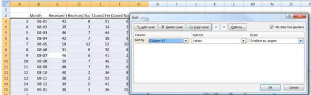
Given that our data are in B3:F15, in A3 enter the formula =ROW() and copy it down to A4:A15. Copy A3:A15 and paste back the values. Next, paste the values into A16:A28. Repeat the paste in the range A29:A41. Next, select the range A3:F28 -- leave rows 29:41 alone -- and sort on column A ascending.
The result will be
To move the contents of col. E and F down 1 row simply select E3:F27 and drag the selected range down 1 row.
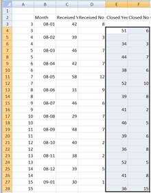
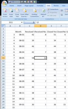
We are almost done. All that's left is the empty row after each data pair. Remember the values copied to A29:A41? They will now come into play. Select A4:F41 and sort on column A ascending. The result will be the data laid out as we want them. A partial snapshot:
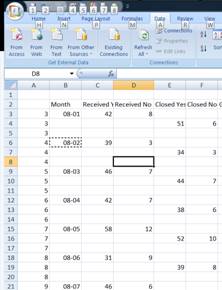
Clear the contents of column A since they are no longer required. Select the data range and create the stacked column chart. It might help to temporarily delete the 'Month' literal from cell B2 (Excel will then treat the 1st column as the x values). Again, remember to (1) set the type of the x-axis to Text (or Category in Excel 2003 or earlier), and (2) change the Gap Width to 0.

