Introduction to Demand and Supply curves
How the step graph for a small market becomes a smooth curve for a larger market
Supply and Demand curves play a fundamental role in Economics. The supply curve indicates how many producers will supply the product (or service) of interest at a particular price. Similarly, the demand curve indicates how many consumers will buy the product at a given price. By drawing the two curves together, it is possible to calculate the market clearing price. This is the intersection of the two curves and is the price at which the amount supplied by the producers will match exactly the quantity that the consumers will buy.
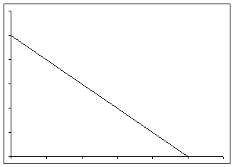
The process is illustrated in Figure 1. The downward sloping line is the demand curve, while the upward sloping line is the supply curve. The demand curve indicates that if the price were $10, the demand would be zero. However, if the price dropped to $8, the demand would increase to 4 units. Similarly, if the price were to drop to $2, the demand would be for 16 units.
The supply curve indicates how much producers will supply at a given price. If the price were zero, no one would produce anything. As the price increases, more producers would come forward. At a price of $5, there would be 5 units produced by various suppliers. At a price of $10, the suppliers would produce 10 units.
The intersection of the supply curve and the demand curve, shown by (P*, Q*), is the market clearing condition. In this example, the market clearing price is P*= 6.67 and the market clearing quantity is Q*=6.67. At the price of $6.67, various producers supply a total of 6.67 units, and various consumers demand the same quantity.
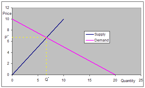
Figure 1
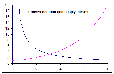
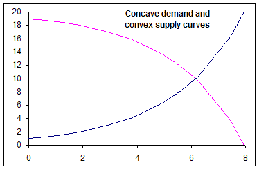
There is no reason why the curves have to be straight lines. They could be different shapes such in the examples below. However, for the sake of simplicity, we will work with straight line demand and supply functions.
 |
 |
Creating the market Demand and Supply curves from the preferences of individual producers and suppliers
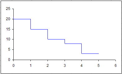
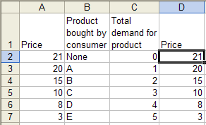
In the examples above, the chart contained smooth curves. While such a curve is an excellent approximation when there are many producers (or consumers), each of the curves is actually made up of many small discrete steps. Each of these steps represent the decision of a single individual (or company). We will see next how these curves are constructed based on the decisions made by individual entities. We construct the demand and supply curves for a very small market. Suppose there are just 5 consumers and each demands one unit of the product. However, they have distinct prices at which the product is valuable enough for them to buy it. Table 1 shows the price at which each individual will buy the product.
|
Creating the curves in Excel
Excel sticks to the norm and expects that in a two-column XY Scatter chart, the first column is the independent variable to be shown on the horizontal (x) axis. In our analysis, we put the price -- the independent variable -- in the first column, but then plot it on the vertical axis. The easiest way to handle this 'difference in expectations' is with an extra column as shown on the right. Note that column D is a copy of column A. It is possible to plot the data without use of the extra column but it requires a little extra work. |
| Once the price data set is duplicated in column D, plot columns C and D in a XY Scatter chart as shown on the right. | 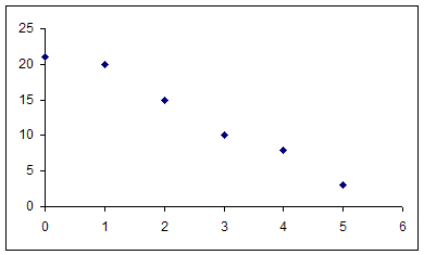 |
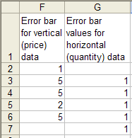
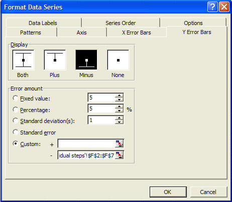
| Next, create the steps needed to complete the chart by
adding X and Y error bars. First, add the data for the Y error bars. In F2, enter the formula =D2-D3. Copy F2 down all the way to F6. To add the data for the X error bars, in G3, enter the formula =C3-C2, and copy G3 all the way down to G7. The data for the error bars should look as below.
Double click the plotted series. In the resulting Format Data Series dialog box, set up the X-error and Y-error bars as shown on the right.
|
  |
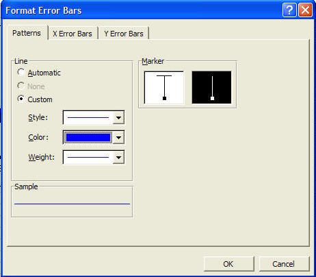
| Double click any of the error bars and choose the
pattern that does not have the cross-bar. Finally, double click
any of the series markers and format the series pattern to have no line
and no marker. Both the dialog box and the result are shown on the right.
|
  |
 Similar to the demand curve, the supply curve starts with
the data in the table below. It shows the prices at which
different producers find it profitable to supply the product. For
the sake of simplicity, we assume each producer makes just one unit.
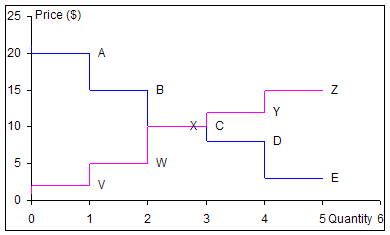
The graph on the right shows the supply curve on the same chart as the
demand curve. Each data point also has a label, which indicates
which consumer (or producer) will demand (or supply) at that price. Similar to the demand curve, the supply curve starts with
the data in the table below. It shows the prices at which
different producers find it profitable to supply the product. For
the sake of simplicity, we assume each producer makes just one unit.
The graph on the right shows the supply curve on the same chart as the
demand curve. Each data point also has a label, which indicates
which consumer (or producer) will demand (or supply) at that price.
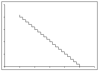
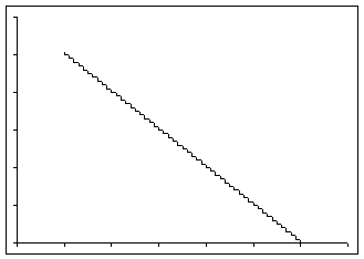
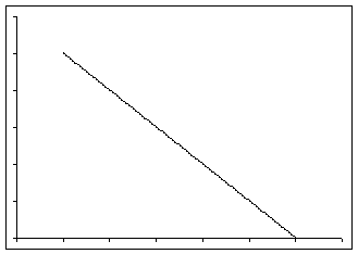
The two graphs intersect at a price of $10. At that price, three consumers (A, B, and C) will buy the product, and three producers (V, W, and X) will make it. Consequently, at (P*=10, Q*=3) the market will clear. Two consumers, D and E, who value the product at less than $10 will not buy anything and two producers, Y and Z, whose production costs exceed $10 will chose to not supply any product. How the step graph for a small market becomes a smooth curve for a larger marketIn a truly competitive market, there will be many consumers and producers. The first graph below shows the demand curve for a market with 20 consumers. The second graph shows the demand curve for a market with 50 consumers, the third a market with 100 consumers and the last a market with 1000 consumers. As more consumers participate in the market, the demand curve takes on an increasingly smooth look.
|


 By now,
the attentive reader may have noted a quirk specific to the analysis of
demand and supply. In the analysis, it is the price that is first
set (i.e., it is the independent variable) and the quantity is the
result of the analysis (i.e., the dependent variable). However, on
a Demand and Supply graph, the quantity is shown on the horizontal axis
and the price on the vertical axis. This reverses the norm for
charting, in which the horizontal axis represents the independent
variable and the vertical axis the dependent variable.
By now,
the attentive reader may have noted a quirk specific to the analysis of
demand and supply. In the analysis, it is the price that is first
set (i.e., it is the independent variable) and the quantity is the
result of the analysis (i.e., the dependent variable). However, on
a Demand and Supply graph, the quantity is shown on the horizontal axis
and the price on the vertical axis. This reverses the norm for
charting, in which the horizontal axis represents the independent
variable and the vertical axis the dependent variable.