Custom Radar
Chart
Introduction
Using the Add-in
The Data Layout
Adding New Data
The Default Excel Radar
Chart
Download files
Additional Documentation
A Radar chart, also
known as a spider chart, visually compares several entities
(products, organizations, investment opportunities, or even
people) on multiple dimensions. For example, a manager of
a diagnostic imaging (radiology) center might want to compare
her facility with the competition on dimensions related to
patients such as Time To Appointment, Report Turnaround Time, No
Show Rate, and Wait Time.
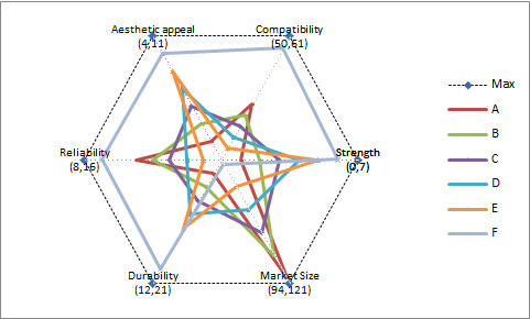
| Or, as in the
example shown on the right, 5 products, A, B, C, D, and E, are compared on 6
different attributes: Aesthetic Appeal, Compatibility, Strength,
Market Size, Durability, and Reliability. The custom radar chart
lets one easily compare all the products along each of the
dimensions on interest. Why
use an add-in when Excel itself has a Radar
chart capability? Essentially, it
plots all the
dimensions on a single scale rather than scaling each
dimension according to its own scale.
|
 |
The compressed (zipped) file
| Once the add-in is
installed, in Excel 2003 or earlier, use TM | Charting > Custom
Radar... |
|
| In Excel 2007 use TM |
Charting | Custom Radar |
 |
| This will bring up a form
where one specifies the varies elements needed to construct the
chart. Each of the items is explained in more detail
below. |
 |
|
The
add-in creates a chart in which
each dimension is plotted according to its own
scale. This allows a
meaningful comparison when the different dimensions
have differing measurement scales. For
example, in the diagnostic imaging example,
Report turnaround time might be measured in
hours, the No show rate in percent, and the
Time to appointment in days or weeks.
For our
product example, the table to the right shows how each
product measured along each dimension.
It is important to
lay out the data as shown. Each column represents
a particular attribute or dimension. Each row
represents one item (product, imaging center, etc.) |
|
In
addition, the add-in allows
user-specified parameters
for the minimum and maximum values for each
dimension. These are provided through two
ranges, one for the minimum values and the other for
the maximum values. |
|
Finally, the SCALING
option controls on whether the
different dimensions are normalized or not. If
SCALING is FALSE, the software creates a plot in
which each axis is scaled according to its own
min/max values (as specified in the table above).
This implies that the range of each axis
determines its visual importance, as shown on the
right |
|
On the
other hand, when
SCALING is TRUE, each axis is
independently
scaled to be
between 0
and 1. The result is on
the right |
|
The easiest way to add new rows or columns
(dimensions) is to delete the existing chart, add the relevant
data, and create a new chart.
|
|
|
Contrast this with
the default XL radar chart, which has only one axis
for the numerical data. Consequently, the
scale that XL uses must accommodate the largest
values. The result is that those attributes
with small values (such as Strength above) are
totally overwhelmed by the something like Market
Size |
 |
The only documentation currently available is
this webpage. In this version of the add-in, the Help button
on the TM Custom Radar form does nothing.
Discussion
Read what others are saying or
post your own comments or questions. |