The term waterfall chart means different things to people in different industries. Search www.google.com or www.yahoo.com for an extensive list. Two types commonly used in business analysis are charts that look like a vertical waterfall or a horizontal multi-stage waterfall. For more on the horizontal waterfall chart see the tutorial on floating bar charts and the Gantt Chart add-in.
Download the workbook used in this tutorial
A typical waterfall chart is shown in Figure 1. A somewhat modified version of the chart, leveraging Excel's capabilities to enhance the visual display of the chart, is shown in Figure 2. This tutorial explains how to create the latter chart. The example demonstrates one hypothetical financial statement of an organization -- the Cash Flow Statement for the year 2004 illustrated in Table 1.
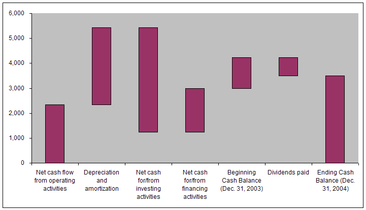
Figure 1
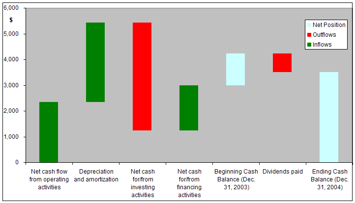
Figure 2
| B | C | |
| 2 | Waterfall Chart Example from Finance | |
| 3 | ||
| 4 | Amount | |
| 5 | Net cash flow from operating activities | 2,336 |
| 6 | Depreciation and amortization | 3,098 |
| 7 | Net cash for/from investing activities | (4,200) |
| 8 | Net cash for/from financing activities | 1,752 |
| 9 | Beginning Cash Balance (Dec. 31, 2003) | 1,248 |
| 10 | Dividends paid | (733) |
| 11 | Ending Cash Balance (Dec. 31, 2004) | 3,501 |
Before creating the waterfall for the data above, one must understand the three 'building blocks' that go into the creation of the desired chart. These building blocks are:
Typically, a stacked chart shows two series so that one series is plotted "as is" and the 2nd series is stacked on top of the first. Consider the example data in Table 2. The first data point of series 1 is 10 and the corresponding data point of the 2nd series is 8. So, Excel will show the first series as a bar from zero to 10, and the 2nd series as a bar from 10 to 18 (see Figure 3).
| 10 | 8 |
| 12 | 10 |
| 14 | 12 |
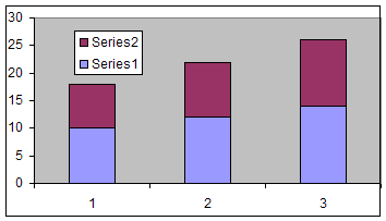
Figure 3
However, if the value in the 2nd series is negative as shown in Table 3, Excel does not start from the top of the first series and subtract the negative value, but it starts the bar for the data point for the 2nd series at zero as in Figure 4.
| 10 | -8 |
| 12 | 10 |
| 14 | 12 |
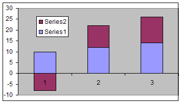
Figure
4
Consequently, if one wants to 'stack' the negative value such that it starts at the top of the first series and effectively subtracts from it, one must do some additional work. Note that to get Excel to stack two points one must plot only a positive value. So, we create a dummy series that has absolute values from the 2nd series. In addition, the value of the first series should be adjusted so that it is now the subtracted value itself. We do this with another dummy series.
| B | C | D | E | |
| 29 | 10 | -8 | 2 | 8 |
| 30 | 12 | 10 | 12 | 10 |
| 31 | 14 | 12 | 14 | 12 |
Cell D29 contains the formula =IF(C29<0,B29+C29,B29) and E29 =ABS(C29). D29:E29 is copied down to rows 30:31.
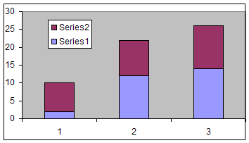
Figure 5
Given the stacked chart in Figures 5, the easiest way to create a floating effect is to make the first series transparent. Double-click the first (lower) plotted series, then in the Format Data Series dialog box, select the Patterns tab. In there, set the Border to None and the Area to None.
Also, select the legend. Pause, then select the legend entry for Series 1. Delete it with the Delete key.
The result should be as in Figure 6.
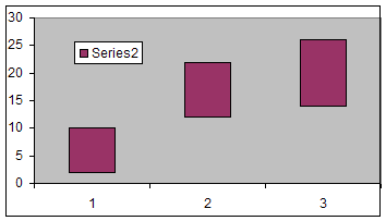
Figure 6
One can simulate a wide variety of conditional formatting of charts. In this case, we want to make it appear as though negative numbers are one color and positive numbers another. The easy way to do this is to create two series, one containing only those numbers that are positive, the other for the negative numbers. The example above becomes:
| B | C | D | E | F | |
| Series 1 | Series 2 | Modified Series 1 | Positive Series 2 values | Negative series 2 values | |
| 45 | 10 | -8 | 2 | #N/A | 8 |
| 46 | 12 | 10 | 12 | 10 | #N/A |
| 47 | 14 | 12 | 14 | 12 | #N/A |
The formula in E45 is =IF(C45>0,C45,NA()); that in F45 is =IF(ISNA(E45),ABS(C45),NA()). Copy E45:F45 down to rows 46:47.
Now, plot three series, those represented by columns D, E, and F. As above, format the first series (column D) to be transparent. Format the 2nd series (the positive values in column E) to have a Green area and no border. Next, format the last series (the negative values plotted as absolute quantities in column F) as red.
Also, as above, delete the extraneous legend entry.
The result should be as in Figure 7.
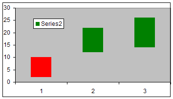
Figure 7
Given the financial data in Table 1 and the result in Figure 2, three things becomes apparent.
- Because at least one of the values is negative, the technique demonstrated in the 'negative values in a stacked chart' must be used.
- Given the floating nature of the bars, there is need for one dummy series to represent the transparent series as in the second building block above.
- Finally, because the result chart has three differently colored series, three additional series are needed -- one for positive cash flows, another for negative flows (though converted to positive values), and the third for the 'net position' values.
Putting it all together, the result is:
| B | C | D | E | F | G | |
| 2 | Waterfall Chart Example from Finance | |||||
| 3 | Columns for charting | |||||
| 4 | Amount | Dummy | Inflows | Outflows | Net Position | |
| 5 | Net cash flow from operating activities | 2,336 | 2,336 | |||
| 6 | Depreciation and amortization | 3,098 | 2,336 | 3,098 | ||
| 7 | Net cash for/from investing activities | (4,200) | 1,234 | 4,200 | ||
| 8 | Net cash for/from financing activities | 1,752 | 1,234 | 1,752 | ||
| 9 | Beginning Cash Balance (Dec. 31, 2003) | 1,248 | 2,986 | 1,248 | ||
| 10 | Dividends paid | (733) | 3,501 | 733 | ||
| 11 | Ending Cash Balance (Dec. 31, 2004) | 3,501 | 3,501 | |||
and the formulae in columns D through G are:
| Columns for charting | |||
| Dummy | Inflows | Outflows | Net Position |
| =IF(C5>=0,ABS(C5),"") | =IF(E5="",ABS(C5),"") | ||
| =IF(C6<0,SUM($C$5:C6),SUM($C$5:C5)) | =IF(C6>=0,ABS(C6),"") | =IF(E6="",ABS(C6),"") | |
| =IF(C7<0,SUM($C$5:C7),SUM($C$5:C6)) | =IF(C7>=0,ABS(C7),"") | =IF(E7="",ABS(C7),"") | |
| =IF(C8<0,SUM($C$5:C8),SUM($C$5:C7)) | =IF(C8>=0,ABS(C8),"") | =IF(E8="",ABS(C8),"") | |
| =IF(C9<0,SUM($C$5:C9),SUM($C$5:C8)) | =IF(C9>=0,ABS(C9),"") | ||
| =IF(C10<0,SUM($C$5:C10),SUM($C$5:C9)) | =IF(C10>=0,ABS(C10),"") | =IF(E10="",ABS(C10),"") | |
| =C11 |
Now, plot columns B, D:G. By default, column B will be the X (or category) values. Format the first plotted series (column D) as transparent, the 2nd (inflows in column E) as green, the third (outflows in column F) as red, and the last (net positions in column G) in light blue to get the result in Figure 2.

