Installing the TM Custom Radar add-in
A radar chart allows the comparison of different entities along multiple dimensions. Entities can be products, companies, people, or similar items. Dimensions are the attributes used for the comparison. One example might be a BI dashboard of the performance of a diagnostic imaging (radiology) center. The manager of the facility might want to compare her facility with the competition on dimensions such as Time To Appointment, Report Turnaround Time, No Show Rate, and Wait Time. Another example might be the comparison of several products on attributes such as strength, compatibility, aesthetic appeal, reliability, durability, and market size.
In such cases, it is common for the different attributes are measured using different scales. For example, strength might be on a scale of 0 to 10, durability on a scale of 0 to 30, and market size on a scale of 0 to 125. TM Radar Chart creates a radar chart that plots each attribute axis on its own scale. In addition, it has an option to normalize all the attributes resulting in a uniform radar chart.
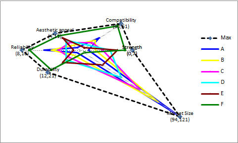
Figure 1 -- TM Custom Radar plots each attribute according to its own measurement scale.
The add-in also has an option to use its own colors as in this chart.
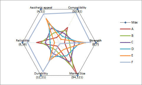
Figure 2 -- TM Custom Radar also
has an option to normalize all the attribute scales resulting in an uniform
plot. The add-in also has an option to create a chart that follows the
workbook theme as in this chart.
It turns out that Excel has a built-in radar chart. Unfortunately, this chart uses a single "value axis" to represent all the different attributes, which makes attribute points with smaller values clump together.
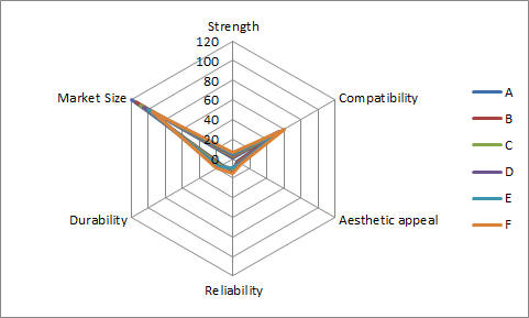
Figure 3 -- The
default Excel radar chart plots all the attributes on a single scale. This
makes the values of some attributes indistinguishable from one another.
Note that the self-installer version also installs an uninstall capability. To uninstall select scroll down to the entry.
If you chose to download the zip version, unzip the add-in file to a directory of your choice.
For installation instructions see common installation instructions. In Excel 2003 load the add-in. In Excel 2007, load the add-in.
In Excel 2007 or later, select tabgroup button.
Figure 4
In Excel 2003 or earlier, select select
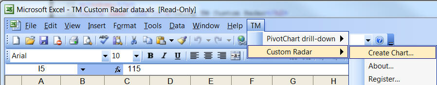
Figure 5
This will bring up the TM Custom Radar dialog box (Figure 6).
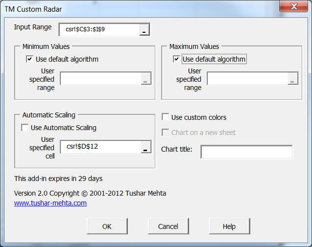
Figure 6
Input Range: The layout of the data should be as shown in Figure 7. The attributes are in columns (D through I in the example) and the individual entities are in rows (products A through F in cells C4:C9). The Input Range in the dialog box must include the attribute names and the entity names. So, in this example, the Input Range is C3:I9.
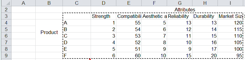
Figure 7
Minimum Values: Use the checkbox to let the add-in calculate the minimum values shown for each attribute. Alternatively, provide a range (with the same number of cells as the number of attributes) that contain the desired minimum values. See Figure 8.
Maximum Values: Use the checkbox to let the add-in calculate the maximum values shown for each attribute. Alternatively, provide a range (with the same number of cells as the number of attributes) that contain the desired maximum values. See Figure 8.
Automatic Scaling: Use the checkbox to enable automatic scaling. This causes each of the attributes to be independently scaled between 0 and 1. Alternatively, provide a single cell that will contain either TRUE or FALSE. See Figure 8.
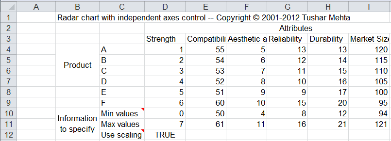
Figure 8
Use Custom Colors: Use this checkbox to have the add-in use its own color choices. If left unchecked, the radar chart will follow the workbook's theme.
Chart Title: Provide an optional title for the custom chart.
The add-in comes with a trial period. To continue using the add-in after this trial period, please register it from the add-in's web page. Also, see the About... and Register... buttons as shown in Figure 9 and Figure 10.
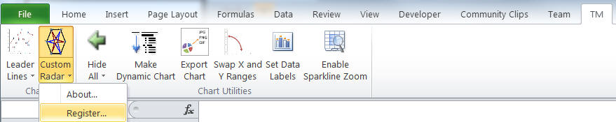
Figure 9
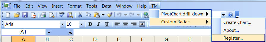
Figure 10
If you use formulas to compute dynamic ranges, the addition of this workspace has the potential of changing the results of some of those formulas.

