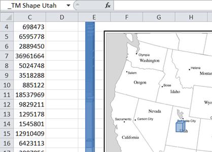
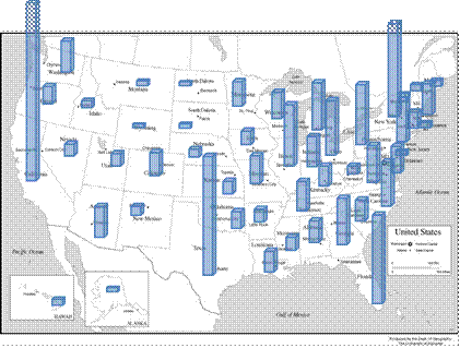
There are times when data are best visualized in a natural context. In the case of geopolitical data such as population related statistics for the 50 states of the United States, a map is the natural context. Suppose we want to see the population of the states as of the year 2009. One way is columns on a map as below.

Of course, a table of the data or a native Excel chart will often be more than enough. But, sometimes seeing information in a natural context conveys information that will otherwise be absent. For example, just a glance at the above shows that the Northern Rocky states (Montana, Wyoming, and the two Dakotas) have among the lowest populations.
We can also see that the states from Texas and to New England that have a large share of the population.
We may also want to see the change in population on a state by state basis (i.e., migration pattern), where the length of the column indicates the amount of change and the color indicates whether the change is an increase of a decrease in the population. We may also want to see the same on a percent basis. In the maps below, the one on the left shows the actual change in a state’s population while the one on the right shows the percentage change in population of each state. We notice one anomaly in the West with Colorado losing population while all of the rest of the MidWest, Rocky Mountain, and Western states saw population increases. Also, while on an absolute basis California and Texas saw large increases, on a percentage basis Utah, Arizona, and Louisiana saw far greater increases.
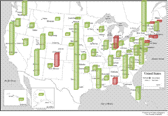
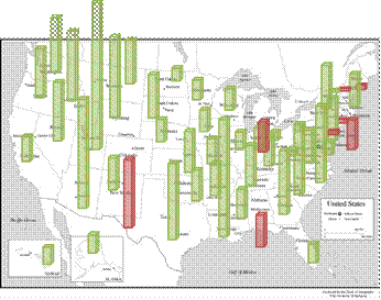
Change in state population from
2007 to 2008 Percent change in
state population from 2007 to 2008
The results above are individual shapes of appropriate size and color positioned to convey the desired visual effect. Because it is extremely difficult, if not impossible, for software to position objects correctly on an image or even ensure that they do not overlap, the solution relies on the consumer for a one time positioning of the individual bars.
The rest of this documents how to create the above solution.
Download the XLSX and the XLSM files in a single ZIP archive.
I used one created by the Department of Geography at the University of Alabama that I found at http://www.csgnetwork.com/usamapstcap.html. Put in in a worksheet.
The software can use either a single shape or 2 shapes that it will size as required.
 Option
1: Create a single shape and name it Shape
Template. Format it as desired. The software will use this shape
for all data points.
Option
1: Create a single shape and name it Shape
Template. Format it as desired. The software will use this shape
for all data points.
 Option
2: Create two shapes and name them Shape
Template Plus and Shape Template Minus. The software will use
the first one for positive data values and the second one for negative values.
Option
2: Create two shapes and name them Shape
Template Plus and Shape Template Minus. The software will use
the first one for positive data values and the second one for negative values.
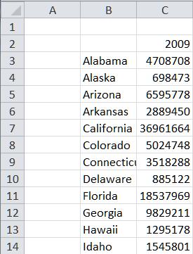
The data should be in 2 columns with the first column the category names and the second column the data column. These 2 columns do not have to be contiguous.
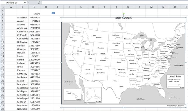
At this point, the worksheet should have the shape that the software will use and the map image. The data set does not have to be in the same worksheet, though in the example below it is.
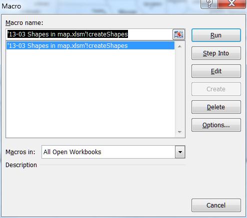
The code should be in a separate workbook, probably the one downloadeded from this webpage. Open this workbook and ensure that macros are enabled.
Use ALT+F8 to select and run the createShapes subroutine.
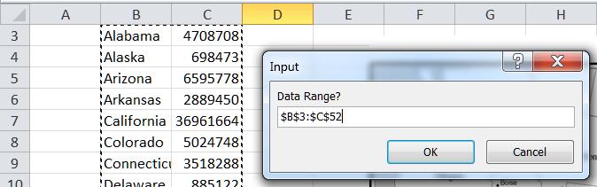
When the code asks for the data range to plot, select the 2 columns containing the category names and the data values. If the two columns are not adjacent make sure to select the category names first.
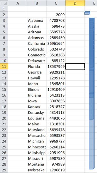
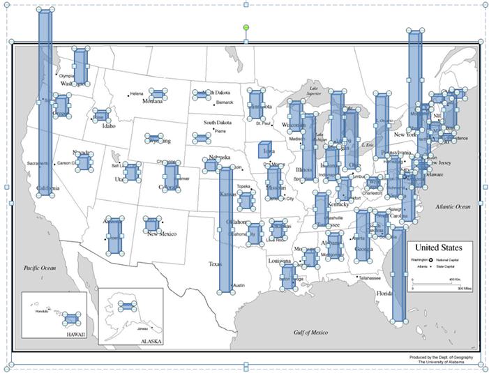
The first time that the subroutine is used for a particular map, it creates one shape for each data pair and stacks all of the shapes on top of one another. This height of each shape reflects the relative size of the data point (relative to the range of values being plotted).
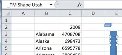
Select a shape and the Name Box will show the data point associated with that shape.
Move this shape to the appropriate location on the map image.
Do the same with every shape (other than the template shape or shapes). Adjust the locations of the shapes to achieve an acceptable visual display as in the example below.
The final step for this first-time use of the macro is to select all the shapes including the map image and group them to create a single group. While this is not strictly required, it is highly recommended.
In subsequent executions of the subroutine, the code will retain the position of each of the shapes as well as the grouping of the shapes, if any.
As mentioned in the introduction, the software works either with a single shape or with two shapes, one for positive values and another for negative values. When the software processes a new set of data, it creates new shapes from the appropriate template shape. Each of these new shapes replaces the corresponding existing shape. The new shape is always positioned so that its base is aligned with that of the old shape it is replacing. The base in this case is defined as the logical zero value, which is not necessarily the base of a shape as Excel understands it. The software manages the correct positioning of the new shape taking into account the sizes of the previous and the new shapes and the previous and new data values.
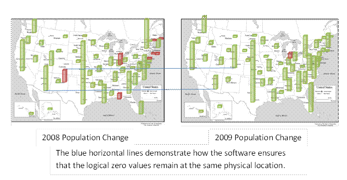
The example below demonstrates how this alignment works. The map on the left shows the population change from 2007 to 2008 and the one on the right from 2008 to 2009. In the former, Colorado had a net negative change while Arizona had a positive change. In the latter, both states had positive changes. The two horizontal blue lines show how the logical zero values remain at the same physical location in the map.