Unzip the downloaded file and extract the XLSX and the XLS files to the folder of your choice and open in Excel
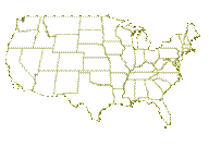
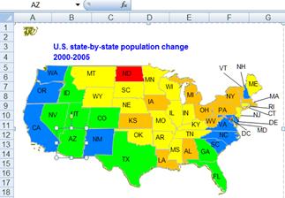
Too often a dashboard is a series of charts and tables presented in a grid format. Yet, there are instances when the “natural context” for that information is not a chart or a grid but some other visual display. A classic example is a geographic map. Information about countries or states or counties or cities is often best visualized in the context of a map. For example, consider the two images of the change in the U.S. population first from 1990 to 2000 and then from 2000 to 2005. Can there possibly be a better way to visualize the trend in national demographics than the two images below? It shows that almost all the states are increasing in population but those in the south and the west are doing so at a much faster clip than those in the Mid-West and the North-East and the three states just above the Gulf of Mexico. Note that while I use a map to illustrate how to implement conditional colors of shapes, the technique itself applies to any set of shapes.
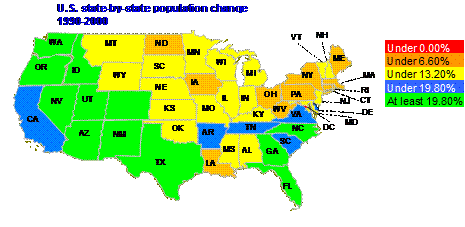
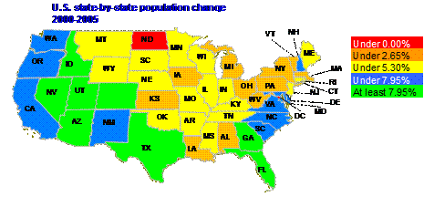
The above maps were created in MS Excel. Yes, that’s right, Excel. And, the transformation from one to the other was the result of a single drop down box!
 |
|
In addition, since the solution uses shapes and not Excel objects, the Excel 2003 (or earlier) limit of a 56 color palette does not apply to this solution.
The rest of this article describes the various steps needed to implement the above, which, essentially, is the ability to implement conditionally colored shapes. The final sections discuss the limitations of this approach and summarize the tip.
Clyde H, serving in the U.S. military, on Dec 12, 2011:
This is along the lines of what I was trying to research. Too bad it cannot be done without using VBA. However, the example does not appear to work and has a broken link for a (Ribbon UI).xlam
There are several pieces that must come together before one can pull off the above:
1) Create the desired graphic using as many shapes as needed. In the example of the U.S. mainland map there are 49 individual freeform shapes (from the Drawing toolbar), each of which is shaped like and represents a specific state. These shapes can optionally be named something other than the default name Excel picks, which is Freeform {n}, where n is a number assigned by Excel. In the example, the shapes for Arizona and Nevada are renamed AZ and NV respectively. All the other names are the default names.
2) Create a table that connects the names of the shapes to names relevant to the data being plotted. Name this table MapNameToShape. In the example, this is a table of state abbreviations and shape names. While a simple range name would be adequate, in the example I used a named formula that adjusts to new data.
|
MapNameToShape |
=OFFSET(Sheet1!$P$5,0,0,COUNTA(Sheet1!$P:$P)-1,2) |
|
|
|
Ideally, the scope of this name, as of all the other names in this solution, should be the worksheet containing the range.
3) Create a table that links the item identifiers from the above table to the data values to plot. Name this table MapNameToValue. In the example, I used a simple range
|
MapNameToValue |
=Sheet1!$D$25:$E$76 |
We will look at how the data change in a minute.
4) Create a table that defines how the values map to shape colors. Name this table MapValueToColor. In the example, I used a named formula to identify a dynamic range.
|
MapValueToColor |
=OFFSET(Sheet1!$K$6,0,0,COUNTA(Sheet1!$K:$K)+1-2,2) |
5) Establish one criterion that identifies this worksheet as having shapes subject to conditional colors. This is as simple as naming a cell – any cell – as ConditionalShapeColor. In the example, I named cell I1.
|
ConditionalShapeColor |
=Sheet1!$I$1 |
6) Add the code that uses the information provided in steps 1 through 5 to manage the colors of the shapes. By using the above approach, the code is very generic and contains nothing specific to any particular solution. All of the definitions are in the tables and cells identified above. Hence, one need know no programming to use or modify this technique.
This would typically be done through the objects on the Drawing toolbar. The final image should consist of individual shapes where each shape can be colored separately.
|
For the map example, it made sense to start with an outline map of the US and add one freeform shape for each state customized to look like the state boundary (For the ribbon versions of Excel: Insert tab | Shapes dropdown | Lines section | Freeform object; For the menu versions of Excel: Drawing toolbar | AutoShapes | Lines > Freeform). Format the shapes as desired. In the example, the line color was set to grey. For the tightly intertwined boundaries of West Virginia, Virginia, Maryland, and the District of Columbia reduce the line width to 0.25 pt and simply eliminate the line for DC itself. |
|
Each state name is a textbox from the Shapes dropdown (or the Drawing toolbar). For those states where the name does not fit inside the state boundary, use a connector (Insert tab | Shapes dropdown | Lines section | Straight Arrow connector or for the menu system: Drawing toolbar | AutoShapes | Connectors > Straight Arrow Connector) to link the shape to the name. Enter the desired name in each textbox. The example uses the commonly used 2 letter abbreviations of U.S. states.
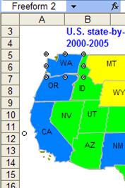
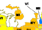
Group the name and shape for each state (and optionally the connector) together (select the 2 or 3 shapes as appropriate, right click and from the context menu select Group > Group). The net result: 49 grouped objects (one for each of the 48 mainland states and one for the District of Columbia) and, of course, the outline. In the image fragment below, the shapes and labels associated with both Michigan and Vermont and the connector associated with the latter were moved off-kilter to show the individual groups. A view of the outline map can be seen underneath the colored shapes.
Next, associate the freeform shapes of step 1 with names that make sense to the application data. In this case, since the data are for the individual states, it makes sense to use the names of the states. Again, use the common 2 letter abbreviations for the state names.
|
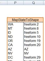
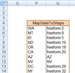
In some out-of-the-way columns (in the example that happens to be columns P and Q), enter all the state names and the associated shape name. |
|
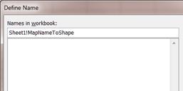
To find the shape name, select the grouped object, pause and then select the shape itself. For example, Washington corresponds to Freeform 2. Name this range (i.e., the cells in P:Q that
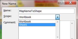
contain the relationship) as MapNameToShape with Formula tab | Name Manager button or Insert | Name > Define… To have the
name automatically adjust to changes in the table, in the Define Name dialog
box, in the Refers To field, enter the formula |
|
|
As mentioned in the concepts section above, all the names in this solution should have the worksheet as their scope. In Excel 2007 or later, specify the scope in the New Name dialog box with the Scope dropdown.
|
|
|
In Excel 2003 or earlier specify the scope by appending the worksheet name to the name
|
|
|
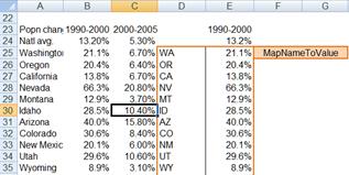
The data can be organized anywhere in the worksheet. For convenience, and because the format suited this particular example, the data for the states were in three columns: A, B, and C. A contains the state name, B the population change from 1990 to 2000 and C the change from 2000 to 2005. |
|
In Column D enter the commonly used 2 letter codes for the state. These should be the same codes used in step 2 above.
|
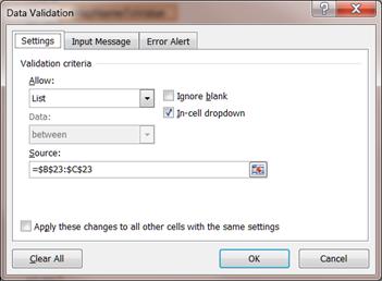
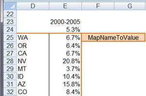
Column E contains the data selected for display (the values from either column B or column C). Cell E23 has a data validation list to select one of the two columns. An out-of-the-way cell (M24) identified the selected column with the formula =MATCH($D$23,$B$23:$C$23,0)
|
|
Cells E24 on down contain the data corresponding to the selected column. E24 has the formula =INDEX(B24:C24,1,$M$24). Copy E24 as far down column E as there are data in column A.
|
Finally, name the range D25:E76 as MapNameToValue (Formula tab | Defined Names group | Name Manager button or the menu item Insert | Name > Define…). |
|
|
|
MapNameToValue |
=Sheet1!$D$25:$E$76 |
|
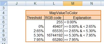
The next step is to identify the colors that correspond to the values in the various cells. Create a table that contains this information. Note the somewhat unusual structure. The first column, which contains the threshold values, has one fewer entries than the second column, which contains the RGB color codes. Column 1 starts in the 2nd row of the table while column 2 starts in the first row. This is because of how the data in the table are used. The third column contains an explanation of how the values are used.
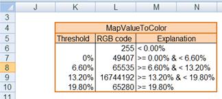
This table can be located anywhere but it must be named MapValueToColor. It can be made to dynamically adjust to changing data. In the Map example, the name refers to the formula =OFFSET(Sheet1!$K$6,0,0,COUNTA(Sheet1!$K:$K)+1-2,2) The +1 compensates for the missing item in row 1 of column 1 of the table and the -2 accounts for the 2 header cells.
Also, the threshold values in the first column of the table can be static or they can change from one data set to the next. In the Map example they do change depending on which data set is plotted. Since the 2 data sets (columns B and C) are sufficiently different, the threshold values are linked to the national average. The thresholds are 0%, half the national average, the national average, and 1-1/2 times the national average.
The software also implements a new user defined function called VBA_RGB. This allows the spreadsheet user to define colors with exact RGB values. For example, the color for values under 0% is RGB(255,0,0) or red. Consequently, cell L6 contains the formula =VBA_RGB(255,0,0). The color for values between 5.3% and 7.95% is light blue. Hence, cell L9 contains the formula =VBA_RGB(0,127,255).
To improve performance, we should ensure that the code runs only for those worksheets that contain conditionally colored shapes. To identify that a particular worksheet does contain such a shape, name a cell – any cell – in the worksheet as ConditionalShapeColor. In the example I named cell I1.
|
ConditionalShapeColor |
=Sheet1!$I$1 |
The final piece is to add the code. After adding the code below, run the ConditionalColorShapes subroutine to enable (or disable) the code.
In a class module named clsApp add the code:
Option Explicit
Dim WithEvents myApp As Application
Private Sub Class_Initialize()
Set myApp = Application
End Sub
Private Sub Class_Terminate()
Set myApp = Nothing
End Sub
Private Sub myApp_SheetCalculate(ByVal Sh As Object)
Dim CondShapeColor As Range
On Error Resume Next
Set CondShapeColor = Sh.Range("ConditionalShapeColor")
On Error GoTo 0
If CondShapeColor Is Nothing Then Exit Sub
Dim aCell As Range
On Error GoTo XIT
For Each aCell In Sh.Range("MapNameToValue").Columns(1).Cells
CheckColor Sh, aCell
Next aCell
XIT:
End Sub
Private Sub myApp_SheetChange(ByVal Sh As Object, ByVal Target As Range)
Dim CondShapeColor As Range
On Error Resume Next
Set CondShapeColor = Sh.Range("ConditionalShapeColor")
On Error GoTo 0
If CondShapeColor Is Nothing Then Exit Sub
Dim aCell As Range
For Each aCell In Target
CheckColor Sh, aCell
Next aCell
End Sub
In a standard module, add the following:
Option Explicit
Dim myApp As clsApp
Public Sub ConditionalColorShapes()
If myApp Is Nothing Then Set myApp = New clsApp _
Else Set myApp = Nothing
MsgBox "Conditional color of shapes " _
& IIf(myApp Is Nothing, "disabled", "enabled")
End Sub
Sub CheckColor(aWS As Worksheet, aCell As Range)
Dim aShp As Shape, TargCell As Range
Dim CellFound As Range
On Error Resume Next
Set CellFound = _
Application.Intersect(aWS.Range("MapNameToValue").Columns(1), _
aCell)
If CellFound Is Nothing Then
Set CellFound = _
Application.Intersect(aWS.Range("MapNameToValue").Columns(2), _
aCell)
If Not CellFound Is Nothing Then _
Set CellFound = CellFound.Offset(0, -1)
End If
On Error GoTo 0
If CellFound Is Nothing Then Exit Sub
Dim TargVal As Range
Set TargVal = CellFound.Offset(0, 1)
On Error GoTo Catch1
Set TargCell = aWS.Range("MapNameToShape").Columns(1).Find( _
CellFound.Value, LookAt:=xlWhole, LookIn:=xlValues)
Set aShp = aWS.Shapes(TargCell.Offset(0, 1).Value)
GoTo Finally1
Catch1:
If TargCell Is Nothing Then Exit Sub
Set aShp = searchAShapeRange( _
TargCell.Offset(0, 1).Value, aWS.Shapes)
If aShp Is Nothing Then Exit Sub
Resume Finally1
Finally1:
On Error GoTo 0
Dim ColorCode As Long
On Error GoTo XIT
If TargVal.Value < aWS.Range("MapValueToColor").Cells(2, 1).Value Then
ColorCode = aWS.Range("MapValueToColor").Cells(1, 2).Value
Else
ColorCode = Application.WorksheetFunction.VLookup( _
TargVal.Value, aWS.Range("MapValueToColor"), 2, True)
End If
aShp.Fill.ForeColor.RGB = ColorCode
XIT:
End Sub
Public Function VBA_RGB(R As Byte, G As Byte, B As Byte) As Long
VBA_RGB = RGB(R, G, B)
End Function
Function searchAShapeRange(ByVal ShapeName As String, ByVal Shapes As Object)
Dim ReturnedShape As Shape, aShape As Shape
For Each aShape In Shapes
Set ReturnedShape = findEmbeddedShape(ShapeName, aShape)
If Not ReturnedShape Is Nothing Then _
Set searchAShapeRange = ReturnedShape: Exit Function
Next aShape
End Function
Function findEmbeddedShape(ByVal ShapeName As String, _
ByVal ParentShape As Shape) As Shape
Dim aShape As Shape, ReturnedShape As Shape
Dim EmbeddedShapes As GroupShapes
If ParentShape.Name = ShapeName Then _
Set findEmbeddedShape = ParentShape: Exit Function
On Error Resume Next
Set EmbeddedShapes = ParentShape.GroupItems
On Error GoTo 0
If EmbeddedShapes Is Nothing Then Exit Function
Set findEmbeddedShape = searchAShapeRange(ShapeName, EmbeddedShapes)
End Function
First, I am a strong proponent of separating code and data. Ideally, the code presented in Step 6 above would be in an add-in. It is already structured to be part of an add-in. However, including instructions on creating an add-in is outside the scope of this tip.
Second, as currently implemented, one cannot have multiple sets of shapes each with its own set of conditional colors on the same worksheet.
This tip demonstrates a very effective way of visually displaying information using a graphic image that is the most appropriate to the subject at hand. At its core, the idea is to establish two linkages. The first establishes a link between a specific worksheet cell and a specific shape. The second establishes a link between the possible values in the cell and the corresponding color used to color the shape. The rest, as the cliché goes, is only details. Of course, this tip goes through the details in detail and includes a functioning example.
I don’t believe I have seen any example of conditionally colored shapes. That, of course, does not mean they do not exist. Just that I haven’t seen any.