When looking at many rows of data it really helps if the data are visually delineated in some way. Since most data are shown in tabular form, it is the rows that expand as we add more data. Consequently, it helps if the rows are delineated in some fashion. It can be a very mechanical approach where every other row has a slightly different background color
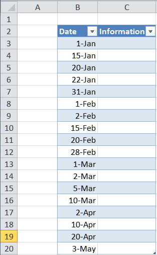
Figure 1
It is possible to change the default color of the bands, just as it is possible to have the bands work with hidden rows as in Figure 2.
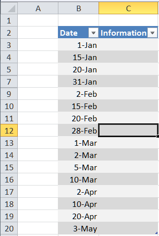
Figure 2
It is also possible to make the bands contextually relevant with the color bands being a function of the data in the table. For example, in Figure 3 the row color changes with the months.
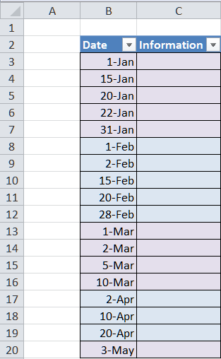
Figure 3
It’s further possible to have something finer in that not only are the months shaded differently, but the data within each month are also visually separated with, say, alternating bands as in Figure 4. This allows for visual segmentation of large amounts of data on multiple nested criteria.
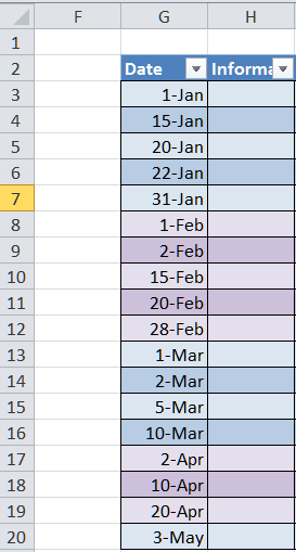
Figure 4
The rest of this note explains how to accomplish the features of Figure 1 and Figure 2 with the use of a Excel Table. Content contextual banding (Figure 3 and Figure 4), will have to wait for a later time.
In Excel 2007 or later when one converts a data range to a table, Excel automatically formats the table with alternating colors for each row. Tables have a lot of capabilities and are worth investigating in their own right. To convert a data range to a table, select any cell in the range, then click Insert tab | Tables group | Table button.
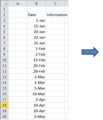
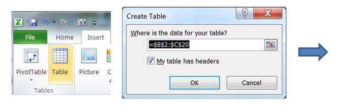
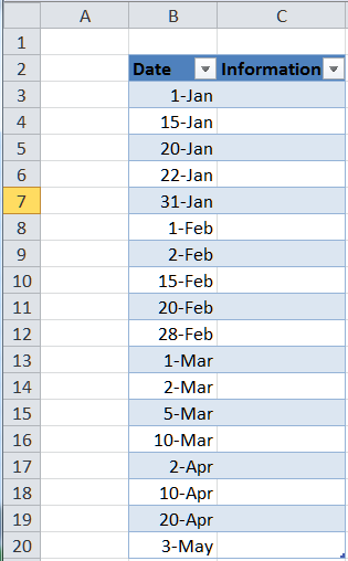
Figure 5
An Excel list supports a variety of format capabilities including several built-in color schemes as well as the ability to create customized band colors. There is a fairly rich feature set that includes banding by row, banding by column, customizable band width, first and last row or column color.
To start select any cell in a table then Table Tools contextual ribbon | Design tab.
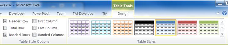
Figure 6
Select any design in the top row of Table Styles or click the down arrow for more selections or to create a new one with the New Table Style… button.
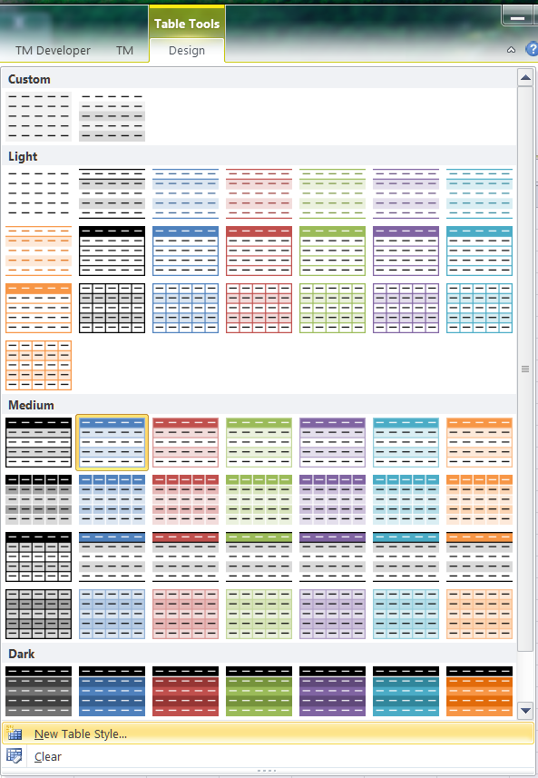
Figure 7
This brings up the New Table Quick Style dialog box. Select a table element and click the Format button to format that element.
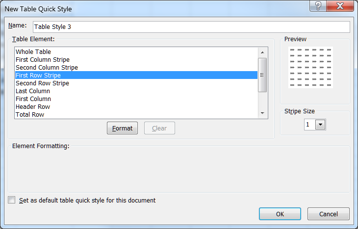
Figure 8
For example, to create the two shades of gray used in Figure 2, change the fill for each of First Row Stripe and Second Row Stripe.
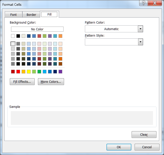
Figure 9
Hide a row and the color bands adjust automatically. In Figure 2, rows 6 and 8 are hidden but there is a seamless continuity in the alternating pattern.
A major limitation with the use of the built-in capability is that the formatting cannot be content contextual. So, the layout in Figure 3 and Figure 4 are not possible with just the Excel Table format capabilities.

