Note that the self-installer version also installs an uninstall capability. To uninstall select scroll down to the entry.
If you chose to download the zip version, unzip the add-in file to a directory of your choice.
For installation instructions see common installation instructions. In Excel 2003 load the add-in. In Excel 2007, load the add-in.
In Excel 2007 or later, the TM Chart Utilities functions are in the of the ribbon...
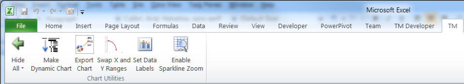
and in the
This feature converts a regular chart into a dynamic chart, i.e., one that automatically plots new data added to the plotted range. The code adjusts to data in columns or in rows and it also factors in any header cells in the data column (or row). It also works when the X values include multiple columns.
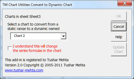
Click the Make Dynamic Chart button to bring up the corresponding dialog box. If a chart is already selected, it will show up in the chart selection drop down. Use the drop down to select the chart to be made dynamic.
Since the software must change the formulas used in the chart, there is a checkbox to approve the change.
Below are a few examples of the software in action.
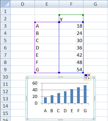
1) Consider the data set and the corresponding chart
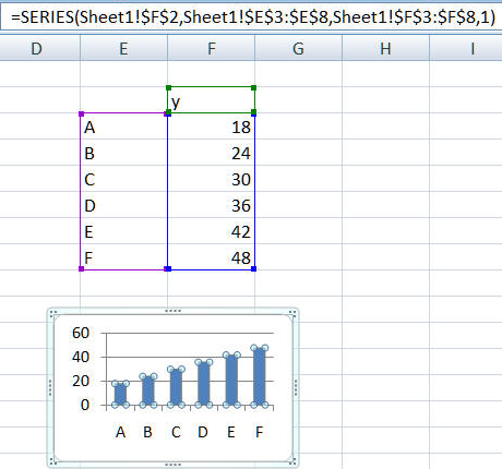
After conversion to a dynamic chart, the chart series uses software generated named formula.
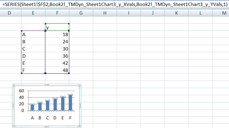
Now, the chart will automatically adjust to new data, for example in E9:F9:
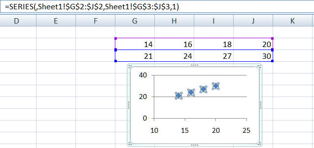
2) The data can also be in rows. In this example, neither the X nor the Y range has a header.
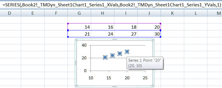
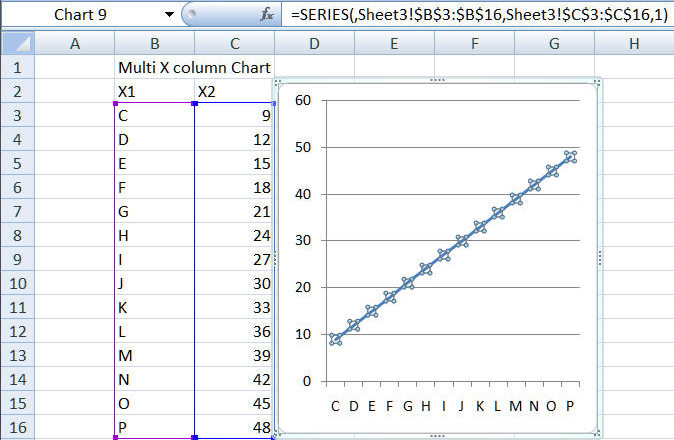
3) The X values can be in multiple columns and can have more than 1 header row.
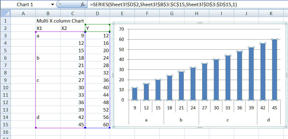
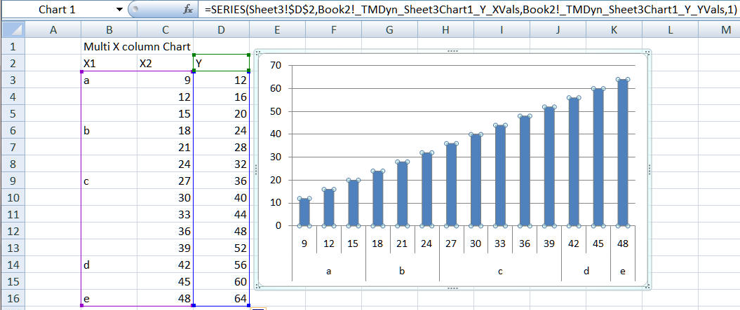
After conversion to a dynamic chart, the chart will automatically pick up new data, say in row 16.
The software analyzes the structure of the existing data to decide how many cells in a column (or row) to ignore. However, it cannot anticipate subsequent changes. So, once the chart is converted to a dynamic chart, do not change the headers of any of the charted ranges.
This function of TM Chart Utilities allows one to export a chart as an image file. Select the chart of interest, the image type, and the output file name.
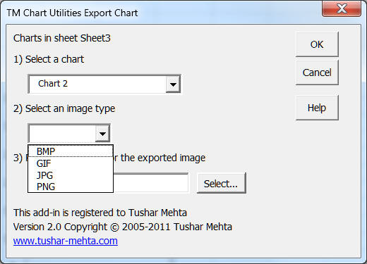
The add-in shows only those image types that the currently running version of Excel supports. In the example above, Excel 2010 could export in any of four file types.
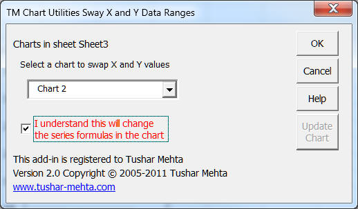
This feature lets one swap the X and Y ranges used in the chart. Obviously, it should be used only for those kinds of charts where both the X and Y axes contain numeric values.
For an example, consider graphing the efficient frontier of a financial portfolio consisting of 2 assets. The assets, A, and B have the following expected returns, standard deviation (a measure of risk), and correlation:
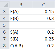
From this one can calculate the portfolio's expected return and standard deviation:
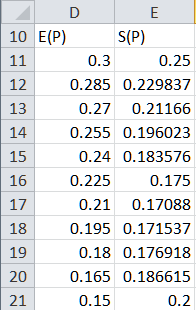
By default Excel will plot this with the expected return on the x axis and the standard deviation on the y axis.
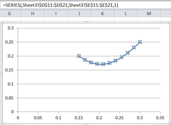
To see the efficient frontier in the more typical view with the expected return on the Y axis and the standard deviation on the X axis, use the add-in's 'Swap X and Y Ranges' button to get:
Note that the software will not stop one from swapping X and y ranges when the original x values are non-numeric. However, the result may not be meaningful until one enters numeric values in the original X range. For example, consider the following chart.
After swapping the X and Y ranges, the result looks like:
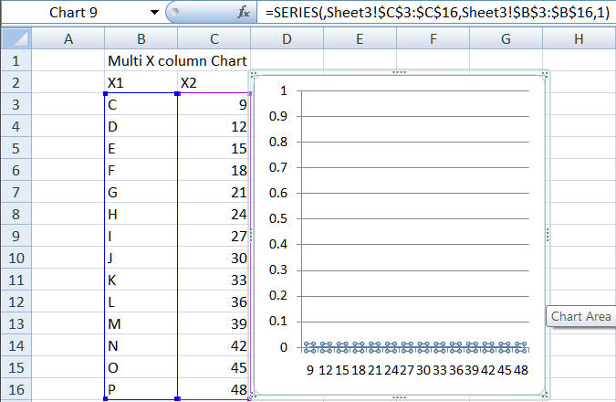
If this was a mistake, reverse the change by using the feature again. Or, replace the text values with numeric values to get a meaningful chart.
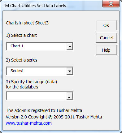
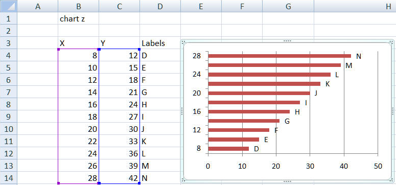
By default, a data label can refer to the series name, the x value, and/or the y value. While it is possible to use some other cell as the data label it cannot be done through the Excel user interface (UI). The function of lets one specify a range other than the x or y values as the source for the data labels.
Consider the data set and the associated bar chart shown below.
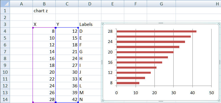
Using the native Excel UI there is no easy way to use column D as the data label source. The function of the allows one to do that through the below dialog box.
This feature may not work smoothly in Excel 2003 since some of the finer control over the chart object became available only after Excel 2003.
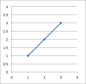
When Excel creates a chart, the physical size of the chart is independent of the values of the data plotted. So, even if one were to plot identical x and y values, as on the left below, the visual effect fails to convey the information that we are plotting a line that should be at 45 degrees to the horizontal. While both the axes show the same range of values, the horizontal dimension is much longer than the vertical one. To get the correct visual effect, as on the right below, the horizontal and vertical sizes should be the same.
To display the data in the same proportion as the plotted values, one must adjust what Excel calls the "inside plotarea." Unfortunately, there's no direct way to do that. When one changes the plotarea, Excel automatically computes the "inside plotarea." Consequently, one must deploy an iterative method to achieve the desired ratios.

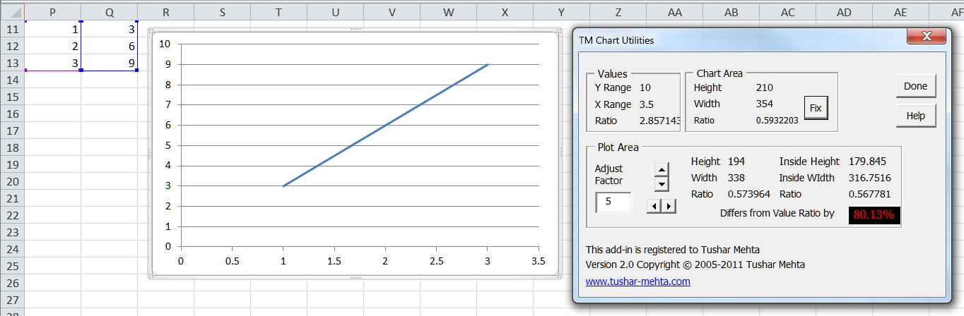
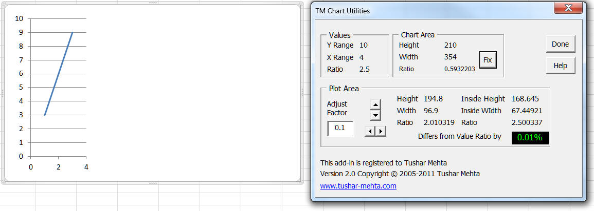
Similarly, if we look at the data set below, the Y range is larger than the X values by a factor of 2.86 . Yet, the physical size of the chart shows a larger x range!
To start the process of making the physical size match the values shown, start by clicking the . The resulting dialog box, shown on the right in the image below, shows that the ratio of the values is 2.857 (rounded to 3 decimal places) whereas the ratio of the inside plotarea dimensions is 0.568. The difference between the two is a whopping 80%!
While the dialog box shows a lot of information, the one key item is the number in the black box. It is the difference between two important ratios and the goal is to make this number as close to zero as possible. The two important ratios are: (1) the ratio of the Y Range to the X Range, and (2) the ratio of the Inside Height to the Inside Width.
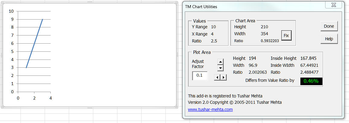
Use the left-right and up-down arrows to adjust the plot area to get the desired visual effect. For the physical chart to show the same ratio as the range of values shown, the difference should be zero (or as close to zero as possible).
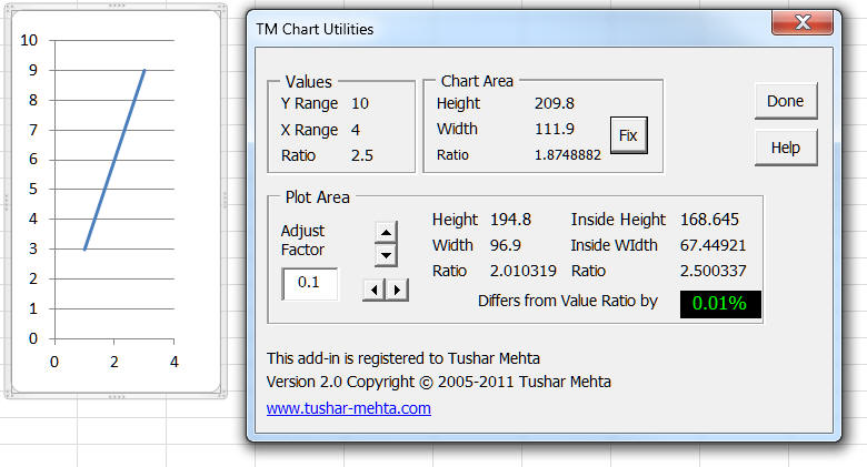
Use the arrow buttons to adjust the dimensions of the plotarea so that the ratio of the physical dimension matches the ratio of the plotted values. By reducing the horizontal size, the best one can accomplish is a difference of 0.46%.
Further tweaking of the height and the width reduces the difference to 0.01%.
Finally, click the Fix button to reduce the chart area while keeping the plot area unchanged.
A sparkline, introduced with Excel 2007, creates a chart in a very small space, i.e., a single cell. While this is a great way to visualize data in a small amount of space, by its very nature it compromises on showing subtleties in the data. The add-in lets one view in a regular chart the same data as in the sparkline of the active cell. To enable this feature click the button. Enabling the Auto Zoom capability results in the button label changing to 'Disable Sparkline Zoom.' Now, with the Zoom enabled, select a cell with a sparkline in it and the add-in will show the same data in a regular chart, named SparklineBigSis.
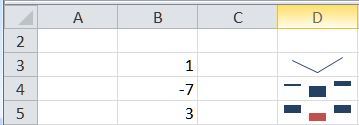
Below is an example. It plots the same data set in three sparklines (D3:D5). Select any of those cells to see the data in a regular chart using the same kind of plot. [For a Win/Loss Sparkline, the regular chart type is a Column Chart.]
After enabling The Sparkline Zoom feature, click in D3 to see
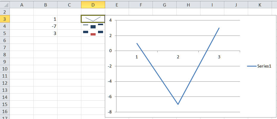
The add-in shows the data using the same chart type as the sparkline -- a Win/Loss Sparkline is a 100% Column Chart.
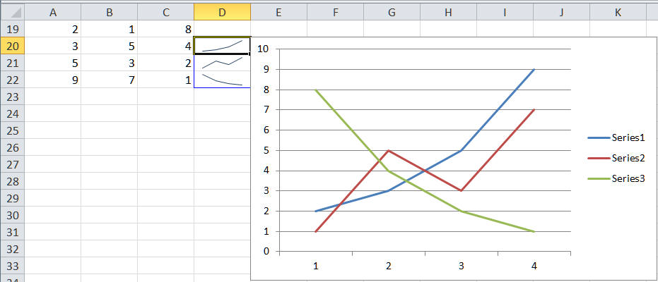
If one creates a sparkline group, clicking in any cell containing a sparkline from that group results in a single chart showing all the series in the group. In the example below, the data in A19:C22 are shown in a single sparkline group in D20:D22. Click in any of the sparkline cells to see the BigSis chart.
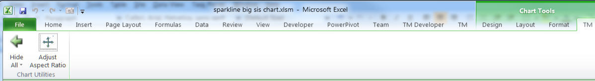
Once the add-in creates a BigSis Chart, one can change the dimensions to suit oneself. This works because the add-in does not delete the BigSis chart. Instead, it simply hides / shows the chart as required.
Contact the author through his website www.tushar-mehta.com.

