One overlooked capability is the ability to format Excel worksheet cells so that the final result is that they convey information visually rather than through numbers. There are many applications of this technique such as creating a Gantt chart, or managing conditional formatting for more than 3 conditions.
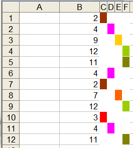
Starting with Excel 2007, Microsoft made several improvements to its implementation of conditional formatting. One of these improvements was to relax the limit of 3 on the number of conditional formats specified for a cell. This means that all the color conditions can be specified in a single cell rather than requiring N/3 cells for N conditions (the example below uses 4 cells for 12 conditions).
In Excel 2003 and earlier, conditional formatting works well for up to three conditions.
But even when the number of conditions exceeds that limit, it is possible to do
without any programming support. For example, one possible
way to show twelve possible rankings through color is shown in Figure 1.
Figure 1
From Dan on March 3, 2013:
I rated this page a 7 because I could not follow along with how to create cells with 12 conditions. I only need to use 4 conditions however, all the solutions I have found will not work with cell containing formulas. Your solution had promise however, I could not follow along. Could you please post and example of a spreadsheet. I would be so grateful.
The effect requires no programming and relies on just a set of conditional formats.
To get going, set the column width for columns C:F to 1.
Set up Cell C1 (Format | Conditional Formatting...)
as shown in Figure 2. In the
formula specified, note the use of
both
a relative-absolute address for cell B1 and the
change in the constant (it increments by one in each subsequent
condition). Also, the color of the cell's pattern is
different for each condition (click on the Format... button).
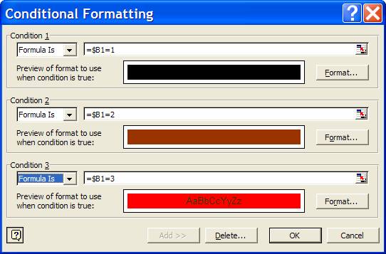
Figure 2
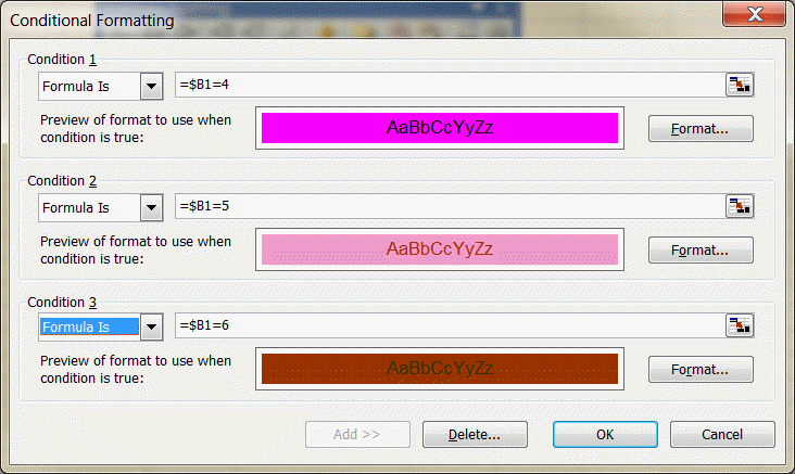
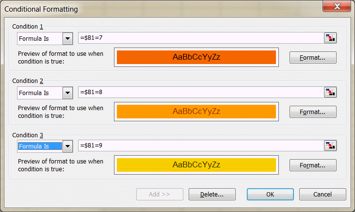
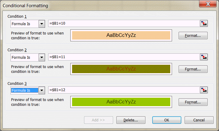
Now, copy C1:F1 down to rows 2:12.
As the values in B1:B12 change so do the colors of the cells in columns C:F.