Keywords: chart show some few selected select limit limited marker data label datalabel
| When plotting a lot of data,
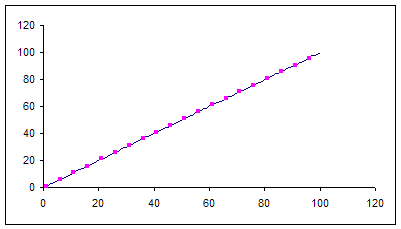
one might want to show a data marker only every so many points
as shown in Figure 1, which contains a plot of 100 data points
but only every 5th one has a marker. Similarly, it is
possible that one wants to show a data label only every so many points.
|
|
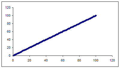
| The reason for doing so
might range from aesthetics to necessity. If plotting a
large number of points, it might be necessary to do something
other than use the Excel
default of showing a marker for every point since this might make the
chart indecipherable. As shown in Figure 2, all the data
markers run into each other and make the chart hard to read.
|
|
Below are three ways to create the chart in Figure 1.
Use a named formula that that doesn't include any #N/As
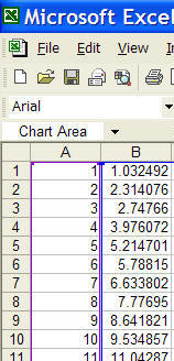
Figure 4
The data for this tutorial includes the numbers 1 through 100 in cells A1:A100 and the same numbers adjusted by a random factor in cells B1:B100. Column A contains the x--values in the XY Scatter chart and column B the y-values. A sample of the data set is shown in Figure 4.
The aim of the tutorial is to show a marker for every fifth data point, starting with the first point. Effectively, the chart will have markers for the first data point, the sixth point, the 11th, 16th, etc., all the way up to the 96th.
Since Excel doesn't interpolates over any cell that contains a #N/A, create a second data set from the first set of y-values such that a non-NA is found after only every-so-many cells. In C1, enter the formula =IF(MOD(ROW(),5)=1,B1,NA()) Copy C1 down to all cells up to C100. The 5 in the formula means that every fifth cell in column C will contain a real value.
Now, plot A1:C100. Make sure it is a XY Scatter chart and that column A represents the x values. Format the first series (corresponding to column B) to show a line but no markers, and the second series (corresponding to column C) to have no line but an appropriately sized marker. [To format a series, double-click it and then in the resulting dialog box select the Patterns tab.]
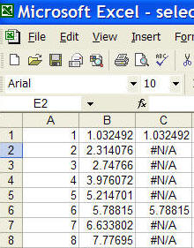
Figure 5
To avoid showing a column largely filled with #N/As, use a named formula. From Insert | Name > Define... create a new name, say SomeCells and set the 'Refers To' field to =IF(MOD(ROW(Sheet1!$B$1:$B$100),5)=1,Sheet1!$B$1:$B$100,NA())
Next, create a XY Scatter chart with the data in columns A and B. Now, plot a new series so that the y-values are this name. For more on how to use a name in a chart see this tutorial. The result should look like on the right.
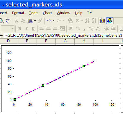
Figure 6
Using a separate column (or a named formula that provides the same functionality) is one way to go. However, it is possible to create a data set with only the non-#N/A values. This named formula is much more complex, and it requires the use of a complementary named formula for the x-values.
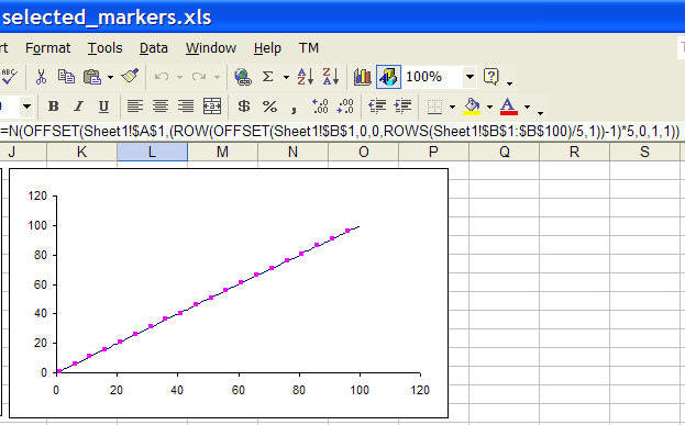
| Create two named formulas (Insert | Name
> Define...). The first, called
NoGapCells is =N(OFFSET(Sheet1!$B$1,(ROW(OFFSET(Sheet1!$B$1,0,0,ROWS(Sheet1!$B$1:$B$100)/5,1))-1)*5,0,1,1)), and the second, named NoGapXVals,
is =N(OFFSET(Sheet1!$A$1,(ROW(OFFSET(Sheet1!$B$1,0,0,ROWS(Sheet1!$B$1:$B$100)/5,1))-1)*5,0,1,1)) Next, create a XY Scatter chart with the data in columns A and B. Now, add a new series where the x-values and y-values are specified by the names NoGapXVals and NoGapCells, respectively. The resulting chart is shown in Figure 7.
|
|