Deependra S on June 20, 2012:
Brilliant
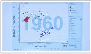
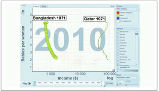
This post was inspired by Hans Rosling’s TED presentation on Religion and Babies (http://www.ted.com/talks/hans_rosling_religions_and_babies.html). He is absolutely great at engaging the viewer with his ability to bring data to life.
One of the things he did in his presentation (see Figure 1 and Figure 2) was show the equivalent of an Excel bubble chart. He showed how different countries measured over the years. He also created a trail showing how a country progressed over time.
|
Figure 1 – A graphical representation of different countries in a particular year. |
Figure 2 – How two countries progressed through time. |
I decided to do the same with an Excel bubble chart – and implement both capabilities, i.e., the time snapshot and the time trail tracing the path, without any VBA code! While I implemented the solution in Excel 2010, it should work with Excel 2007 and also Excel 2003, though in all fairness, I haven't verified the older versions.
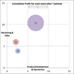
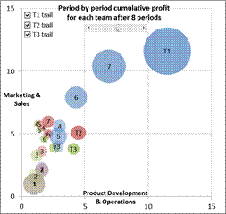
The example I used was data from one of a series of seminars I had taught to healthcare executives. They participated, in teams, in a real-time, interactive, web-based simulation. In the simulation each team made decisions about how much of their limited resources to invest in (1) product development and operations and (2) marketing and sales. Their profitability depended both on their own decision and also their competitors. The simulation typically lasted 10 to 12 periods. The result of the work is in Figure 3 and Figure 4. The scroll bar in each chart controls the period shown in Figure 3 and the latest period in Figure 4. The checkboxes control which teams have their performance history traced in the chart.
|
Figure 3 – Performance of each of 3 teams after a specific time period. The scroll bar controls the period shown. |
Figure 4 – A trail of increasingly more opaque bubbles traces the path of how a team fared over time. The checkboxes control the teams for which a path is shown. The scroll bar controls the number of periods shown in the chart. |
Download the zip file with the Bubble Chart by Period workbook.
In the downloadable workbook, see the worksheet labeled ByPeriod.
Start with the data in tabular form with 10 columns. The first is the time period, which goes from 1 to 11. The remaining nine columns are split into three groups of 3, one for each of the three teams. Within each group, the first column, labeled O, and which will be the X values in the graph, represents investment in product development & operations. The second, labeled M, and which will be the Y values in the graph, represents the investment in marketing & sales. The third column, labeled P, and which will be the bubble size, is the cumulative profit. This table goes in the range ByPeriod!A1:J13
|
|
T1 |
T2 |
T3 |
||||||
|
Period (i) |
O1i |
M1i |
P1i |
O2i |
M2i |
P2i |
O3i |
M3i |
P3i |
|
1 |
1 |
686 |
1 |
1 |
686 |
1 |
1 |
686 |
|
|
2 |
1.6 |
2.2 |
266 |
1.6 |
2.1 |
273 |
1.1 |
1.6 |
346 |
|
3 |
2.9 |
4 |
180 |
1.6 |
3.6 |
173 |
1.2 |
3.3 |
201 |
|
4 |
3 |
5.6 |
250 |
1.7 |
5.5 |
80 |
1.2 |
5.8 |
60 |
|
5 |
2.9 |
4.8 |
440 |
1.4 |
5.8 |
80 |
1.4 |
5.3 |
60 |
|
6 |
4.3 |
7.9 |
710 |
2.1 |
5 |
120 |
1.8 |
4.6 |
90 |
|
7 |
6.9 |
10.4 |
1620 |
2.1 |
6 |
200 |
2.6 |
3.9 |
160 |
|
8 |
11.5 |
11.6 |
3250 |
4.5 |
5.1 |
320 |
4.1 |
3.8 |
200 |
|
9 |
12 |
12 |
4910 |
3.9 |
9.1 |
660 |
6.1 |
3.7 |
440 |
|
10 |
12 |
12 |
6480 |
3.3 |
11.8 |
710 |
8.6 |
6.7 |
840 |
|
11 |
12 |
12 |
7290 |
2.8 |
12 |
660 |
11.7 |
9.1 |
1280 |
Table 1
The scroll bar in the chart is a forms control that goes from 1 to 11 and is linked to cell O11.
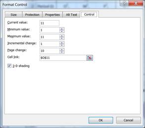
Figure 5
So, based on the value in cell O11, we have to identify which row in the table to show in the chart.
The bubble chart contains three series. Each series uses a named formula for its X, Y, and bubble size. That is a total of 9 final named formulas, named TjX, TjY, and TjP, where j is the team number.
|
AllData |
=ByPeriod!$A$3:$J$13 |
|
PeriodCol |
=INDEX(ByPeriod!AllData,0,1) |
|
PeriodIdx |
=MATCH(ByPeriod!$O$11,ByPeriod!PeriodCol,0) |
|
PeriodData |
=INDEX(ByPeriod!AllData,ByPeriod!PeriodIdx,0) |
|
T1X |
=INDEX(ByPeriod!AllData,ByPeriod!PeriodIdx,2) |
|
T1Y |
=INDEX(ByPeriod!AllData,ByPeriod!PeriodIdx,3) |
|
T1P |
=INDEX(ByPeriod!AllData,ByPeriod!PeriodIdx,4) |
|
T2X |
=INDEX(ByPeriod!AllData,ByPeriod!PeriodIdx,5) |
|
T2Y |
=INDEX(ByPeriod!AllData,ByPeriod!PeriodIdx,6) |
|
T2P |
=INDEX(ByPeriod!AllData,ByPeriod!PeriodIdx,7) |
|
T3X |
=INDEX(ByPeriod!AllData,ByPeriod!PeriodIdx,8) |
|
T3Y |
=INDEX(ByPeriod!AllData,ByPeriod!PeriodIdx,9) |
|
T3P |
=INDEX(ByPeriod!AllData,ByPeriod!PeriodIdx,10) |
Table 2
Finally, the chart contains 3 series, one for each team. A typical series formula is shown in Figure 6.
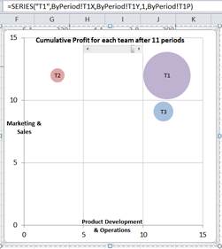
Figure 6
A final note: In Excel 2010 it is not possible to embed a form control in the chart. So, the scroll bar and the chart are grouped to ensure they stay together.
In the downloadable workbook, see the worksheet labeled Trails.
This is more complicated than the snapshot version because of the need to show bubbles that represent a team through time. Also, rather than show all the bubbles with the same transparency, those representing later periods are more opaque. Finally, to make it easier to identify a path, all but the latest bubble show the period number with the last bubble showing the team name.
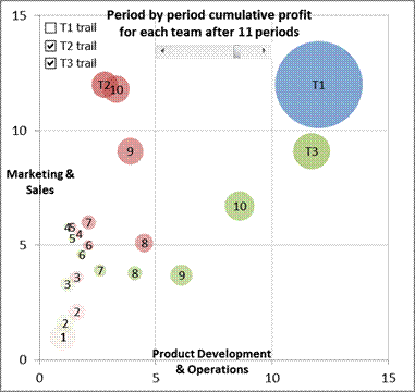
Figure 7
There were several requirements for the chart:
1) Show bubbles for all the periods from 1 to the period-of-interest.
2) The bubble for the latest shown period had the highest opacity (lowest transparency) with earlier periods having progressively lower opacity.
3) Show the path (trail) only for specific teams, as chosen in the checkboxes in the chart.
4) Always show the bubbles for all the teams for the latest period.
To make this work, introduce a work area. The formulas in this area connect the scroll bar value, the checkboxes values, and the original data.
In Figure 8, row 2 indicates which checkboxes are checked and unchecked.
The value in L3 is the that from the scroll bar – it indicates the latest period to be shown.
Since all the bubbles for the latest period will always be shown, the formula in row 3 uses the value in L3 as an index into the original data. So, M3 contains =IF($L3>0,INDEX(B$3:B$13,$L3),NA()) with the formula copied over to N3:U3.
Rows 4 through 13 show the values from earlier periods. Hence, they are also dependent on the corresponding checkbox value in row 2. M4 contains =IF(AND(M$2,$L4>0),INDEX(B$3:B$13,$L4),NA()) with the formula copied down to M5:M13 and across to N4:U13.
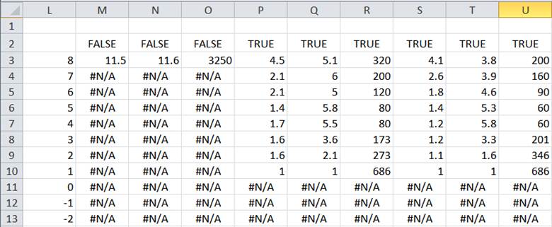
Figure 8
In the chart, each row is one series. So, series 1, which represents the latest period, uses the values in row 3. The formula is =SERIES(,(Trails!$M$3,Trails!$P$3,Trails!$S$3),(Trails!$N$3,Trails!$Q$3,Trails!$T$3),1,(Trails!$O$3,Trails!$R$3,Trails!$U$3)).
The rest of the series similarly reflect the data in subsequent rows. Adjust the formatting (color and transparency) to create the appropriate effect.
The labels for the 3 points in the 1st series are the contents of B1, E1, and H1, respectively. The labels for the subsequent series are the period value from column L.
While everything above is can be done by hand, it is a lot of painstaking work, especially if one wants to experiment with different format, layout, colors, transparencies, etc. Consequently, I used some amount of code to facilitate the creation of the chart.