From KSM on April 25, 2012
This page had helped me in understanding the regressions in Excel. Thanks a lot!
From M.K. on April 26, 2011
This page is an excellent blend of regression theory and application with Excel. It was just what I needed to solve my problem. Thanks!
A trendline shows the trend in a data set and is typically associated with regression analysis. Creating a trendline and calculating its coefficients allows for the quantitative analysis of the underlying data and the ability to both interpolate and extrapolate the data for forecast purposes. It is probably best to illustrate the problem with a simple example.
|
Consider monthly sales as shown in Table 1. |
Table 1 |
Data for two months are missing but in general, it would appear that there is an upward trend with a growth in sales as time goes by. However, beyond that what can we conclude? Can we estimate the sales for month 9? Or, can we tell the rate at which sales are increasing? Not really. However, with a systematic analysis of the data, we can get a lot more information.
|
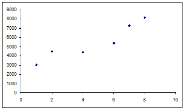
A good start would be to plot the data as shown in Figure 1. Now, the upward trend is a lot more obvious. |
Figure 1 |
|
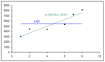
With a trendline we can quantify that observation. To add a trendline, select the plotted series, and then Chart | Add Trendline… | Type tab | select Linear and from the Options tab | check ‘Display equation on chart’ |
Figure 2 |
In addition to the trendline, Figure 2 also contains horizontal line showing the average of the sales data. From the trendline, we can conclude that on average monthly sales increase by 650 units each month. But, that is about the limit of the information. It is important to note that extrapolating too far out beyond the existing data set is not a very smart thing to do. It would be OK to estimate sales in each of the missing months: 3 and 5. Estimating for missing data within the overall data set is known as interpolation. By contrast, estimating sales for months outside the data set is known as extrapolation. It might be OK to make an estimate for “nearby” months such as month 9 or maybe even 10. However, it would be foolhardy to conclude that a year from now sales will have risen by 650*12 or 7,800 units. The limit of what one can do with a regression is further addressed in the section on Confidence Intervals.
While the trendline is of some value, if we were to use the information in any analysis, it would help to have the data in worksheet cells and not as text in a chart. In addition, consider the case in which the dependent variable (sales in the above example) was a function of not one independent variable (month in the above example) but multiple variables? Known as a multiple regression, a graphical analysis would require what cannot be done in Excel: an n‑dimensional graph. The section on Linear regression with multiple variables addresses how this can be done in an Excel worksheet.
Excel includes multiple functions for regression analysis. We will look at LINEST in detail. Once we understand the LINEST function, LOGEST will not be too difficult to understand. In addition to using LINEST for linear estimates, we will also see how its name is misleading. It can actually be used for a large variety of different types of trends such as polynomial, logarithmic and exponential.
The previous chart showed a linear trend with one independent variable. What other kinds of trends are there? Figure 3 shows five different types: polynomial of order 3, linear, logarithmic, natural exponential, and power.
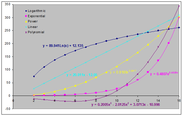
Figure 3 – Note that what Excel calls an exponential trendline
is strictly speaking a natural exponential trendline of the form ![]() .
Excel doesn’t have the capability of drawing the more general exponential
trendline of the form
.
Excel doesn’t have the capability of drawing the more general exponential
trendline of the form ![]()
Other types of trendlines would include the trigonometric
functions ![]() or
or ![]() , as well
as the exponential function,
, as well
as the exponential function, ![]() . While Excel
includes a special function to analyze the exponential regression – the LOGEST
function – we will see why, strictly speaking, it is not necessary.
. While Excel
includes a special function to analyze the exponential regression – the LOGEST
function – we will see why, strictly speaking, it is not necessary.
The rest of the case study is structured as follows:
A linear regression fits the line ![]() ,
or as Excel prefers to call it
,
or as Excel prefers to call it ![]() , to the existing data
set. It does so through a technique known as minimizing the sum of the
squares of the error terms. To get the complete result of a regression
analysis, select a range 5 rows by 2 columns and array-enter the LINEST function
as shown in Figure 4. The first row contains the 2 coefficients a1
and a0 respectively.
, to the existing data
set. It does so through a technique known as minimizing the sum of the
squares of the error terms. To get the complete result of a regression
analysis, select a range 5 rows by 2 columns and array-enter the LINEST function
as shown in Figure 4. The first row contains the 2 coefficients a1
and a0 respectively.
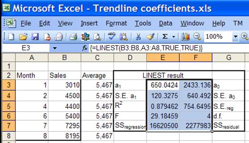
Figure 4
Using regression analysis yields a lot more information than the trendline’s coefficients. The rest of the information is important in understanding how well the regression line fits the data, how significant the individual coefficients are, as well as the significance of the regression as a whole. It also contains key elements needed to build confidence intervals for interpolated or extrapolated estimates, a subject covered in the section titled Confidence Intervals.
But, first, we start with some nomenclature. The number
of data points is given by n. The number of independent variables
is given by k. If a constant is included in the regression, it
increases k by 1. Figure 5 is a zoomed-in version of Figure 2 focusing on
the data point (4, 4400). Each of the recorded observations is denoted by
the pair of values
![]() . For each
. For each ![]() , the
value predicted by the regression is given by
, the
value predicted by the regression is given by ![]() .
. ![]() is pronounced “y hat.” The average of
all the observed y values is known as
is pronounced “y hat.” The average of
all the observed y values is known as ![]() , pronounced “y bar.”
, pronounced “y bar.”
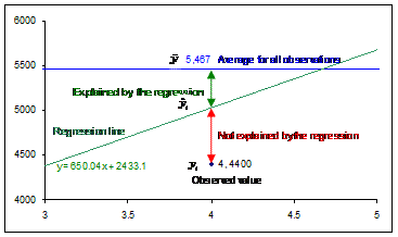
Figure 5 – Enlarged view of Figure 2 around the data point (4, 4400)
Lacking any information about the regression one could still
estimate the average of all the y’s, i.e., ![]() .
That’s a “first cut” estimate that we seek to improve with a regression.
The value that one gets from the regression is
.
That’s a “first cut” estimate that we seek to improve with a regression.
The value that one gets from the regression is ![]() . As Figure 5 shows,
the total gap between the observed data point and the “first cut” estimate is
given by the deviation
. As Figure 5 shows,
the total gap between the observed data point and the “first cut” estimate is
given by the deviation ![]() -
- ![]() .
Out of this the regression accounts for the amount
.
Out of this the regression accounts for the amount ![]() ‑
‑![]() . This leaves a residual (also known as
an error) of
. This leaves a residual (also known as
an error) of ![]() ‑
‑![]() unexplained
by the regression.
unexplained
by the regression.
With the nomenclature established, we look at the result of
the LINEST function. For reasons that will soon be apparent, we start with
the last row. There are two values ![]() and
and ![]() . These are aggregate measures of
something we have already looked at the level of an individual data point.
Recall that for each individual data point, the measure of how much the
regression explains is
. These are aggregate measures of
something we have already looked at the level of an individual data point.
Recall that for each individual data point, the measure of how much the
regression explains is ![]() and how much remains unexplained is
and how much remains unexplained is ![]() .
. ![]() and
and ![]() are aggregate values of the same metrics.
The first is the sum of the squared values of how well the regression fits the
data or
are aggregate values of the same metrics.
The first is the sum of the squared values of how well the regression fits the
data or ![]() . The second is the sum of the squared
values of how much remains unexplained or
. The second is the sum of the squared
values of how much remains unexplained or ![]() .
.
Row 4 contains two values: the F statistic and the
degrees of freedom, df. The degrees of freedom is given by the
expression n-k, where n and k are explained earlier in this section. The F
statistic, or the observed F-value, is a measure of the significance of
the regression as a whole. For the technically minded it tests the null
hypothesis that all of the coefficients are insignificant against the
alternative hypothesis that at least one of the coefficients is significant.
While Excel provides the value, it can also be computed as 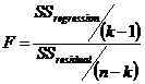 . This, the observed F-value, is then
compared against a critical F-value, F(a,
v1, v2), where a
is 1 - the level of significance we are interested in, and v1 and v2
are as calculated below. The typical level of significance one is
interested in is 95%. Hence, a =
1-0.95 or 0.05. If the constant term in included in the regression (the
LINEST parameter const is either TRUE or omitted), v1 = n – df – 1
and v2 = df. If the constant term is excluded from the
regression (the LINEST parameter const = FALSE), then v1 = n – df and
v2 = df.). Excel’s FINV function, used as FINV(F, v1, v2),
provides the critical F-value. If the observed F-value is greater than the
critical F-value, it means the regression as a whole is significant.
. This, the observed F-value, is then
compared against a critical F-value, F(a,
v1, v2), where a
is 1 - the level of significance we are interested in, and v1 and v2
are as calculated below. The typical level of significance one is
interested in is 95%. Hence, a =
1-0.95 or 0.05. If the constant term in included in the regression (the
LINEST parameter const is either TRUE or omitted), v1 = n – df – 1
and v2 = df. If the constant term is excluded from the
regression (the LINEST parameter const = FALSE), then v1 = n – df and
v2 = df.). Excel’s FINV function, used as FINV(F, v1, v2),
provides the critical F-value. If the observed F-value is greater than the
critical F-value, it means the regression as a whole is significant.
Row 3 contains the two metrics, R2 and the
SEreg. The R2 is measure of how well the
regression fits the observed data. It ranges from 0 to 1 and the closer to
1 the better the fit. Mathematically, it is calculated as  , where each term is explained above.
Graphically, in terms of Figure 5, it is a measure of how close the regression
line is to all of the observations. Suppose the regression line
were to pass through every observation. Then, SSresidual would
be zero since each of its components
, where each term is explained above.
Graphically, in terms of Figure 5, it is a measure of how close the regression
line is to all of the observations. Suppose the regression line
were to pass through every observation. Then, SSresidual would
be zero since each of its components ![]() would be zero, and R2
would become SSregression/SSregression or 1. The
second item in this row is the Standard Error of the regression, or SEreg.
It can also be calculated from what we already know, i.e.,
would be zero, and R2
would become SSregression/SSregression or 1. The
second item in this row is the Standard Error of the regression, or SEreg.
It can also be calculated from what we already know, i.e.,  . Keep in mind that n-k is also the
df
value in row 4 of the result. SSreg will play a role in
calculating the confidence intervals later in this chapter.
. Keep in mind that n-k is also the
df
value in row 4 of the result. SSreg will play a role in
calculating the confidence intervals later in this chapter.
Row 2 provides the standard error of each coefficient, or ![]() . The section Understanding the result
addresses how these errors help determine if the coefficients are significant.
. The section Understanding the result
addresses how these errors help determine if the coefficients are significant.
LINEST can return more than just the coefficients of the regression. Used as an array formula in a 5 rows by X columns range, LINEST returns not only the coefficients but also other statistical information about the results. Some might find it surprising but the Excel documentation for LINEST does a very good functional job of explaining not only contents of all the rows but also the statistical value of that information. Nonetheless, we will look at one key element of the result that bears repeating – it is overlooked by way too many users of LINEST. Figure 6 shows the result of some linear regression[1] using LINEST.
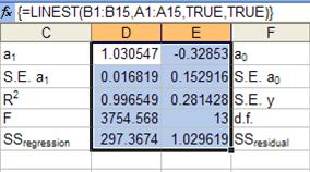
Figure 6
When array-entered in 5 rows (D2:E5), LINEST, as before,
returns the coefficients in row 1. In row 2 it provides the standard
error
of each of the coefficients. Taken together, the two rows contain critical
information in estimating whether each of the coefficients is statistically
different from zero. Dividing the absolute value of the coefficient value
by the standard error yields what is known as the observed t-result,
or  Comparing the absolute value of this
t-result with the corresponding critical t-value lets one decide whether
that coefficient should be treated as zero. If the observed t-result is
less
than the critical t-value then statistically the coefficient is the same as
zero. In the above example, the t-result for the a1 and
the a0 (constant) terms are:
Comparing the absolute value of this
t-result with the corresponding critical t-value lets one decide whether
that coefficient should be treated as zero. If the observed t-result is
less
than the critical t-value then statistically the coefficient is the same as
zero. In the above example, the t-result for the a1 and
the a0 (constant) terms are: 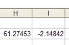 , respectively. The critical t-value is
calculated with the formula =TINV(0.05, df.), where 0.05 corresponds to the 95%
confidence level and d.f. is the degrees-of-freedom for the regression. In
the above example, d.f. is given by E4. The result of the formula, i.e.,
the critical t-value, is
, respectively. The critical t-value is
calculated with the formula =TINV(0.05, df.), where 0.05 corresponds to the 95%
confidence level and d.f. is the degrees-of-freedom for the regression. In
the above example, d.f. is given by E4. The result of the formula, i.e.,
the critical t-value, is ![]() .
The absolute value of the observed t-result for the coefficient (a1)
is much greater than the critical t-value. Hence, we can conclude that the
a1
term is statistically significant. On the other hand, the absolute value
of the observed t-value for the a0 (constant) term is 2.148.
Since it is less than the critical t-value, we conclude that, statistically
speaking, the constant is zero.
.
The absolute value of the observed t-result for the coefficient (a1)
is much greater than the critical t-value. Hence, we can conclude that the
a1
term is statistically significant. On the other hand, the absolute value
of the observed t-value for the a0 (constant) term is 2.148.
Since it is less than the critical t-value, we conclude that, statistically
speaking, the constant is zero.
Since the constant term is statistically indistinguishable from zero, one should run the regression with the constant term forced to zero. This yields the result in Figure 7.
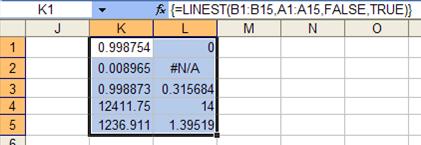
Figure 7
Note that the R2 value has actually increased from 99.65% to 99.88%! Hence, removing the value that was statistically indistinguishable from zero has improved the R2 value. Of course, this may not always be true, but removing a term that is statistically the same as zero is always a good idea.
Regression analysis is not magic. It is a tool that is only as good as the underlying data used in the analysis and as good as the person using it. Ultimately, there is no substitute for a better understanding of the underlying cause-and-effect that the regression is meant to analyze as well as a better understanding of the real world elements being modeled in the regression.
A question that arises on occasion is “what kind of trendline should I pick?” The answer is that the analyst has to have some understanding of the process under analysis. For example, in the example used in the beginning of this chapter, we modeled the sales volume as a linear function of the month. While it made sense for the range of vaues we had, if we were working over a longer period, it is quite possible that a different model, such as a logarithmic regression, might have been more appropriate.
A few other examples that come to mind will demonstrate the importance of paying attention to the underlying issues that affect the analysis:
In one case, someone had 5 years of data for the number of applications and the number of admissions to a college. Based on this data, her boss had asked her to project the number of applications and admissions for the next 5 years. Extrapolating five years of data this far out into the future is simply dangerous. Any number of factors can affect application and admission rates to a college and ignoring the various possible causes is a prescription to a disaster.
In a consulting assignment, I was asked by a regional utility to help analyze the pattern of calls to its call center. As one can imagine any number of variables go into such calls. Among others, there were seasonal trends, annual trends, day-of-week patterns, storm-related surges in call volume, etc. One of the challenges was to better understand call patterns through the week. The obvious and intuitive thing to do was establish a ‘day of week’ indicator. However, that did not yield statistically significant results. After talking with the call center management and the call center operators, I realized that the key was not the day-of-the-week but ‘operating day of week’ – a term that accounted for holidays. What that meant was that if Monday was a working day, it would be operating-day-1. However, if it was a holiday, then for that week Tuesday would be operating-day-1. Once we factored in this kind of reasoning, together with a similar flag for ‘last-working-day-of-the-week’ the independent variables immediately became statistically significant!
The final example is a classic from an introductory MBA class on statistics. Suppose one were to do either of the following two regressions: (1) the number of men buying ice cream each day as a function of the number of women wearing bikinis that day, or (2) the reverse, i.e., the number of women buying ice cream each day as a function of the number of men going shirtless that day.[2] The result will show a significant statistical correlation. But does it make sense? No, not really. The events are correlated, but neither is the cause of the other. In fact, the true cause is missing from the analysis – the average daily temperature! In summer, when the outside temperature is high, both men and women buy more ice cream and wear fewer clothes. When the temperature drops during the winter months, people wear more clothes and buy less ice cream.
These examples should highlight the risks of carrying out a regression analysis without truly understanding the underlying factors that affect the analysis. If one is lucky the results will be so absurd that they will be rejected out-of-hand. If one is unlucky, the result may lead to bad organizational or individual decisions.
Research this issue further by searching Google or by
visiting Gary Klass’s
“Interpreting the Numbers. (under construction)” at
http://lilt.ilstu.edu/jpda/interpreting/interpreting_the_numbers.htm
or Gerald Bracey’s “THOSE MISLEADING SAT AND NAEP TRENDS: SIMPSON'S PARADOX AT
WORK” at
http://www.america-tomorrow.com/bracey/EDDRA/EDDRA30.htm
Given how easy it is to add a polynomial trendline to an Excel chart, it is tempting to always ask for a high order polynomial as the curve of best fit. The number of requests one sees in the Excel newsgroups where someone asks for a cubic polynomial or even a sixth-order polynomial is quite high. However, it is usually not a good practice to over-specify a regression since it can lead to results that are numerically unstable. This over-specification is easy to identify if one uses LINEST to find the coefficients of a polynomial best-fit and then tests if the coefficients are statistically significant.
Suppose one carried out a quadratic polynomial regression[3] for the data from the previous section. The result of the LINEST function would be:
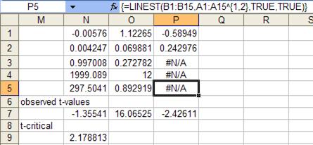
Figure 8
The absolute value of the observed t-value corresponding to the x2 term is 1.355. The t-critical value is 2.1788. Hence, statistically speaking, the coefficient of the x2 term is indistinguishable from zero. What this tells us is that asking for a quadratic polynomial best-fit over-specifies the regression. Removing the x2 term leads to the result of Figure 6, which, in turn, leads to the result of Figure 7.
Among the uses of a regression is the ability to estimate missing information as well as information outside of the range of data analyzed. In the example from the first section, one might want to estimate the sales volume missing in months 3 and 5. Or, one might want to estimate sales in months 9 or 10, or even further out into the future. Note the emphasis on “estimate.” Clearly, one cannot state with certainty that the sales volume in month 3 must have been a particular amount. Similarly, it is hard to imagine a certain prediction about sales volume a year from now. However, we can do two things. First, provide what is called a point estimate. Second, provide a range of within which we can state with some certainty the actual value will fall. This information is often shown graphically as in Figure 9. The lower and upper curved lines demarcate the range of the 95% interval whereas the regression line itself represents the point estimate. Hence, for month three the best point estimate would be 4,383 units. For most practical purposes there is a 95% probability that the actual value was between the upper and lower CIs. For month 3 those values would be 3,363 and 5,404 respectively.
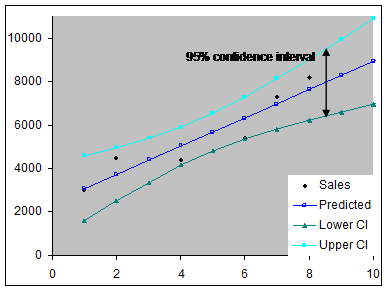
Figure 9
The calculations required to plot the three lines are
described below. The predicted line is the same as the regression line and
each y value, yj, is calculated as described in The basic linear
regression, i.e., ![]() . The distance of
each confidence interval point from the regression line is given by the equation
. The distance of
each confidence interval point from the regression line is given by the equation 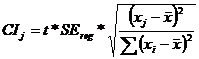 , where CIj is the value for the
value of interest xj and xi represents the known
observations. SEreg is one of the values returned by the LINEST
function and explained in The basic linear regression section. Excel
provides a function, DEVSQ, to compute the sum of the squares in the equation.
, where CIj is the value for the
value of interest xj and xi represents the known
observations. SEreg is one of the values returned by the LINEST
function and explained in The basic linear regression section. Excel
provides a function, DEVSQ, to compute the sum of the squares in the equation.
Next, we compute these values in Excel. The original data set is shown in Figure 10. Only four of the regression related values are shown – a1, a0, SEreg, and the two-side 95% t(df) value.
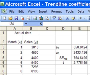
Figure 10
Next, we calculate the predicted value and the confidence interval values for the months 1 through 20.
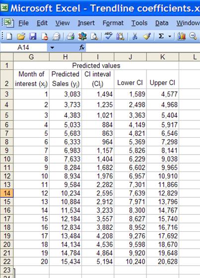
Figure 11
H3:K3 contain the formulas shown below.
|
H3 |
=$E$3*G3+$E$4 |
|
I3 |
=$E$6*$E$5*SQRT(1/COUNT($A$3:$A$8)+(G3-AVERAGE($A$3:$A$8))^2/DEVSQ($A$3:$A$8)) |
|
J3 |
=H3-I3 |
|
K3 |
=H3+I3 |
Copy cells H3:K3 rows 4:22. Graph H, J, K as the y values and G as the x-values in a XY Scatter chart to get
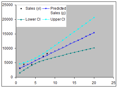
Figure 12
Note how much additional uncertainty is introduced the further we get from the original data set, which had values only for the first 9 months.
As shown in Figure 3, there are many different types of trendlines possible. Each reflects a different relationship between the independent and the dependent variables. Some trend functions of a single variable – other than a linear or a polynomial trend – are listed in the table below.
|
Logarithmic |
|
|
Power |
|
|
Exponential function to base b |
|
|
Natural Exponential function |
|
|
Trigonometric function |
|
Table 2
The key to understanding this section (as well as the one on polynomial trends) is realizing something that apparently the Microsoft people who documented LINEST overlooked: the linearity required in sum-of-square best fit regression analysis applies not to the variables but to the unknown coefficients! Hence, as long as we can write a function in a form that is linear in the unknown coefficients, LINEST can be used to analyze the data. Keep this in mind as we look at how to transform the above functions into a form amenable to analysis by LINEST. Also, the data for the examples for the different trendlines are in Figure 13. This is the same data set used for the trendlines in Figure 3. Hence, for those functions for which Excel can create chart trendlines, the reader can compare the results below with the chart trendline results.
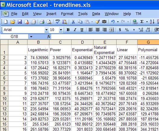
Figure 13
We start with the logarithmic trendline function,
![]() . It is already in a linear form (
. It is already in a linear form (![]() ). Hence, given the x and y values,
=LINEST(y-range, LN(x-range)) will give the required a (slope) and b
(intercept) values.
). Hence, given the x and y values,
=LINEST(y-range, LN(x-range)) will give the required a (slope) and b
(intercept) values.
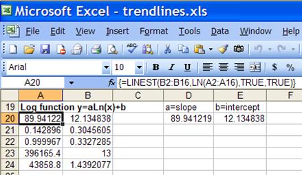
Figure 14
The power function ![]() can
be transformed into
can
be transformed into ![]() [4]. As in
the log trendline, given x and y values, using LINEST with this transformed
function means that =LINEST(LN(y-range), LN(x-range)) yields ln(a) as the
intercept and b as the slope. Hence, for the original regression
a
will be EXP(intercept) and b will be the slope itself.
[4]. As in
the log trendline, given x and y values, using LINEST with this transformed
function means that =LINEST(LN(y-range), LN(x-range)) yields ln(a) as the
intercept and b as the slope. Hence, for the original regression
a
will be EXP(intercept) and b will be the slope itself.
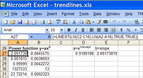
Figure 15
The exponential function to base b, ![]() , can be transformed into
, can be transformed into ![]() . Using LINEST with this transformed
function means that =LINEST(LN(y-range), x) yields ln(a) as the intercept
and ln(b) as the slope. Hence, for the original regression a=EXP(intercept)
and b=EXP(slope).
. Using LINEST with this transformed
function means that =LINEST(LN(y-range), x) yields ln(a) as the intercept
and ln(b) as the slope. Hence, for the original regression a=EXP(intercept)
and b=EXP(slope).
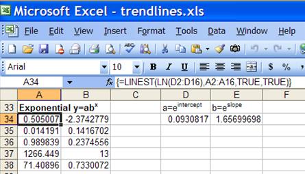
Figure 16
Finally, the natural exponential function ![]() can be transformed into
can be transformed into ![]() . Using LINEST with this transformed
function means that =LINEST(LN(y-range), x) yields ln(a) as the intercept
and b
as the slope. Hence, for the original regression a=EXP(intercept)
and b=slope.
. Using LINEST with this transformed
function means that =LINEST(LN(y-range), x) yields ln(a) as the intercept
and b
as the slope. Hence, for the original regression a=EXP(intercept)
and b=slope.
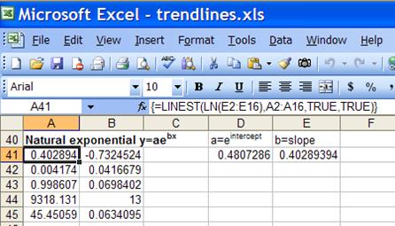
Figure 17
We can easily extend the above case with its single
independent variable to include multiple independent variables. When the
dependent variable is a function of multiple independent variables the problem
is called multiple regression[5].
In mathematical terms, ![]() , where each x
represents an independent variable and the various m’s are the coefficients from
the regression (m0 is the regression constant). One example
would be the assessed value of a commercial building as a function of floor
space, number of offices, number of entrances, and age. This is from the
Excel help file and is duplicated here to provide a sense of continuity between
the help and this document. In addition, it serves as a stepping stone for
the next section, which is a type of regression that is frequently requested.
, where each x
represents an independent variable and the various m’s are the coefficients from
the regression (m0 is the regression constant). One example
would be the assessed value of a commercial building as a function of floor
space, number of offices, number of entrances, and age. This is from the
Excel help file and is duplicated here to provide a sense of continuity between
the help and this document. In addition, it serves as a stepping stone for
the next section, which is a type of regression that is frequently requested.
In the commercial building example, the y would be the value of the building and the x’s are the respective independent variables as shown in Table 3.
|
Variable |
Refers to the |
|
y |
Assessed value of the office building |
|
x1 |
Floor space in square feet |
|
x2 |
Number of offices |
|
x3 |
Number of entrances |
|
x4 |
Age of the office building in years |
Table 3
Suppose the value of the commercial building and the corresponding values of the independent variables are known (see Figure 18).
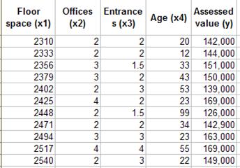
Figure 18
Hence, the regression equation would be ![]() . In this case, the regression result
of LINEST is shown in Figure 19
. In this case, the regression result
of LINEST is shown in Figure 19
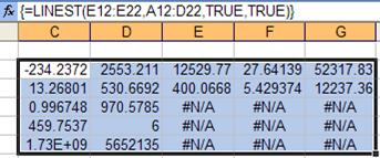
Figure 19
The number of columns is one more than the number of independent variables, the extra column for the regression constant. Left to right the coefficients are m4 to m0. Hence, -234.2372 is the coefficient of x4, the age of the office building and 27.64139 is the coefficient of x1, the floor space.
For an explanation of the various rows see the earlier section on ‘Understanding the result.’
Returning to a recurring theme, does the result make sense? What is the sign of each of the coefficients? Do you agree with the sign? The coefficients for the floor space, the number of offices, and the number of entrances are all positive (and based on the observed t-value statistically significant). That means that more entrances (or more floor space or more offices) means a higher value for the building. The age of the building, on the other hand, has a negative (and significant) coefficient. That means that the larger the age, i.e., the older the building, the lower its value. That makes sense, doesn’t it?
In a regression analysis with polynomials such as ![]() each term is like a different variable,
i.e.,
each term is like a different variable,
i.e., ![]() . Written in this form it
becomes apparent that a polynomial regression is no different from a multiple
regression. One could create three columns of data: one with the x values,
the next with the x2 values, and the last with the x3
values and then use the same LINEST syntax as for a multiple regression.
However, the mechanics can be simplified thanks to Excel’s array formula
capability. For example, the solution to a third order (cubic) polynomial
regression would be the array formula =LINEST(y-range, x-range^{1,2,3}).
The last expression takes the x-range and converts it into three separate
vectors,
. Written in this form it
becomes apparent that a polynomial regression is no different from a multiple
regression. One could create three columns of data: one with the x values,
the next with the x2 values, and the last with the x3
values and then use the same LINEST syntax as for a multiple regression.
However, the mechanics can be simplified thanks to Excel’s array formula
capability. For example, the solution to a third order (cubic) polynomial
regression would be the array formula =LINEST(y-range, x-range^{1,2,3}).
The last expression takes the x-range and converts it into three separate
vectors, ![]() ,
, ![]() , and
, and ![]() , that are then used for the multiple
regression. Using the data of Figure 13, the result of the LINEST function
is in Figure 20. Again, one can compare the result of the LINEST function
with the chart trendline of Figure 3.
, that are then used for the multiple
regression. Using the data of Figure 13, the result of the LINEST function
is in Figure 20. Again, one can compare the result of the LINEST function
with the chart trendline of Figure 3.
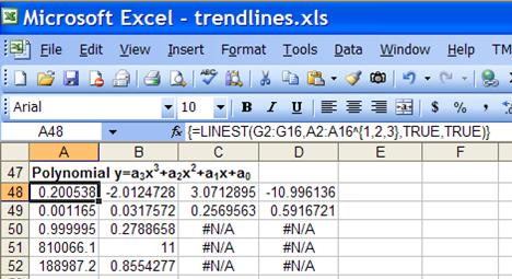
Figure 20
There are many instances when an independent variable does not contain numeric values but rather categorical values. A simple example is the variable Gender, which can contain only one of two values M or F. In such a case, one represents each categorical value with an Indicator (or Dummy) variable that is either 1 or 0 depending on the category value. For example, we could introduce a variable M that would be 1 if Gender equals M. Otherwise, it would be zero.
While it might appear that one should also have another variable that is 1 when Gender equals F, it is not really required and should not be created. After all, M=0 implies F=1, just as M=1 implies F=0. As a rule, the number of indicator variables will be one less than the number of values that the category variable can take.
Another example: imagine an independent variable, Season, that could equal Spring, Summer, Fall, or Winter. We would need only three Indicator variables, say, Spring, Summer, and Fall. Winter would be implied by all three indicator variables being zero.
Sometimes, what might appear to be a numeric variable is actually a categorical variable. Most businesses break up the year into four quarters, typically numbered 1, 2, 3, and 4. While this might make it look like the variable is numeric it is actually a category variable. After all, the quarters could just as easily be labeled A, B, C, and D. Essentially, one must be careful to identify and treat a categorical variable correctly.
This issue of correctly identifying a category variable shows up in the next example. It consists of a made-up data set from someone asking for help. Given the data in Figure 21, we have to forecast the sales in each of the quarters in 2004.
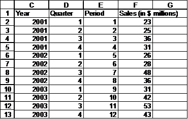
Figure 21
One instinctive approach might be to carry out a simple regression treating the Sales as dependent on the Period. However, that would be a mistake. Before doing anything, as noted at the start of this chapter, a very good idea is to always plot the data. Suppose we lay out the data slightly differently as in Figure 22and create a Line chart as in Figure 23.
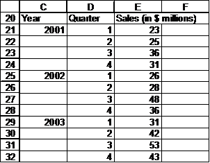
Figure 22
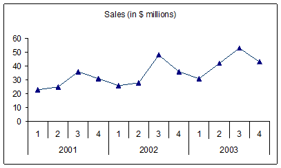
Figure 23
There are two patterns that stand out. First, there is a slight increase in sales year-over-year. Second, there is a pattern within each year. The sales start off low in Q1 of a given year, increase slightly in Q2, rise substantially in Q3, and drop a fair bit in Q4, falling slightly further in Q1 of the next year.
The two trends should alert us that we cannot use a single variable Period as the independent variable. The results would be totally incorrect. What we need to do is introduce Indicator variables. Since the Quarter variable can take 1 of 4 values, we need three Indicator variables. Let’s call them Q1, Q2, and Q3. Remember that Q4 is implied by all of Q1, Q2, and Q3 being zero. The resulting table is shown in Figure 24.
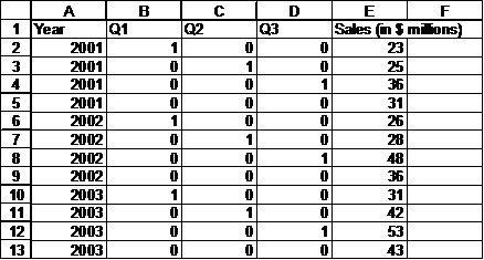
Figure 24
Now, select a 5x5 range, say, G3:K7, and enter the array formula =LINEST(E2:E13,A2:D13,TRUE,TRUE) to get the result:
If we use these coefficients to forecast the sales for each quarter of 2004, we would get
To get these values, add the data in columns A:D. Then, in E14 enter the formula =$G$3*D14+$H$3*C14+$I$3*B14+$J$3*A14+$K$3 and copy E14 down to E15:E17. If we plot the resulting data, we get Figure 25
Figure 25
As expected, the forecast for 2004 fits in very well with both the year-over-year and the quarter-by-quarter patterns.
For reasons best know to itself, Microsoft opted to implement two different regression algorithms, one for the chart trendline and another for the LINEST function. While the two yield the same result for most data sets, in those few cases where they disagree the chart trendline returns a more accurate result. This is especially true for versions of Excel prior to 2003.
I enhanced code originally posted by David Braden to retrieve the coefficients from a chart into worksheet cells. It has several limitations that are documented within the code itself. The google.com archive is at http://groups.google.com/group/microsoft.public.excel.charting/msg/0eda30f29434786d?hl=en& and is reproduced in Appendix A.
.
With Excel 2003, Microsoft changed the algorithms used in several statistical functions. One of the improved functions is LINEST. Among the improvements is an algorithm with improved numerical stability. In addition, the software does a better job of detecting collinearity.
The power of LINEST is not restricted to Excel. Conceptually, it is available in VBA just as it is in Excel: specify a column vector of y-values and a matrix of x-values together with the optional arguments. For a single variable analysis, the matrix of x-values will be a single column vector. For a multiple regression, the matrix will have multiple columns, one for each independent variable. This is exactly the same setup as in an Excel worksheet. The VBA syntax for a column vector with m elements is Dim aVector (1 to m, 1 to 1) and a matrix with m rows and n columns is Dim aMatrix (1 to m, 1 to n). The result of LINEST will be an 2 dimensional matrix, just as in Excel. A key difference between Excel and VBA is that the latter doesn’t support array formulas. Effectively, in VBA one must forgo the simplicity of an array formula and explicitly set up the matrix necessary for the regression model. For example, to carry out a cubic polynomial regression in VBA we would have create a matrix with three columns rather than use the Excel abbreviation of x-range^{1,2,3}.
In the code below, PolyTrends expects YVals and XVals to be column vectors. Since the subroutine calculates the trend of a polynomial regression, the single column of x-values must be converted into a multi-column matrix. Once the single column of x-values is converted into the matrix with the necessary columns, the PolyTrends function returns as its result whatever is returned by the Linest function. As with the other code examples, functional decomposition and modularity results in self-documented code. As such, the task of converting the x-value column vector into a multi-column matrix is delegated to the XArray function.
Function PolyTrend(YVals, XVals, PolyPower As Integer)
Dim XArr()
XArr = XArray(XVals, PolyPower)
PolyTrend = Application.WorksheetFunction.LinEst(YVals, XArr, True, True)
End Function
The XArray function is shown below. It takes the single column of x values and returns a multi-column matrix. The first column contains values of x1, the next column x2, etc.
Function XArray(InArr, PolyPower)
'The returned value is a matrix that has the same number of rows as _
InArr and as many columns as are needed to contain the powers of x _
specified in PolyPower. _
Since the lower bound and the upper bound of InArr are unknown, the _
use of the LBound() and UBound() functions makes the code much more _
robust
Dim XArr()
Dim I As Long, J As Long
ReDim XArr(LBound(InArr) To UBound(InArr), 1 To PolyPower)
For I = LBound(XArr, 1) To UBound(XArr, 1)
XArr(I, 1) = InArr(I, LBound(InArr, 2))
For J = 1 To PolyPower
XArr(I, J) = XArr(I, 1) ^ J
Next J
Next I
XArray = XArr
End Function
Finally, the PolyTrend function can be used from another routine as shown below. For the sake of simplicity, the testPolyTrend routine gets the x and y values from an Excel worksheet. However, there is no such requirement. The data could just as easily come from some other file such as a text file output by another program. The printResults routine prints the result returned by the PolyTrend function.
Sub testPolyTrend()
Dim Rslt As Variant
Rslt = PolyTrend(Range("G2:G16").Value, Range("A2:A16").Value, 3)
printResults Rslt
End Sub
For the sake of completeness, the printResults routine it is shown below. All it does is write the contents of the Rslt variable to the Visual Basic Editor (VBE) Immediate window, one row at a time.
Sub printResults(Rslt)
Dim I As Integer, J As Integer, sMsg As String
For I = LBound(Rslt, 1) To UBound(Rslt, 1)
sMsg = ""
For J = LBound(Rslt, 2) To UBound(Rslt, 2)
sMsg = sMsg & IIf(IsError(Rslt(I, J)), "#N/A", Rslt(I, J)) & ", "
Next J
Debug.Print Left(sMsg, Len(sMsg) - 2)
Next I
End Sub
Acknowledgements
This document has benefited from comments from various people including but not limited to Jerry Lewis; David Haiser; and Werner Prystav of the Institute of Agricultural Engineering (ATB) in Potsdam, Germany
Introduction to Simple Linear Regression, Gerard E. Dallal, 2000 http://www.tufts.edu/~gdallal/slr.htm
EXCEL: Multiple Regression, A. Colin Cameron, Dept. of Economics, Univ. of Calif. – Davis, 1999, http://cameron.econ.ucdavis.edu/excel/exmreg.html
Microsoft Excel 2000 and 2003 Faults, Problems, Workarounds and Fixes, David Haiser, 2006, http://www.daheiser.info/excel/frontpage.html
An Introduction to Statistics, David Stephenson, 2000,
http://web.gfi.uib.no/~ngbnk/kurs/notes/node74.html
Regression analysis, Wikipedia,
http://en.wikipedia.org/wiki/Regression_analysis
The code below implements functions (UDFs) to retrieve trendline coefficients from a chart.
Option Explicit
Option Base 0
'Function TLcoef(...) returns Trendline coefficients
'Function TLeval(x, ...) evaluates the current trendline at a given x
'
'The arguments of TLcoef, and the last 4 of TLeval: _
vSheet is the name/number of the sheet containing the chart. _
Use of the name (as in the Sheet's tab) is recommended _
vCht is the name/number of the chart. To see this, deselect _
the chart, then shift-click it; its name will appear in the _
drop-down list at the left of formula bar. In the case of a _
chart in its own chartsheet, specify this as zero or the zero _
length string "" _
VSeries is a series name/number, and vTL is the series' trendline _
number. If the series has a name, it is probably better to _
specify the name. To determine the name/number, as well as _
the trendline number needed for vTL, pass the mouse arrow _
over the trendline. Of course, if there is only one series in _
the chart, you can set vSeries = 1, but beware if you add _
more series to the chart.
'First draft written 2003 March 1 by D J Braden _
Revisions by Tushar Mehta (www.tushar-mehta.com) 2005 Jun 19: _
Various documentation changes _
vCht is now 'optional' _
Correctly handles cases where a term is missing -- e.g., _
y = 2x3 + 3x + 10 _
Correctly handles cases where a coefficient is not shown because _
it is the default value -- e.g., y = Ln(x)+10 _
When only the constant term is present, the original function _
returned it in the correct array element only for the _
polynomial and linear fits. Now, the function returns it in _
the correct array element for other types also. For example, _
for an exponential fit, y=10 will be returned as (10,0) _
Arrays are now base zero.
'Limitations: _
The coefficients are returned to precision *displayed* _
To get the most accurate values, format the trendline label _
to scientific notation with 14 decimal places. (Right-click _
the label to do this) _
Given how XL calculation engine works -- recalculates the _
worksheet first, then the chart(s) -- it is eminently _
possible for the chart to show one trendline and the _
function to return coefficients corresponding to the values _
shown by the chart *prior* to the recalculation. To see the _
effect of this '1 recalculation cycle lag' plot a series of _
random numbers. _
An alternative to the functions in this module is the LINEST _
worksheet function. Except for those few cases where LINEST _
returns incorrect results, it is the more robust function _
since it doesn't suffer from the '1 recalculation cycle' _
lag. With XL2003 LINEST may even return more accurate _
results than the trendline.
Function TLcoef(vSheet, vCht, vSeries, vTL)
'To get the coefficients of a chart on a chartsheet, specify vCht _
as zero or the zero length string ""
'Return coefficients of an Excel chart trendline. _
Limitations: See the documentation at the top of the module _
'Note: For a polynomial fit, it is possible the trendline doesn't _
report all the terms. So this function returns an array of _
length (1 + the order of the requested fit), *not* the number of _
values displayed. The last value in the returned array is the _
constant term; preceeding values correspond to higher-order x.
Dim o As Trendline
Application.Volatile
If ParamErr(TLcoef, vSheet, vCht, vSeries, vTL) Then Exit Function
On Error Resume Next
If vCht = "" Or vCht = 0 Then
If TypeOf Sheets(vSheet) Is Chart Then
Set o = Sheets(vSheet).SeriesCollection(vSeries) _
.Trendlines(vTL)
Else
TLcoef = "#Err: vCht can be omitted only if vSheet is a " _
& "chartsheet"
Exit Function '*****
End If
Else
Set o = Sheets(vSheet).ChartObjects(vCht).Chart. _
SeriesCollection(vSeries).Trendlines(vTL)
End If
On Error GoTo 0
If o Is Nothing Then
TLcoef = "#Err: No trendline matches the specified parameters"
Else
TLcoef = ExtractCoef(o)
End If
End Function
Function TLeval(vX, vSheet, vCht, vSeries, vTL)
'DJ Braden
'Exp/logs are done for cases xlPower and xlExponential to _
allow for greater range of arguments.
Dim o As Trendline, vRet
Application.Volatile
If ParamErr(TLeval, vSheet, vCht, vSeries, vTL) Then Exit Function
On Error Resume Next
If vCht = "" Or vCht = 0 Then
If TypeOf Sheets(vSheet) Is Chart Then
Set o = Sheets(vSheet).SeriesCollection(vSeries) _
.Trendlines(vTL)
Else
TLeval = "#Err: vCht can be omitted only if vSheet is a " _
& "chartsheet"
Exit Function '*****
End If
Else
Set o = Sheets(vSheet).ChartObjects(vCht).Chart. _
SeriesCollection(vSeries).Trendlines(vTL)
End If
On Error GoTo 0
If o Is Nothing Then
TLeval = "#Err: No trendline matches the specified parameters"
Exit Function
End If
vRet = ExtractCoef(o)
If TypeName(vRet) = "String" Then TLeval = vRet: Exit Function
Select Case o.Type
Case xlLinear
TLeval = vX * vRet(LBound(vRet)) + vRet(UBound(vRet))
Case xlExponential 'see comment above
TLeval = Exp(Log(vRet(LBound(vRet))) + vX * vRet(UBound(vRet)))
Case xlLogarithmic
TLeval = vRet(LBound(vRet)) * Log(vX) + vRet(UBound(vRet))
Case xlPower 'see comment above
TLeval = Exp(Log(vRet(LBound(vRet))) _
+ Log(vX) * vRet(UBound(vRet)))
Case xlPolynomial
Dim Idx As Long
TLeval = vRet(LBound(vRet)) * vX + vRet(LBound(vRet) + 1)
For Idx = LBound(vRet) + 2 To UBound(vRet)
TLeval = vX * TLeval + vRet(Idx)
Next Idx
End Select
End Function
Private Function DecodeOneTerm(ByVal TLText As String, _
ByVal SearchToken As String, _
ByVal UnspecifiedConstant As Byte)
'splits {optional number}{SearchToken} _
{optional numeric constant}
Dim v(1) As Double, TokenLoc As Long
TokenLoc = InStr(1, TLText, SearchToken, vbTextCompare)
If TokenLoc = 0 Then
v(1) = CDbl(TLText)
Else
If TokenLoc = 1 Then v(0) = 1 _
Else v(0) = Left(TLText, TokenLoc - 1)
If TokenLoc + Len(SearchToken) > Len(TLText) Then _
v(1) = UnspecifiedConstant _
Else v(1) = Mid(TLText, TokenLoc + Len(SearchToken))
End If
DecodeOneTerm = v
End Function
Private Function getXPower(ByVal TLText As String, _
ByVal XPos As Long)
If XPos = Len(TLText) Then
getXPower = 1
ElseIf IsNumeric(Mid(TLText, XPos + 1, 1)) Then
getXPower = Mid(TLText, XPos + 1, 1)
Else
getXPower = 1
End If
End Function
Private Function ExtractCoef(o As Trendline)
Dim XPos As Long, s As String
On Error Resume Next
s = o.DataLabel.Text
On Error GoTo 0
If s = "" Then
ExtractCoef = "#Err: No trendline equation found"
Exit Function '*****
End If
If o.DisplayRSquared Then s = Left$(s, InStr(s, "R") - 2)
s = Trim(Mid(s, InStr(1, s, "=", vbTextCompare) + 1))
Select Case o.Type
Case xlMovingAvg
Case xlLogarithmic
ExtractCoef = DecodeOneTerm(s, "Ln(x)", 0)
Case xlLinear
ExtractCoef = DecodeOneTerm(s, "x", 0)
Case xlExponential
s = Application.WorksheetFunction.Substitute(s, "x", "")
ExtractCoef = DecodeOneTerm(s, "e", 1)
Case xlPower
ExtractCoef = DecodeOneTerm(s, "x", 1)
Case xlPolynomial
Dim lOrd As Long
ReDim v(o.Order) As Double
s = Application.WorksheetFunction.Substitute(s, " ", "")
s = Application.WorksheetFunction.Substitute(s, "+x", "+1x")
s = Application.WorksheetFunction.Substitute(s, "-x", "-1x")
Do While s <> ""
XPos = InStr(1, s, "x")
If XPos = 0 Then
v(o.Order) = s 'constant term
s = ""
Else
lOrd = getXPower(s, XPos)
If XPos = 1 Then v(UBound(v) - lOrd) = 1 _
Else _
v(UBound(v) - lOrd) = Left(s, XPos - 1)
If XPos = Len(s) Then
s = ""
ElseIf IsNumeric(Mid(s, XPos + 1, 1)) Then
s = Trim(Mid(s, XPos + 2))
Else
s = Trim(Mid(s, XPos + 1))
End If
End If
Loop
ExtractCoef = v
End Select
End Function
Private Function ParamErr(v, ParamArray parms())
Dim l As Long
For l = LBound(parms) To UBound(parms)
If VarType(parms(l)) = vbError Then
v = parms(l)
ParamErr = True
Exit Function
End If
Next l
End Function
[1] The original data set is not presented since the individual values are irrelevant to understanding the results of the LINEST function.
[2] One could even reverse the relationship between the independent and dependent variables, i.e., carry out a regression of the number of men going shirtless (women wearing bikinis) as a function of the number of women (men) buying ice cream. While the results may be statistically significant, the absurdity of the conclusion should be obvious.
[3] Polynomial regression is addressed in more detail in a later section.
[4] The fact that the transformed equation is amenable to linear sum-of-squares best-fit analysis can be easily seen by making the notational changes, . The linearity of the resulting equation is now obvious.
[5] When there is a single dependent variable with multiple independent variables, the problem is known as a Multiple Regression. When there are multiple dependent variables, the problem is called a Multivariate Regression. For more see the References section.