![]() 2010 (32-bit and 64-bit)
2010 (32-bit and 64-bit)
![]() 2007
2007
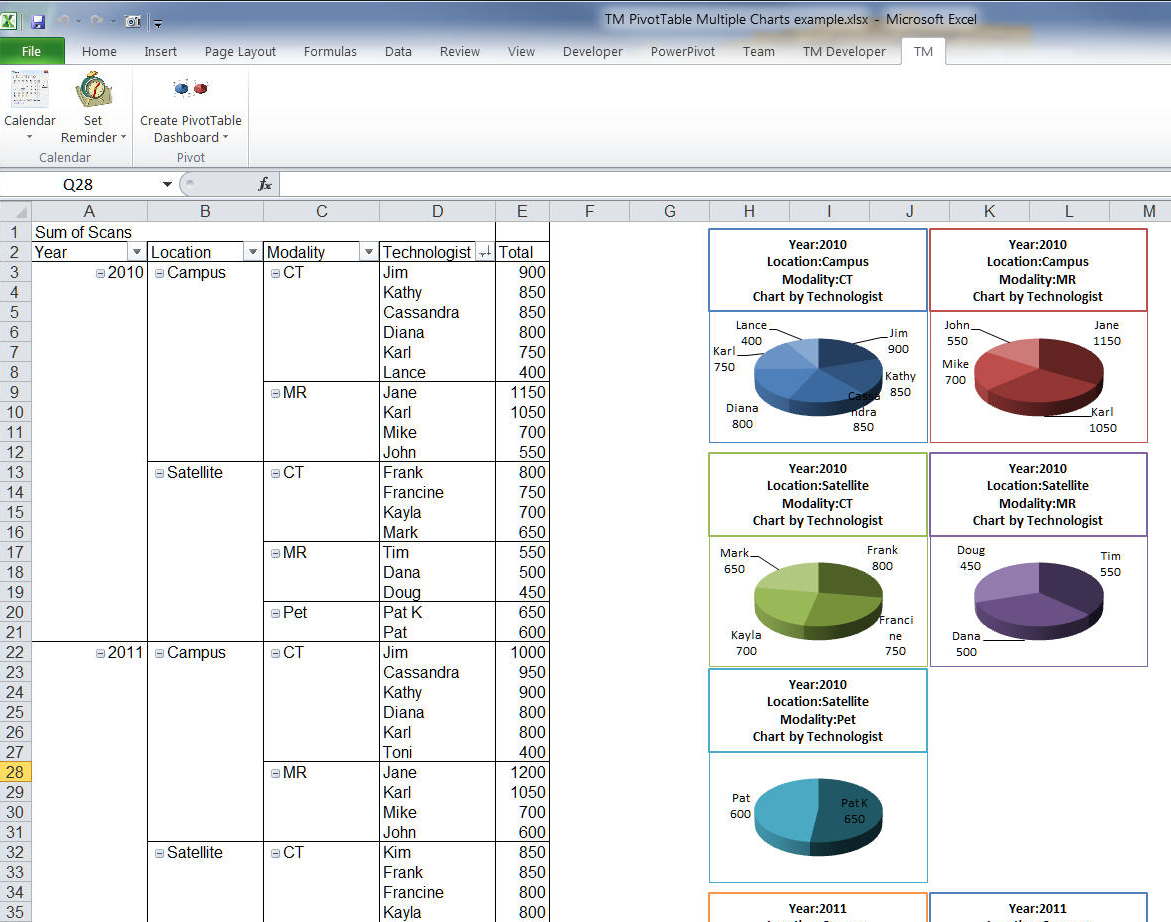
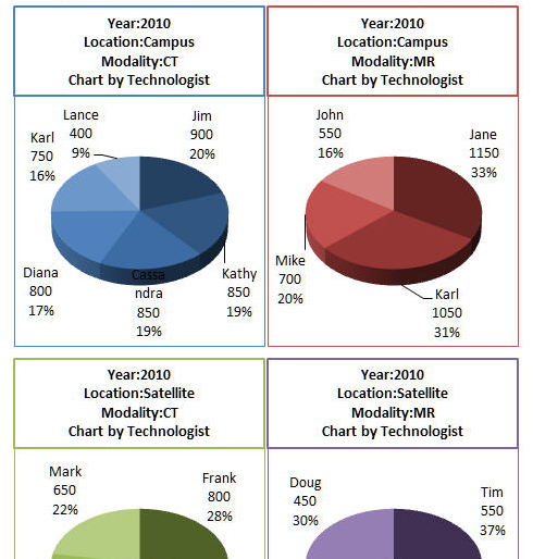
This add-in creates a dashboard from the contents of a PivotTable. Each chart in the dashboard shows the last of the row fields and the data field. Elements of the chart are customizable. The example below shows a PivotTable reporting on the number of annual scans of different types performed by each technologist at a radiology department with two locations (the 2011 data are projected scan volume). The PivotTable has 4 row fields (Year, Location, Modality, and Technologist) and 1 data field (Sum of Scan). The dashboard consists of 1 chart for each combination of Year, Location, and Modality with each chart showing the number of scans by technologist.
The location of the dashboard is consumer-specified.
The add-in can create a default chart or one can specify a template chart. Certain elements of this template chart are customizable.
The pivot table can have any number of row fields, one and only one data field, and no column fields.
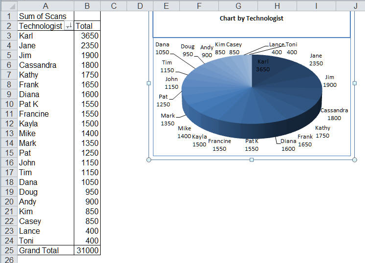
The TM PivotTable Dashboard dialog box
Using a Custom Dashboard Chart
Dashboard Charts Grouping and Layout
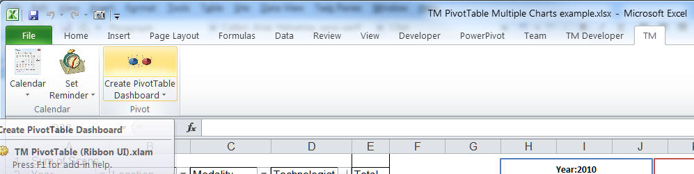
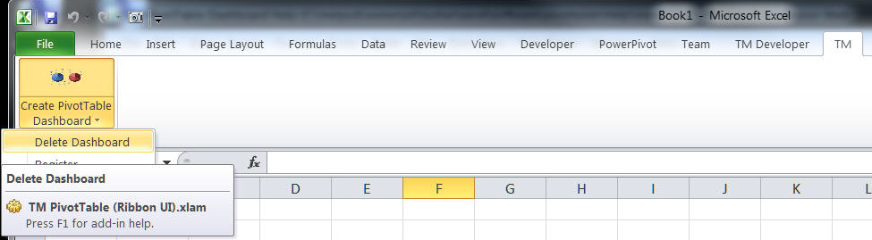
In Excel 2007 and 2010, select the TM tab | Pivot group | Create PivotTable Dashboard button to bring up the TM PivotTable Dashboard dialog box.
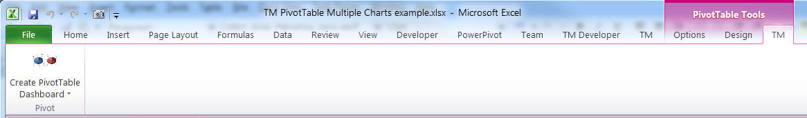
Another way to reach the same dialog box is to select any cell in the pivot table of interest, then select from the PivotTable Tools contextual tabs: TM tab | Pivot group | Create PivotTable Dashboard button. In this case, the software pre-fills the 'source pivot table' field of the dialog box
There are three elements that one can specify, but only two (the Source PivotTable and the location of the dashboard) are mandatory.
The add-in allows tremendous flexibility in terms of what is located where. Each of the three items (the source, the destination, and the template, if any) can be on any worksheet in any workbook.
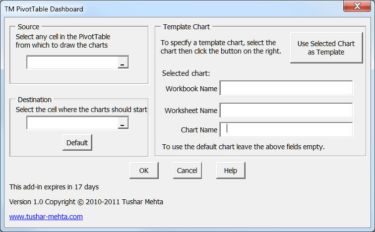
To specify the source pivot table click in the source field and then click any cell in the pivot table. The pivot table should have at least one row field, exactly one data field and no column fields. For a pivot table with one or more column fields, for the purpose of creating a dashboard just move the column fields to row fields.
To specify the location where the dashboard should start (i.e., the location of the top-left corner of the first chart in the dashboard), click in this field and then click on the cell where you want the dashboard.
Use the 'Default' button to have the add-in pick a column that is 2 columns to the right of the active sheet's used range.
To specify a template chart, select the chart then click the button 'Use Selected Chart as Template'. To use the default chart, make sure that the 'Chart Name' field is empty.
Below is an example of a template chart and the corresponding dialog box entries.
As shown above, one can specify a custom chart that the add-in uses as a 'template.' Obviously, the chart should have only one plotted series (since the add-in only works with a pivot table with one data field). The add-in modifies the data range of the series to reflect the data in the actual pivot table. It also modifies the color scheme of the plotted series. It cycles through the six colors in the current theme, picking the next one for each subsequent chart. For a specific chart, after selecting the theme color, it then modifies the brightness for each data point plotted. The first data point has a brightness value of -0.5 and the last one is almost, but not quite 1. An example (which reports the total scans by technologist over both the years) is below.
The add-in does not modify anything else in the template. That makes it possible for one to create different kinds of charts with customized axes and data labels, as in the example follows.
In this example, the template uses a 3D clustered cylinder chart. Both the y-axis and the gridlines are hidden. The chart has a custom 3D perspective. The data label shows only the plotted value (no category information as in the above example). Finally, the x-axis text alignment is set to -45 degrees.
The template chart:
And a partial view of the resulting dashboard:
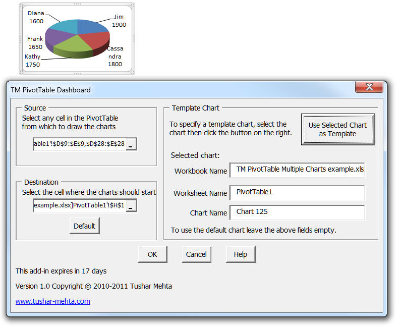
If no template chart is specified, the add-in creates a 3D pie with data labels containing the category, value, and percentage. The chart's shape is a square.
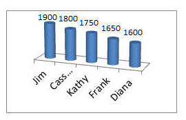
If there is a single row field, the add-in creates a single chart as shown below.
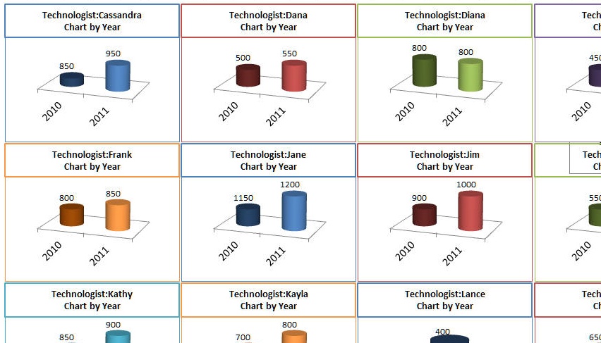
When the number of row fields is greater than 1, the add-in groups the charts based on the row fields as explained below.
The add-in groups the charts in the dashboard into logical groups based on the number of row fields. As noted above, the right-most row field is used as the category (X) range for each chart. Then, the data in the next right-most row field are grouped together for each of the row fields to the left. So, in the example, the charts for the scan types (CT, MR, and PET CT) are grouped together for each combination of Year and Location.
Within each group, the add-in lays out the charts in a square grid. What that means is the following:
If there are 4 or fewer charts in the group, the add-in will put the first 2 charts in row 1 and then 2 more in row 2.
If there are 5 to 9 charts in the group, the add-in will layout the charts so that the first 3 charts go in row 1, the next 3 in row 2, and the last 3 in row 3.
It repeats this pattern, using a 4x4 grid for 10-to-16 charts, a 5x5 grid for 17-25 charts, and so on.
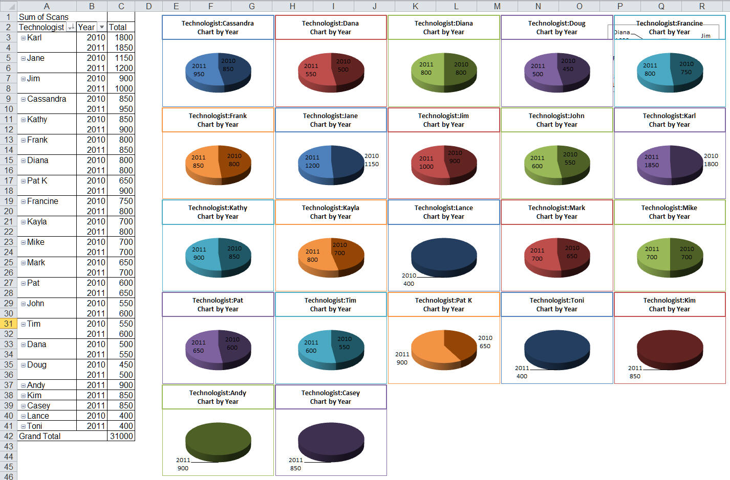
For example, if we create a pivot table to review the number of scans performed by each technologist in each of the 2 years, the technologist would be the first row field and the year the second row field. Then, the dashboard would consist of 22 charts, one for each technologist and each chart would have 2 elements, the number of scans performed by that technologist in each of the 2 years. This dashboard would be in a 5x5 grid with 5 charts in each of the first 4 rows and 2 charts in the 5th row.
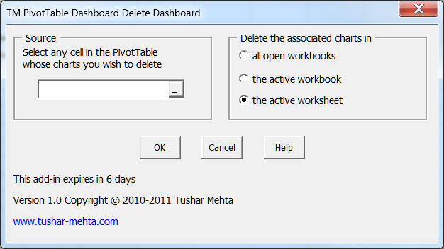
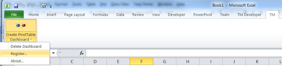
To delete all the charts in a dashboard associated with a PivotTable, select the drop down menu of the Create PivotTable Dashboard | Delete Dashboard
In the resulting dialog box, specify the pivottable for which you want to delete the dashboard. Specify, also, which of the associated dashboards to delete.
The add-in comes with a trial period, after which continued use requires a registration key. Once you get the registration key, to enter it select the Create PivotTable Dashboard's dropdown menu | Register...
Contact the author through his website at www.tushar-mehta.com

