Purpose of the Autochart add-in
How to use the Autochart add-in
The dialog box for the example
One of the limitations of Excel's charts is the inability to link worksheet cells to parameters that govern how a chart axis is shown. For example, the minimum and maximum values for an axis can either be set to 'automatic' (meaning that Excel will decide what the values should be) or can be specified as a number. However, there is no way to tell Excel that it should use the contents of a particular cell. This add-in allows one to do just that!
In addition, the add-in saves the automation information in the workbook in the form of hidden names. Consequently, the links need to be specified only once, and each time that the workbook is opened, the links will be reestablished (as long as the add-in is loaded).
Version 2 of the add-in figures out for itself what kind of chart it is dealing with. It uses this information to selectively enable only those fields that correspond to axes that can contain maximum and minimum values. For example, only if the chart has secondary axis that can contain maximum and minimum values will the corresponding dialog box fields be enabled. Similarly, the Series axis parameter will be enabled only if it is possible to specify the maximum and minimum values for that axis.
See common installation instructions.
This add-in is available after a chart has been created. The chart can be in a separate sheet (i.e., a chart sheet) or embedded in a worksheet (within a chartobject). Enter the maximum and minimum values for the various axes into worksheet cells. Each of these cells can have a number that has been typed in, or a formula that yields a number.
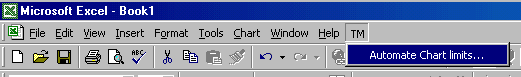
Click the chart (or the tab of the chart sheet). On the chart menu bar, next to the Help menu, will be a new menu named TM. Select TM | Automate Chart limits...
|
|
This will bring up the dialog box that lets one specify the various limits for the selected chart (see Figure 4).
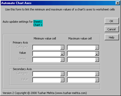 |
Only those fields relevant to the chart will be enabled. Fields corresponding to other axes will be disabled and dimmed. For those axes whose limits are to be dynamically adjusted, specify the cell that contains the limit value. Leave other dialog box entries blank.
The dialog box identifies by name the chart that will be automated.
Identify the cells that contain the minimum and maximum values for each of the three axes, the Category, Value, and Series axes in this area. Each entry should contain a reference to one cell. Those limits (minimum or maximum values) that do not have to be dynamically changed should be left blank.
Remember that a Series axis applies only to a 3-D chart.
For a 2-D chart, it is possible to have a secondary category axis as well as a secondary value axis. For each of these, the cells that contain the corresponding minimum and maximum values are specified in this section of the dialog box.
OK, OK, I know you know, but for the sake of completeness...
The OK button lets the add-in start its work, the CANCEL button stops the add-in from going any further, and the HELP button brings up this help information.
To stop the automatic updating of the chart, go through the steps required to automate the process but this time clear out all cell references. Clicking OK will cause the add-in to stop updating the selected chart.
When necessary, the add-in changes the parameters associated with the axes of the chart being automated. When changes are made, the ability to undo the last change is lost. This is an intrinsic feature of Excel and there is not much one can do about it.
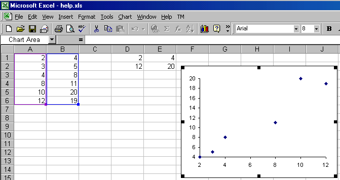
Start with a sample data set, such as the one shown below. The values in cells A1:B6 are randomly generated numbers. Since the data set is randomly generated, the values that you see in the example workbook will be different. However, that does not affect the method by which one uses the add-in.
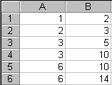 |
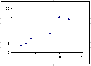
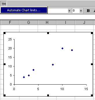
Chart the data set to get the graph shown below.
 |
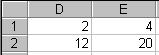
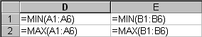
The limits for the x-axis are in column D. Cell D1 is the minimum value of the axis and D2 is the maximum value for the axis. Similarly, column E contains the minimum and the maximum values for the y-axis. The cell values and the formulas are shown in Figure 7.
 |
 |
Click on the chart to select it. The chart menu bar will have the menu TM. Select it and then the item Automate Chart limits... as shown below in Figure 8.
 |
Set the references for the minimum and maximum values for the x- and y- axes to the appropriate cells as shown in Figure 9 below.
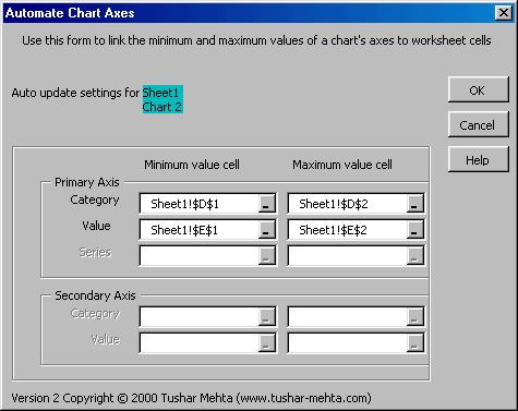 |
Figure 10 and Figure 11 below show the result of automatic maintenance of the axes limits. Once the OK button in the dialog box is clicked, the chart will reflect the values in cells D1:E2. As the cell values change, the chart will update automatically.
 |
Since the data points are generated with a random generator, forcing a recalculation (F9) yields different numbers in A1:B6. This causes the minimum and maximum values associated with the x- and y-axes to change (see cells D1:E2 in Figure 11 below). The final effect is that the axes and the plotted data points change in the associated chart.
 |