One important caveat: The effect that I describe below relies on having a lot of data points close together. This creates the effect of a continuous color bar (which, in actuality, is lots of small vertical lines). So, the fewer the data points that you have the less spectacular will be the effect.
Below is the description of how to create one zone (highlighting in red the area from -3 standard deviations to -4 standard deviations). I will leave it up to you to do all the zones
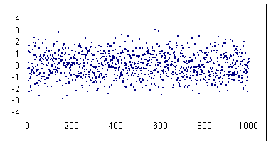
The data set: Start with a thousand normally distributed random numbers with a mean of zero and a standard deviation of 1. This means the data set would have about 2/3 of the points in the range -1 to +1, 95% in the range -2 to +2 and 99.5% in -3 to +3. The remaining, or about 5 points would be either < -3 or > +3.
Step 1: Create an x-y scatter chart of the 1000 data points and set the line format to none.
Step 2: Set the series marker to a minus sign (i.e., '-') with a size of 2 units. Remove any extraneous formatting (legends, gridlines, borders, plot area, etc.) that Excel creates by default. Adjust the min and max values of the x- and y- axis to your satisfaction (I used -4 to +4 for the y-axis and 0 to 1000 for the x-axis). Remove the solid line used for drawing the axis. Also, change the y-axis attribute so that the x-axis crosses at a value of -4 -- which is -4 sigma. I also changed the font size of the axes to 9 point and turned off the auto scale option.
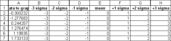
Step 3: Next, add 7 more series each with a 1,000 points (the same number as the data points). The values in the first series are all -3 (which happens to be -3 sigmas from the mean in this data set), the second series consists of all -2, ... the fourth is all zeros (the expected mean for this data set), ... the last is all +3.
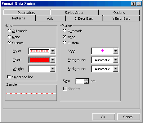
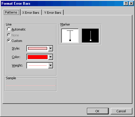
Step 4: Select the first new data series (the -3s) and add it to the chart. Format the data series as follows: Set the markers to none. Set the line style to the last option in the drop-down list (it is a rectangle with about 25% fill). Set the line color to red. Set the line weight to dots (the first option in the drop down list).
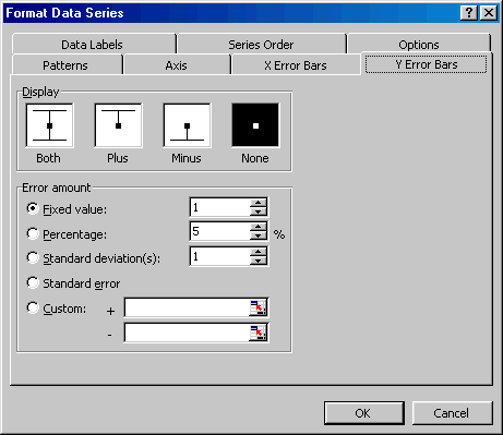
Step 5: Add a y-error-bar (the minus type) with a value of 1.
The result at this step will be a solid 'bar' of black in the chart. This is the cumulative effect of all the error bars.
Step 6: Double-click the (error) bars to format them. In the Patterns tab, set the line style, color, and weight as for the series itself (see the previous paragraph). In addition, select the Marker type to be the vertical type without the horizontal cross line (it's the second option in the Marker section of the Pattern tab).
You will find the result is that the 1,000 data points show up against what seems to be a lightly colored red 'bar.'
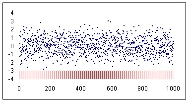
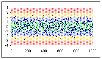
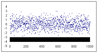
Step 7: Repeat the process for each of the other series. For the mean (zero in this example) series use a + and - error bar of with a fixed value of 1. For the +1, +2, and +3 error bars use + error bars with a fixed with of 1. The final effect: