Keywords: TQM, track deviation, shaded area (or zone) on x-y chart, colored zone, color zone, colour zone, coloured zone, unstacked area
This suggestion for using
unstacked area chart series to create the bands
shown in Figure 1 comes from Jon Peltier. He is a regular contributor
to the Excel newsgroups. The basic idea is to use a
combination chart, with unstacked area chart
series for the +/- sigma bands on the primary
axes, and XY Scatter for the data on the
secondary axes.

Figure
1
The data points for plotting are
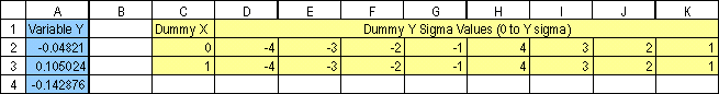
in A2:A101, and the sigma band data are in C2:K3
as in Figure 2. In this example, the data
are randomly created using the =NORMSINV(RAND())
function. Of course, in a real
application, the data would come from an
external source. Similarly, in this case,
the limits for the sigma bands are known to have
the value -3, -2, ..., +3. Alternatively,
one could always calculate the limits from the
mean and the standard deviation of the sample.
Figure
2
Step 1 (Chart 1): Create a XY
Scatter chart of the random data in
A2:A101.
Chart
1
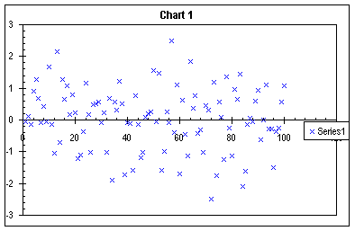
Step 2 (Chart 2): Add the sigma
data in C2:K3. This is with the copy/paste
special method, adding new series, as columns,
with the category values in the first column.
Chart
2
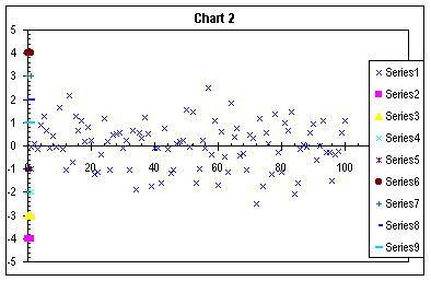
Step 3 (Chart 3): Assign Series 1 (the random data) to the secondary axes.
Chart
3
Step 4 (Chart 4): Some intermediate housekeeping. Format the Secondary Y axis so that the Value X axis crosses at -5000 (an arbitrarily large number that assures the axis labels and ticks stay at the bottom). The primary X axis crosses the primary Y axis at zero. In Chart Options, add the secondary X axis. While it is possible to remove the Secondary Y axis, leave it for clarity, and remove it later.
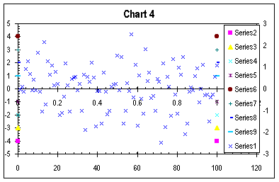
Chart
4
Step 5 (Chart 5): Convert Series
2 to an Unstacked Area type series, the first of
the area chart options.
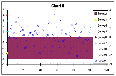
Chart
5
Step 6 (Chart 6): Repeat the
Unstacked Area conversion for Series 3 through
9. Luckily, the F4 key works to repeat chart
type selection.
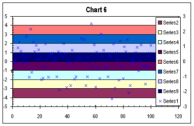
Chart
6
Step 7 (Chart 7): Format the area
series to indicate deviation from the mean.
Series 2 and 6 are filled red for >3 sigma;
series 3 and 7 are yellow for >2 sigma;
series 4 and 8 are green for >1 sigma; and
series 5 and 9 are blue for <1 sigma. In this
example, the series have no border, but that's a
user preference.
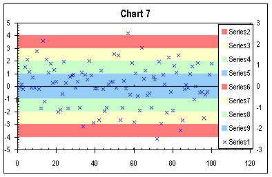
Chart
7
Step 8 (Chart 8): Complete remaining housekeeping:
Delete the legend
In Chart Options finally remove that secondary Y axis; if it's left on the chart, the user must ensure that its scaling matches that of the primary Y axis.*
Format the primary category (X) axis to have no major or minor ticks and no labels.
In the example, the axis line is set to red to show the mean, but that's another user preference.
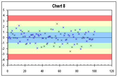
Chart
8
* There are advantages to splitting the data and the sigma bands to primary and secondary axes. The major one is that as points are added, you do not need to expand the range of dummy points. A major disadvantage of having both Y axes is the need to ensure that both are identically scaled.

