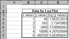
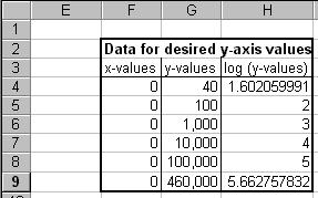
The requirement is to plot the data shown in columns B and C of Figure 1. The graph should use a logarithmic scale for the y-axis, with a minimum value of 40, a maximum value of 460,000. In addition, the graph should contain grid lines at those two values of y, as well as at y = 100, y = 1,000, y = 10,000, and y = 100,000. The resulting graph should look like Figure 2.

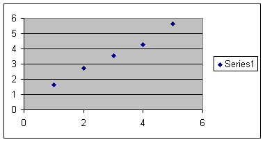
Instead of plotting the actual y-values and formatting the y-axis as having a log scale, calculate the log values in the spreadsheet (see column C in Figure 1) and plot those using a XY-scatter plot as in Figure 3.
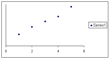
Remove the gridlines (select the chart and then the menu item Chart | Chart Options... | Gridlines tab).
Format the plot area to remove the border and the background (select the Plot Area and then the menu item Format | Selected Plot Area...).
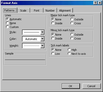
Finally, remove the tick marks and the values shown on the y-axis (click on the y-axis and then select the menu item Format | Selected Axis... | Patterns tab. The last format change is shown in Figure 4.
The result should look like Figure 5.
The data set for the pseudo axis is in Figure 6. Once again, remember to create the log of the y-values as in Column H.
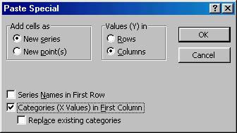
Create a new series with this data set -- using the x-values and the log (y-values). Select the chart and follow the steps in Figure 7 through Figure 9.
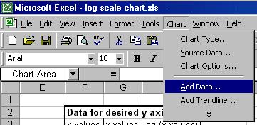
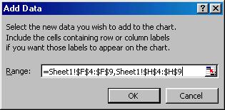
Figure 8
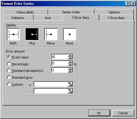
Format the data series created above (either double-click the plotted series or select it and then select the menu item Format | Selected Data Series...) as shown in Figure 10 through Figure 12. This removes the line and the markers, and adds data labels and positive x error bars. Note that the value of 6 used in creating the error bars represents the maximum value of the x-axis itself.
The result will look incredibly messy; just wait for the next few steps.
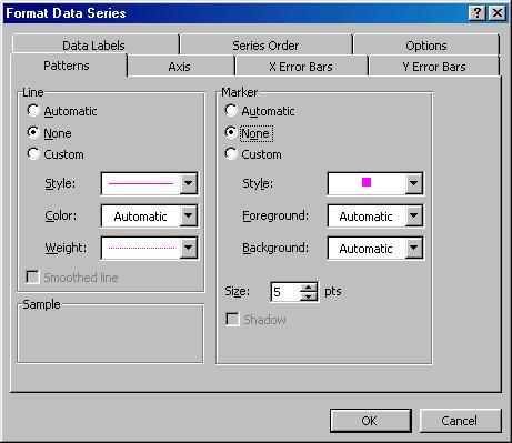
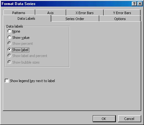
Figure 11
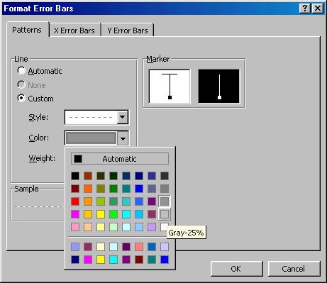
Format the error bars by double-clicking on one of them. The idea is to remove the crossbar at the end of each error bar and to make them much 'lighter' in the effect they have on the chart. Figure 13 shows the necessary steps.
Currently, all the data labels are 'zero.' Change them so that they get their values from the y-values in Column G (Figure 6). Use Rob Bovey's Chart Labeler utility (www.appspro.com) or look at a google.com posting on how to accomplish the same goal "by hand."
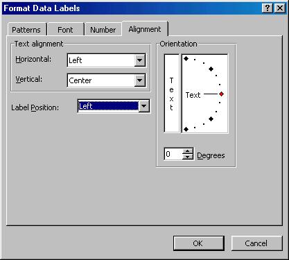
Also, adjust the formatting of the data labels so that the text alignment is 'left,' and the label position is 'left,' as in Figure 14.
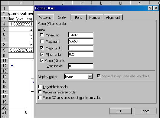
Adjust the minimum and the maximum y-axis values (Select the y-axis, then select the menu item Format | Selected axis... | Scale tab) so that they reflect the desired values. Remember to use the log of the desired values as in Figure 15.
Adjust the x-axis scale so that the maximum is the desired value. Note that the length of the error bars must match this value..
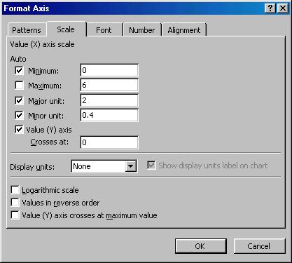
Figure 16

Figure 17

