When creating a chart in Excel, one way to show the data in the chart is to use a Data Table. To use this capability, with the chart selected, select Chart | Chart Options... | Data Table tab, and then check the 'Show Data Table' checkbox. While easy to use, this capability has any number of limitations and, consequently, is not widely used.
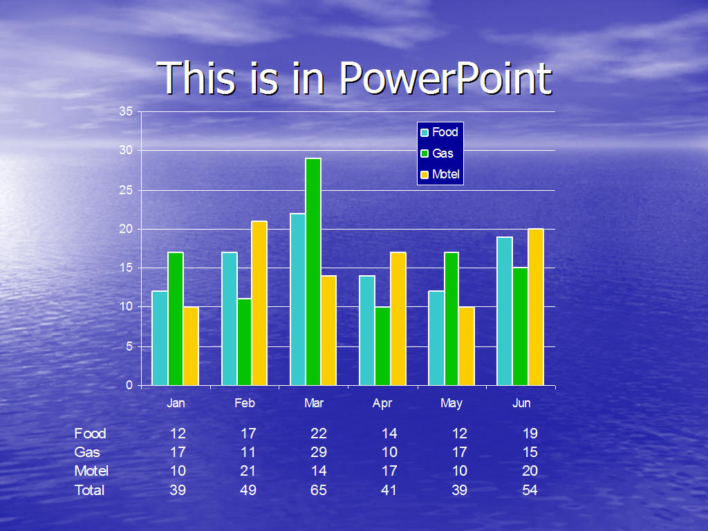
Given the significantly greater capability of formatting cells within a worksheet, it makes more sense to visually combine a chart with information in worksheet cells to create a cohesive single display entity. This technique also applies to an Excel chart embedded in another program such as PowerPoint. For a copy of the Excel and PowerPoint files used in this tutorial, download this zip file.
One such example is follows. Suppose the data set below needs to be charted in a chart. For the purposes of this example, I will use a clustered column, but the use of the method in this tutorial is not restricted to a single chart type.
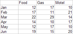
The desired result is the chart with the data in a tabular form below the chart. In addition, the table should show the total on a month-by-month basis, but the total should not be included in the chart itself.
Using Excel's built in chart data table capability, showing the totals but not plotting them would not be possible.
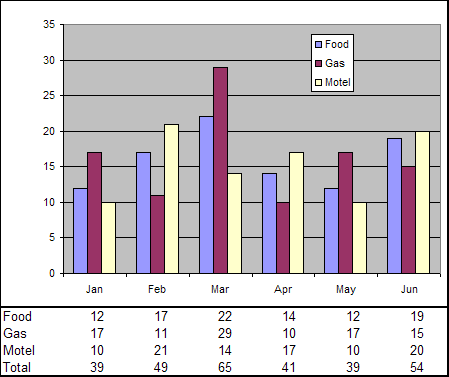
Instead, here's what can be done to accomplish the visual effect shown above.
Create the chart as an embedded object in a worksheet. For a new chart, in the last step of the Chart Wizard specify 'As an object in' and pick a worksheet of choice. For an existing chart, right click on the chart and select the 'Location...' menu item.
Make sure there are enough rows below the chart to hold all the data you want shown.
Now, make a copy the data set. Optionally, it may be necessary to transpose the data, as in this example. Note that the original data had all the month names going down a single column. However, the chart has the months going across in a single row. Hence, the data need to be transposed. If you don't need to transpose, just make a copy of the data. To make a transposed copy of the data, first copy the data, then select an unused range and use Edit | Paste Special... | check the Transpose option.
Delete the top row of the copied data set. In the above example, this should be the row with the names of the months.
Add the Total row. Each cell in the row contains a formula summing the three values above that cell.
Select all the cells containing the data below the chart and the cells beneath the chart. Create a border of an appealing size (Format | Cells... | Border tab). Also, select the first row of data and create a top border.
Select the chart area and then select Format | Selected Chart Area... From the Patterns tab, set the Border to None.
With any cell in the worksheet selected, select Tools | Options... | View tab. Uncheck the Show Gridlines checkbox.
Adjust the chart and the formatting of the cells of the simulated data table to achieve the desired effect.

