This mini-tutorial consists of the following segments. For every thumbnail you encounter click on it to see the original in a new window.
Create a XY Scatter chart such that the y-axis looks like it starts at zero, breaks, resumes at some value and is then a continuous line. In effect, the resulting graph should look like below. Note that this technique works only with a XY Scatter Chart.
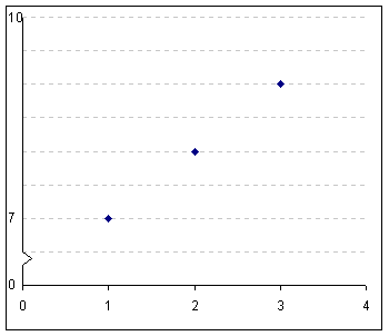
Figure 1
The example below graphs the following data:
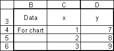
Figure 2
Start off with a default graph (Figure 3) and adjust the format to get the graph in Figure 4.
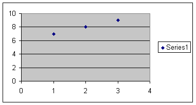
Figure 3
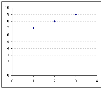
Figure 4
Double-click on the y-axis (or select it and then select the menu item Format | Selected axis...)
Set the y-axis scale such that the minimum is 6 and the maximum is 10 (Figure 5). In the Patterns tab set the Lines to None and the Tick mark labels to None (Figure 6) to get the result in Figure 7.
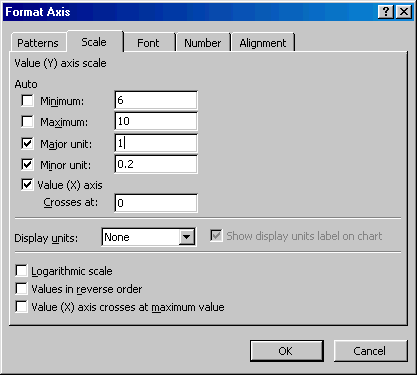
Figure 5
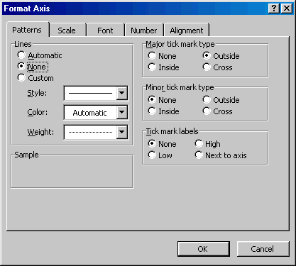
Figure 6
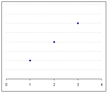
Figure 7
To do so, add the data point x=0, y=6 as below. Remember that the y-axis minimum was set to 6. Hence, the 'zero' marker is actually a y-value of 6.
First, the data point x and y values are entered in the cells as in Figure 8.
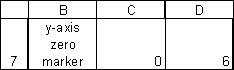
Figure 8
Select the chart and select the menu item Chart | Add Data... In the resulting dialog box set the range to the cells containing the value (0,6) as in Figure 10 and in the Paste Special... dialog box make sure to select the option 'New Series' and, also, make sure to check the 'X values in first column' box (see Figure 11).
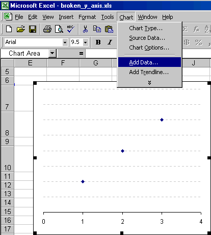
Figure 9
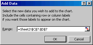
Figure 10
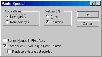
Figure 11
Edit the new point by double-clicking on it and in the resulting dialog box set the marker to none (Figure 12), and set the data labels to 'Show Label' as in Figure 13. Format the data label by double-clicking on it. In the Format Data Labels dialog box, set the Label Position to Left (see Figure 14).
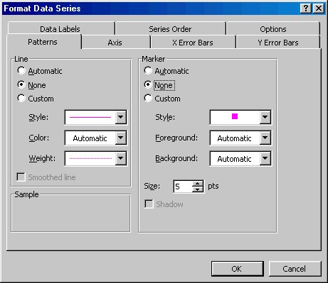
Figure 12
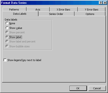
Figure 13
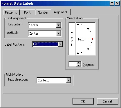
Figure 14
The data set is:
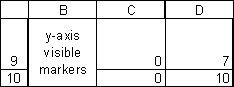
Figure 15
Select the chart and then select the menu item Chart | Source Data... In the dialog box, in the Series tab, click the Add button and select the appropriate cell ranges for the X Values and the Y Values (see Figure 16).
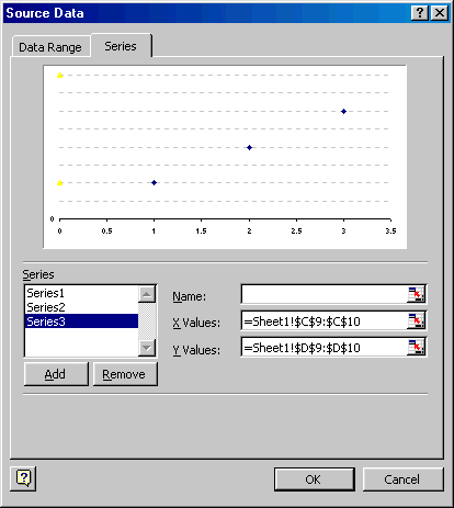
Figure 16
Format the new series without any markers but with a black line (Figure 17). Also, add data labels but this time select the 'Show values' option as in Figure 18. Format the data labels so that they are to the left of the data points, as for the previous series. The result is shown in Figure 19.
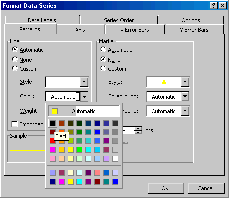
Figure 17
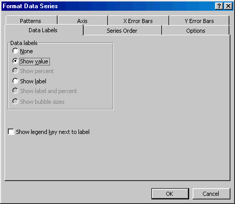
Figure 18
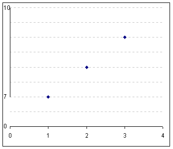
Figure 19
To do this use the data set shown in Figure 20:
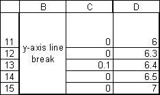
Figure 20
Add this data set as in the previous section and format it to have a black line and no marker. Do not add any data labels. The result should be:
Figure 21

