Jenessa on Feb. 20, 2012:
Could you update these directions for the newer versions of excel? I''m stuck at step two of creating data to make a bell curve because when I paste in that equation all I get are the results for A2, not for all the A''s like you have. I know there''s a way in the new version to highlight all the A''s and get them all calculated but I don''t know how
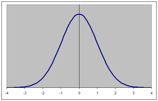
A graph that represents the density function of the Normal probability distribution is also known as a Normal Curve or a Bell Curve (see Figure 1 below). The Normal distribution requires two parameters, the mean and the standard deviation. A Normal distribution with a mean of zero and a standard deviation of 1 is also known as the Standard Normal Distribution (m=0, s=1) as in Figure 1.
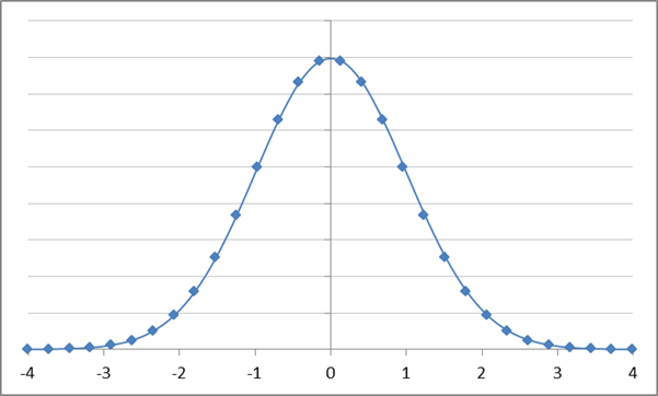
Figure 1 – Standard Normal Distribution
In Excel, there are multiple ways to draw this function:
Enumerate a set of points in a worksheet
Use named formulas to create the graph
Use the shareware add-in, TM Plot Manager
Understand the Standard Normal distribution and how it connects all other Normal distributions
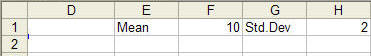
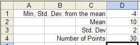
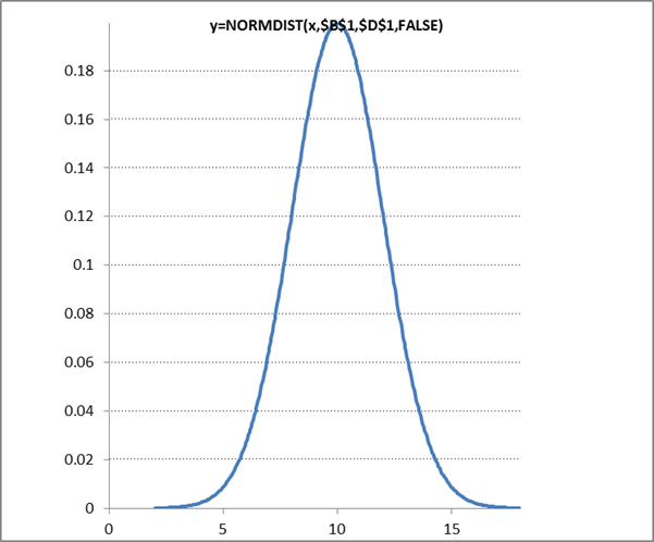
To create a normal distribution graph with a specified mean and standard deviation, start with those values in some cells in a worksheet.
The example uses a mean of 10 and a standard deviation of 2. Enter those values in cells F1 and H1.
Next, set up the x-values for a standard normal curve.
In A2, enter the number -4.

Select cell A2, then click Home tab | Editing group | Fill dropdown | Series… button (in Excel 2003, select Edit | Fill ► Series...)
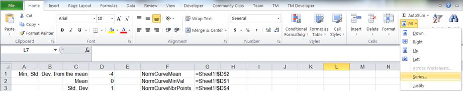
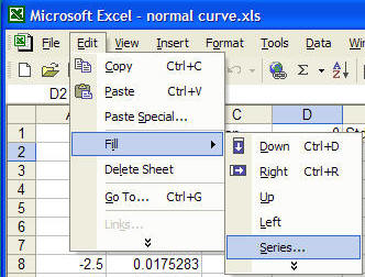
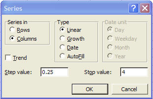
In the resulting dialog box, use a step value of 0.25, which is typically adequate. However, if you want more data points, use a smaller number, such as 0.1.
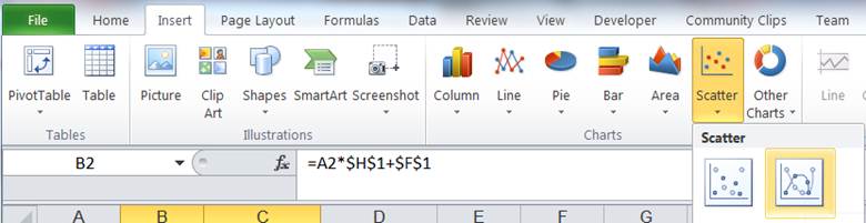
Next, in B2, enter the formula =A2*$H$1+$F$1. This converts the standard normal distribution to the distribution of interest.
In C2, enter the formula =NORMDIST(B2,$F$1,$H$1,FALSE). This provides y-values for the distribution of interest.
Copy B2:C2 down to cover all the rows that contain data in column A. The result should look like Figure 2.
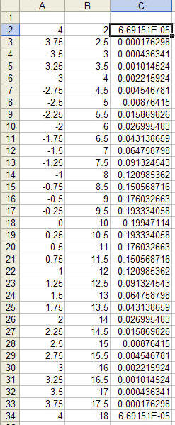
Figure 2
Plot columns B and C in a XY Scatter chart (smoothed lines without markers)

The result should be as in Figure 3. Finally, format the chart to get a result similar to Figure 1 or as desired.
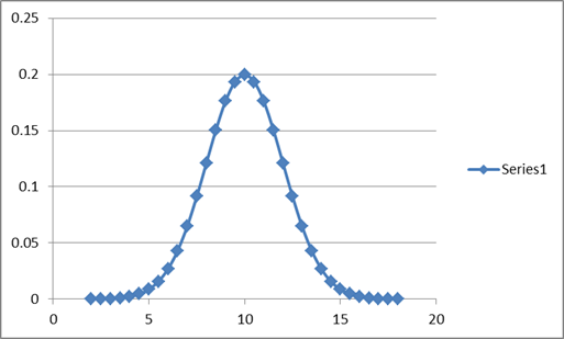
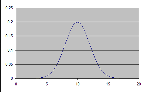
Figure 3
One can use named formulas to create the chart. The advantage of this method is that it doesn't use cells in the worksheet. However, the result might be a little more difficult to understand for those not familiar with the concept.
Put the information required to create the chart in cells in a worksheet.
The first three cells contain information similar to that provided in the Enumerate a set of points in a worksheet. The last item is analogous to the step value used in the Fill dialog box. However, this time, the number of points used in the chart is specified directly.
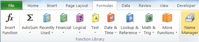
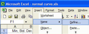
Next, create the required names Formulas tab | Defined Names group | Name Manager button (in Excel 2003 Insert | Name ► Define...)
The result should look like:
|
NormCurveMean |
=Sheet1!$D$2 |
|
NormCurveMinVal |
=Sheet1!$D$1 |
|
NormCurveNbrPoints |
=Sheet1!$D$4 |
|
NormCurveStdDev |
=Sheet1!$D$3 |
|
NormCurveXVals |
=NormCurveMean+NormCurveStdDev*(NormCurveMinVal+ABS(2*NormCurveMinVal)/(NormCurveNbrPoints-1)*(ROW(OFFSET(Sheet1!$A$1,0,0,NormCurveNbrPoints,1))-1)) |
|
NormCurveYVals |
=NORMDIST(NormCurveXVals,NormCurveMean,NormCurveStdDev,FALSE) |
Next, plot the normal curve. Click any cell that does not contain data and has no adjacent cell with data and create a XY Scatter chart (sub type Smoothed line with no markers) as in Enumerate a set of points in a worksheet. This time the chart will be empty! Select the empty chart and type (or paste) the formula below into the formula bar (change the name of the workbook to the name of your workbook).
=SERIES(,'normal curve.xls'!NormCurveXVals,'normal curve.xls'!NormCurveYVals,1)
Finally, format the chart as desired.
For more on how to use named formulas in a chart, see the Dynamic Charts page of the author's web site.
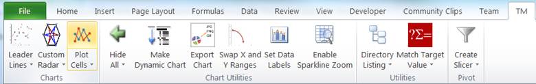
If you have not already done so, download and install the add-in.
The add-in plots a complete graph from a formula in a single Excel worksheet cell.
Suppose the mean and standard deviation for the normal distribution are in B1 and D1:
![]()
In B2, enter the formula for a normal distribution function. =NORMDIST(A2,$B$1,$D$1,FALSE).
In B5 and B6, enter the minimum and maximum x-values to plot. ±4 standard deviations translate to =-4*$D$1+$B$1 and =4*$D$1+$B$1, respectively.
Now, use the Plot Manager add-in:
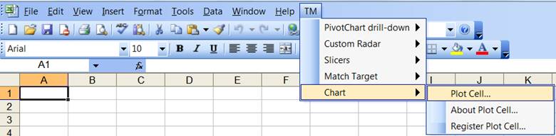
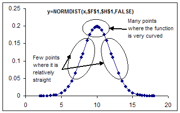
Specify the parameters as shown in Figure 4.
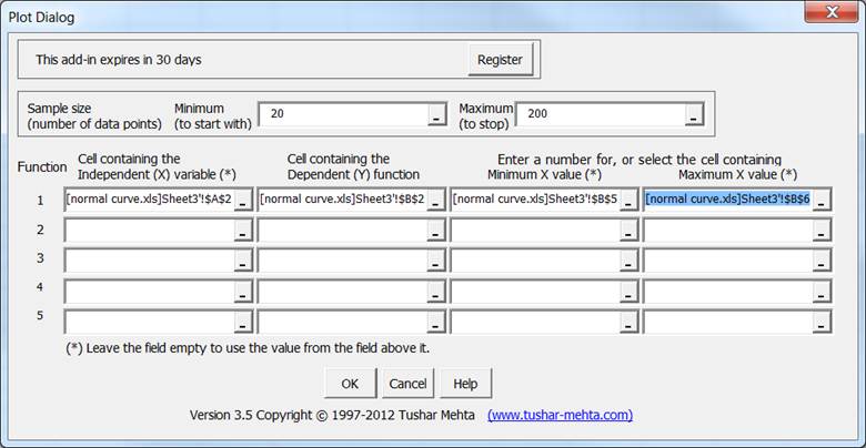
Figure 4
The add-in will put in working data and the resulting chart in a new worksheet in the workbook.
Format the chart as desired; move it to another sheet if that is more appropriate.
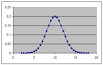
The add-in optimizes its choice of the (x,y) data pairs based on the local curvature of the function. It assigns more data points where the function is curved and fewer points where the function is relatively straight. To visualize the result, compare two normal curves, where the one on the right is the result of TM Plot Manager. The optimized allocation of the data points becomes quite evident.
A value, x, from a normal distribution specified by a mean of m and a standard deviation of s can be converted to a corresponding value, z, in a standard normal distribution with the transformation z=(x-m)/s. And, of course, in reverse, any value from a standard normal graph, say z, can be converted to a corresponding value on a normal distribution with a mean of m and a standard deviation of s by the formula x=m+z*s. Remember that the standard normal distribution has a mean of 0 and a standard deviation of 1, i.e., m=0, s=1.
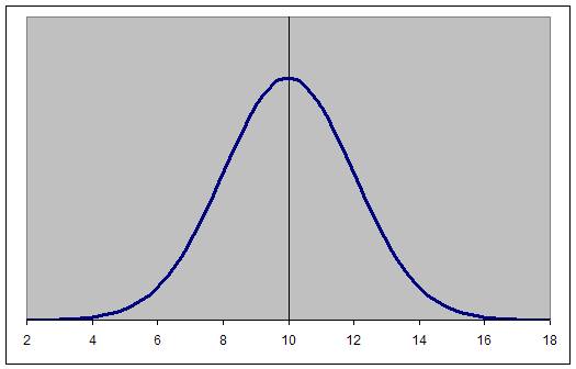
The ability to carry out this transformation is very important since we can do all our analysis with the standard normal distribution and then apply the results to every other normal distribution, including the one of interest. For example, to draw a normal curve with a mean of 10 and a standard deviation of 2 (m=10, s=2), draw the standard normal distribution and just re-label the axis. The first figure below is the standard normal curve and the next figure is the curve with (m=10, s=2).
Each value along the x-axis represents that many standard deviations from the mean. The 1 (or -1) x-value is one standard deviation from the mean. Similarly, the 3 (or -3) represents three standard deviations from the mean.
The same concept applies to any normal distribution, not just the standard normal distribution. The numbers on the x-axis represent the standard deviations from the mean. So, if the mean is 10 and the standard deviation is 2, one standard deviation from the mean (±1s) yields the values 12 and 8 (10±1*2). Similarly, ±3s yields the values 4 and 16.