What does the final graph look like?
Enter the function to be graphed
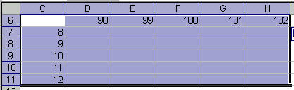
Create a table of data for the chart
What Excel really does and why a 3-D surface chart is not a 'true' 3-D chart
|
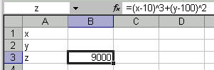
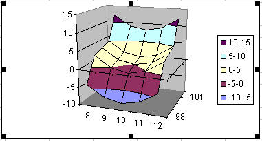
The goal Plot z=(x-10)3 + (y-100)2 as in the chart on the right |
 |
|
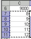
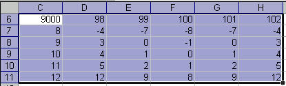
Create the
data table for the chart
|
 |
 |
|
 |
|
 |
|
|
|
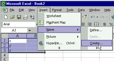
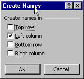
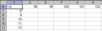
Create the
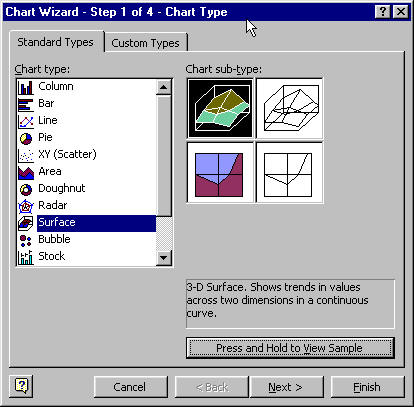
chart Step 1: Create the basic chart Step 2: Specify the 'x-values' |
|
|
Step 1:
The basic chart
|
|
|
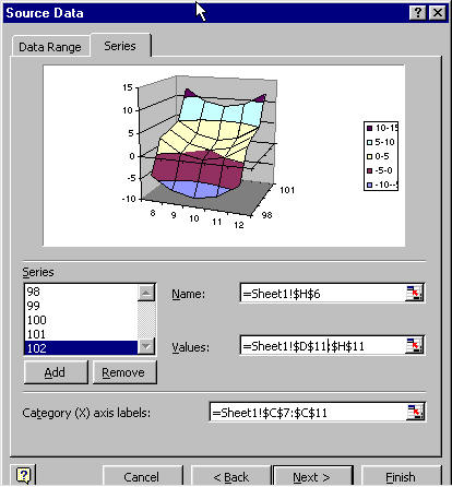
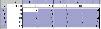
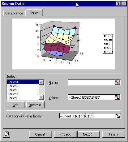
Step 2:
Specify the 'x-values'
|
|
|
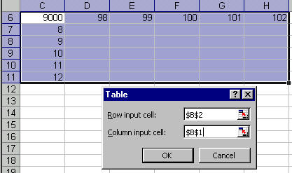
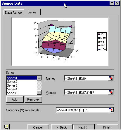
Step 3:
Specify the 'y-values'
|
|
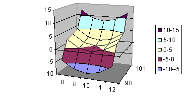
| Step 4: The result |
 |
|
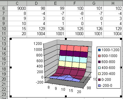
What's the
limitation on creating a 3-D chart? In creating the chart above, the x-values were entered not a real numeric values but as 'category labels.' This was done in Step 2 of the Chart Wizard. Excel does not attach any numerical significance to these labels. All the labels are arranged so that they are next to each other at equal distances. Similarly, the y-values are not real values. Excel draws a 3-D chart by charting multiple series and overlaying a surface across all the series. What looks like y-values of 98, 99, etc., are nothing but series names specified in Step 2 of the Chart Wizard. This example deliberately picked x-values such that the difference between adjacent values was the same (1 in this case). The y-values have the same characteristic, with each being 1 more than the previous one. Any category chart which contains equidistant x-values will look OK. However, consider the case where the x values are 8, 9, 10, 15, and 20. The chart corresponding to this data set is shown on the right. |
 |