An example to illustrate how to use the Add-in
Start with a sample data set, such as the one shown below. The values
in cells A1:B6 are randomly generated numbers. Since the data set is
randomly generated, the values that you see in the example workbook will be
different. However, that does not affect the method by which one uses the
add-in.
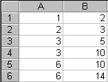 |
Figure 5
Chart the data set to get the graph shown below.
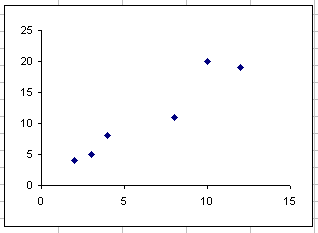 |
Figure 6
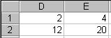
The limits for the x-axis are in column D. Cell D1 is the minimum value
of the axis and D2 is the maximum value for the axis. Similarly, column E
contains the minimum and the maximum values for the y-axis. The cell
values and the formulas are shown in Figure 7.
 |
 |
Figure 7
Click on the chart to select it. The chart menu bar will have the menu
TM. Select it and then the item Automate Chart limits... as shown below in
Figure 8.
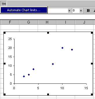 |
Figure 8
|
For custom technology solutions,
operations consulting, or training contact web-underscore-contact@tushar-hyphen-mehta-dot-cee-oh-em.
By accessing any page or link on this
web site other than this page,
you agree to the terms and conditions.
Ads from amazon.com
|
|
A comment selected at random:
|
|
Copyright © 2000-2008 Tushar Mehta.
Send comments and suggestions about the web site to webmaster@tushar-hyphen-mehta-dot-cee-oh-em
Last edited
April 13, 2008
|
|