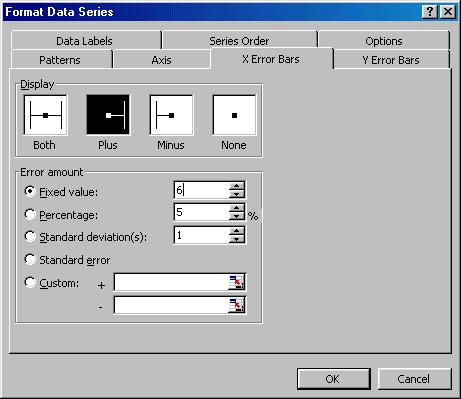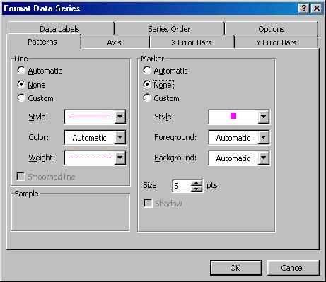
Format the data series created above (either double-click the plotted series or select it and then select the menu item Format | Selected Data Series…) as shown in Figure 10 through Figure 12. This removes the line and the markers, and adds data labels and positive x error bars. Note that the value of 6 used in creating the error bars represents the maximum value of the x-axis itself.
The result will look incredibly messy; just wait for the next few steps.
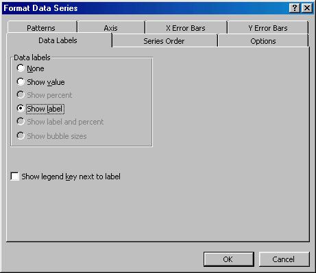
Figure 11